You've got a logo. Your designer sent over a nice-looking file. The shirts are for a staff rollout, an event, or a merch drop, and the deadline is getting close. Then the printer asks for vector art, spot colors, placement specs, garment color, proof approval, and suddenly a simple T-shirt order doesn't feel simple at all.
That hand-off between your designer and your print manufacturer is where most avoidable problems start. A design can look polished on a screen and still print poorly on fabric if the file, sizing, color plan, or placement instructions aren't built for production. Good screen printing t shirts designs aren't just creative. They're prepared to survive setup, ink, fabric texture, and repeat production without surprises.
Table of Contents
- From Digital File to Finished Shirt
- Core Design Principles for Printability
- Technical File Preparation for Your Printer
- Artwork Sizing and Placement That Looks Professional
- Finalizing Your Design with Mockups and Proofs
- Common Pitfalls and Pro Tips to Save Money
From Digital File to Finished Shirt
A first-time buyer usually starts in the same place. They have a logo on a white background, a social media graphic, or a PDF from a designer, and they assume the print shop can “just use that.” Sometimes we can clean it up. Sometimes we can't without rebuilding the art.
That difference matters because screen printing is an old craft built on a precise production process, not a drag-and-drop upload. Its roots go back to China's Song Dynasty, roughly 960–1279 AD, and it became a major commercial apparel method in the 1960s, helping turn the graphic tee into a mainstream category, as noted in this history of screen printing. The process has changed, but the basic truth hasn't. The cleaner the original art, the better the shirt.
Most bad outcomes start before ink ever touches fabric. A business owner approves a design on a laptop. The designer exports a flattened file. The printer receives artwork with soft shadows, tiny text, or colors that weren't separated for print. Then the order stalls while everyone goes back and forth trying to define what should have been clear from the start.
A short project brief fixes a lot of that confusion. If your designer and printer are working from the same notes on garment color, print locations, ink style, quantity, deadline, and who gives final approval, the job moves faster. If you need a framework for that conversation, this guide on clarifying project goals with a brief is useful because it forces the right questions early.
Practical rule: The best time to solve a print problem is before your designer exports the first production file.
For a new buyer, screen printing is still the default method for many shirt orders because it handles bold graphics well, wears well, and makes sense when the design is built for repeat production. If you want a plain-language overview of how the decoration process works on apparel, this walkthrough on how to print a design on a shirt is a good companion before you approve art.
Core Design Principles for Printability
The best digital artwork isn't always the best print artwork. Fabric has texture. Ink sits on a shirt differently than color sits on a backlit monitor. If you want screen printing t shirts designs that look sharp in real life, design with the press in mind.
Think bold, not delicate
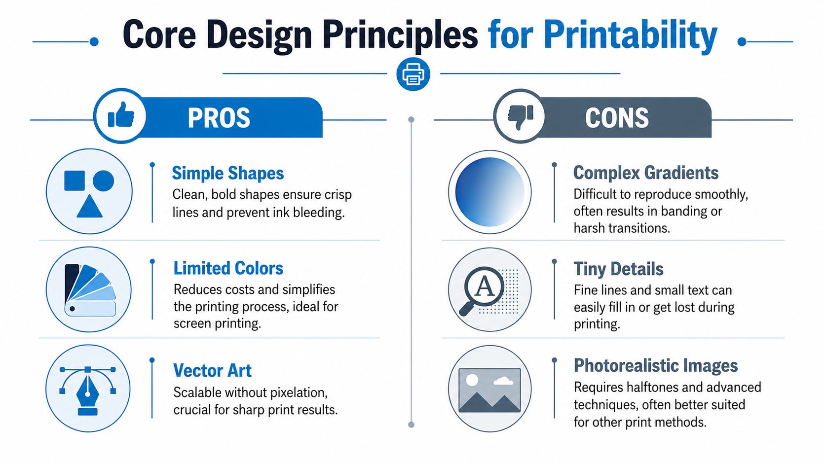
A strong screen print usually comes from solid shapes, clean edges, and intentional contrast. Fine hairlines, tiny reversed text, and subtle fades often create trouble. What looks elegant on a design board can fill in, soften, or lose definition on cotton.
Think bold. Think simple. If a detail only works when someone zooms in on a screen, it probably won't carry the shirt.
That doesn't mean every print has to be plain. It means the design needs clear priorities. A logo mark, one strong phrase, a graphic shape, and controlled color use will usually outperform a busy layout full of competing details.
Fewer colors usually print cleaner
In screen printing, each color usually means its own screen setup. That affects prep time, alignment, and the chance for something to drift during production. It also changes the conversation about budget. A business client may fall in love with a mockup that uses many separate shades, but the printer sees a design that needs more setup and tighter registration.
A limited palette often improves the shirt. It gives the eye one thing to focus on. It also makes the art easier to separate and easier to repeat across a full run.
A few practical design habits help right away:
- Use clear contrast: Dark ink on a dark shirt or light ink on a light shirt can work, but only if the contrast is strong enough to read from a normal viewing distance.
- Build with shape first: If the design still works in one color, it usually has a solid structure.
- Treat gradients carefully: Soft transitions can require advanced handling and may still look harsher on fabric than they did on screen.
- Make small text earn its place: If the message is important, enlarge it. If it's decorative filler, remove it.
Choose artwork built for apparel
Vector artwork is usually the safest route because it scales cleanly and keeps edges sharp. Photorealistic images can be done, but they often push the project into a different technical conversation. For many business shirts, a cleaner graphic approach works better.
If you want to see what buyers tend to notice in finished shirts, reading through actual feedback from Amazing T Shirts customers can be helpful. Not for hard metrics, but for pattern recognition. People respond to readability, color clarity, and a print that feels intentional.
Ink choice also affects how a design reads on fabric. If you're comparing print looks and hand feel, this overview of water-based ink printing can help you decide whether your design should lean softer and more vintage-looking or bolder and more opaque.
Technical File Preparation for Your Printer
The fastest way to delay an order is to send art that looks finished but isn't production-ready. In such instances, designers and buyers often talk past the print shop. The designer says the file is high quality. The printer opens it and sees missing fonts, merged colors, low-resolution effects, or artwork that can't be separated cleanly.
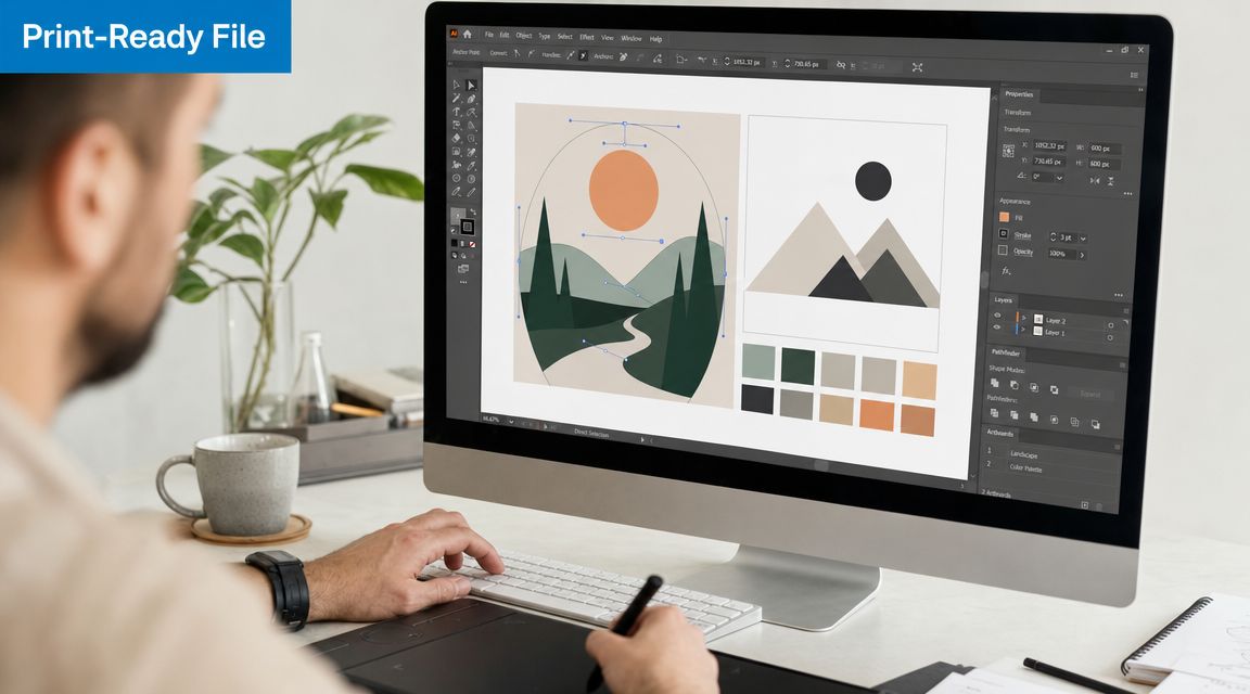
For production-ready work, published process guidance recommends artwork at 300 DPI, converted into a clean film positive, with attention to contrast and exposure prep because weak artwork contrast, uneven emulsion coating, and incorrect UV exposure timing all hurt final print quality, according to MFG Merch's screen printing process guide.
Vector beats raster for production
Think of vector art as instructions and raster art as a snapshot. A vector logo tells the computer where lines and shapes belong, so it can scale cleanly. A raster file, like a JPG or PNG, is made of pixels. Enlarge it too much and the edges break down.
For screen printing t shirts designs, that difference shows up fast. A vector file lets the printer separate colors, clean edges, and control output. A low-grade raster file often turns into a redraw job.
Ask your designer for one of these if possible:
- AI or EPS: Common working formats for print production
- SVG: Often useful if it's built cleanly
- PDF: Good if it preserves vector objects and outlined text
If the only file you have is a JPG pulled from a website, say that upfront. A printer would rather know early than discover it after the order is already in motion.
What your printer needs before press setup
Good file prep is less about software and more about removing ambiguity. The printer shouldn't have to guess what color is intended, whether a shadow should print, or if text can be edited.
Send artwork with these production habits in mind:
Convert text to outlines
If the font doesn't travel with the file, your layout can change when someone else opens it.Use spot colors for print colors
Screen printing works best when each ink color is clearly defined. “Dark blue-ish” isn't a production instruction.Keep backgrounds transparent when needed
If the art isn't supposed to print a white box behind it, the file should make that obvious.Separate placements into distinct files or artboards
Front, back, sleeve, and left chest should never be left to interpretation.Include notes for size and location
“Make it standard” means different things to different people.
One smooth hand-off often includes the art file, a mockup, garment style and color, print locations, and approval contact. Dirt Cheap Product, Inc. accepts uploaded logos and provides proofs, which is one example of the kind of workflow that reduces ambiguity between buyer and production team.
A short visual explanation can help if your team is new to production terminology:
Print-Ready File Checklist
| Check | Requirement | Why It Matters |
|---|---|---|
| Yes/No | Vector file included if available | Keeps edges sharp and makes color separation easier |
| Yes/No | Raster art set to 300 DPI at print size | Reduces visible pixelation in output |
| Yes/No | Text converted to outlines | Prevents font substitution problems |
| Yes/No | Colors defined clearly as spot colors | Helps the printer separate inks accurately |
| Yes/No | Background removed if not meant to print | Avoids accidental boxes or unwanted shapes |
| Yes/No | Each print location labeled | Prevents front/back/sleeve confusion |
| Yes/No | Intended print size included | Stops scaling guesswork |
| Yes/No | Garment color specified | Ink visibility depends on shirt color |
| Yes/No | Mockup attached | Gives the printer visual intent |
| Yes/No | Approval contact listed | Keeps revision decisions with the right person |
A file is ready when a printer can open it and make almost no assumptions.
Artwork Sizing and Placement That Looks Professional
A design can be excellent and still feel wrong if it sits too high, too low, too small, or too wide for the garment. Placement is where a lot of first orders start to look homemade. Professional shirts feel balanced because the artwork matches the shirt style and the purpose of the order.
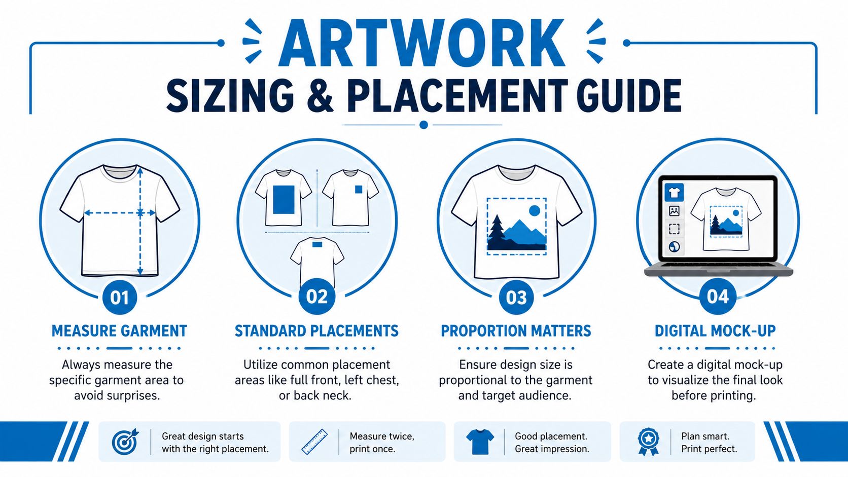
Industry guidance recommends placing standard chest artwork 2–3 inches below the collar for visual consistency across sizes, as described in this shirt placement guide from OOShirts. That's a useful benchmark because many new buyers instinctively place chest art too low.
Match placement to the job
Different shirt goals call for different placement logic.
A company uniform usually benefits from restraint. A left-chest logo or modest front print reads cleanly and doesn't fight with the wearer. Event shirts often need stronger visibility, so a larger front or back print makes more sense. Retail-style merch can push scale further, but it still needs balance with the garment cut.
Here's the practical way to consider this:
- Left chest: Good for uniforms, staff apparel, and understated branding
- Full front: Best when the graphic is the main message
- Upper back: Useful for team names, sponsor marks, or event identity
- Sleeve print: Works as a secondary hit, not the main story
Use a mockup that answers questions
A mockup shouldn't just look attractive. It should remove uncertainty.
The best mockups show the exact garment color, artwork location, print width, and whether the design changes across shirt sizes. If the order includes youth sizes, ladies' cuts, or extended adult sizes, say so. A print that feels oversized on a small shirt can feel underpowered on a larger one if nobody planned for proportion.
Send your printer a simple tech pack or approval sheet that answers these questions:
- Which garment is being printed
- Which placements are included
- What size each placement should be
- Whether all sizes use one print width or a scaled version
- Who has final approval authority
A mockup is not decoration. It's an instruction sheet that prevents expensive misunderstandings.
Finalizing Your Design with Mockups and Proofs
The proof stage is where a good order gets protected. It's also where buyers get casual because they assume the hard part is over. It isn't. The proof is the last moment to catch errors while they're still cheap to fix.
A proof should answer one question clearly. “Is this exactly what we want printed?” If the answer is anything short of yes, it's not ready.
What to check before you approve
Don't scan a proof. Read it like a purchase order.
Start with the basics. Check spelling, punctuation, dates, URLs, and phone numbers. Then check the production items. Look at garment color, ink color, print location, and relative size on the shirt.
A careful approval pass usually includes:
- Artwork content: Names, event dates, taglines, and legal marks
- Color intent: Does the approved art reflect the ink look you expect on that garment shade?
- Placement: Is the left chest really left chest, or did the mockup shift it visually?
- Scale: Does the print feel appropriately sized for the garment and audience?
- Multiple locations: If there's a front and back print, are both listed and shown?
If two people need to sign off internally, get that done before you approve production. A lot of rework starts with one person saying yes while another decision-maker still thinks changes are coming.
Why rushed approvals get expensive
One of the most common shop-side stories goes like this. A client is in a hurry. They receive the proof on a busy afternoon. They approve it from their phone without zooming in. The shirts arrive, and a line of small text is wrong, or the back print is smaller than expected. The printer produced exactly what was approved.
That doesn't make the client careless. It means they treated the proof like a formality instead of a control point.
If a detail would bother you on delivery day, check it on proof day.
The best approval process is boring. One person reviews the file carefully. One person gives final sign-off. Everyone else comments before that step, not after. It slows the project by a few minutes and can save an entire run from becoming a lesson.
Common Pitfalls and Pro Tips to Save Money
Most over-budget apparel orders don't come from one giant mistake. They come from a chain of small, fixable choices. The design started too complex. The file came in wrong. Someone requested changes after approval. The client expected a specialty effect from a standard print method.
When you understand how those choices affect setup, labor, and rework, it gets much easier to buy smart.
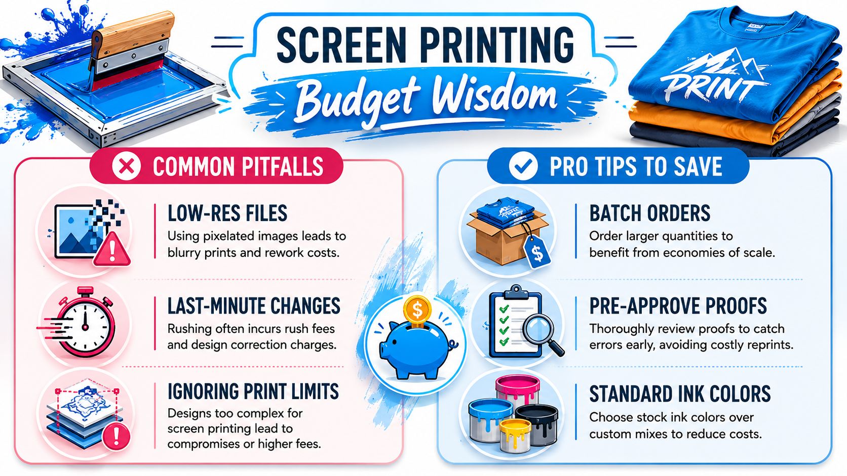
Instead of this, do this
Instead of sending a web JPG, send the original design file.
A logo copied from a website is usually the wrong starting point. Ask your designer for the editable source file or a clean vector export.
Instead of designing in unlimited colors, reduce the palette on purpose.
Each color usually requires separate setup in screen printing. A tighter color plan often looks stronger and keeps the job easier to produce.
Instead of treating garment color as a late decision, choose it early.
Ink, contrast, and overall mood all change based on the shirt color. If you switch from white tees to dark tees late in the process, the art may need adjustment.
Instead of asking for tiny details everywhere, prioritize what people will notice.
Most shirts are seen from several feet away. Strong shapes and readable type matter more than micro-details.
Instead of approving loosely worded instructions, define each placement.
“Large front” is not specific. A mockup with clear sizing and location saves corrections later.
Instead of making changes after proof approval, hold internal review first.
Last-minute edits can trigger rework, delay production, or force a reset on approvals.
Where buyers misread oversized graphics
Large prints create excitement in mockups, but buyers often confuse three different things: a standard full-front print, a very large front print, and a true wrap-around or all-over result.
A true wrap-around print is typically done in a cut-and-sew environment before the shirt is assembled, not on a finished garment, as explained in this wrap-around screen printing overview. That's the key fact that clears up a lot of unrealistic expectations. If someone shows you a concept that runs smoothly across seams and around the body, that's a different production conversation than printing on stocked finished tees.
For budgeting, that means you should ask early whether the visual goal is:
- A standard print area on a finished shirt
- An oversized print within the limits of a finished shirt
- A cut-and-sew style result
Those are not the same job.
Large artwork is possible. Seamless all-around artwork on a finished blank usually isn't.
Another money saver is choosing the right process for the design itself. If your art needs many colors, soft transitions, or multiple placements on a short run, ask whether screen printing is still the right fit or whether another decoration method makes more sense. Good buyers don't force one process onto every design. They match the method to the artwork and order size.
If budget planning is part of your next order, this guide on how much it costs to screen print a shirt is a practical place to compare the decisions that usually change the final invoice.
The strongest screen printing t shirts designs usually follow a simple pattern. The art is bold. The file is clean. The placement is planned. The proof gets reviewed carefully. None of that is glamorous, but it's what keeps a shirt order looking professional and staying on budget.
If you're ready to turn a logo or concept into production-ready apparel, Dirt Cheap Product, Inc. can help you move from artwork hand-off to approved proof with clear placement, decoration, and file guidance for custom T-shirt orders.