
You're probably looking at a mockup right now. Maybe it's a brewery staff shirt with a heather gray body and navy sleeves. Maybe it's a little-league top with a white body and royal sleeves. On screen, it looks easy. In production, it isn't just “a shirt with different color sleeves.” It's a garment with separate fabric zones, visible seam lines, and decoration limits that need to be decided before ink, thread, or heat ever touches the shirt.
That's where buyers usually get tripped up. They approve the colors first, then ask about print size, logo placement, shrinkage, or reorders after the purchase order is already moving. By then, the sleeve seam has already decided part of the result.
The clean way to buy shirts with different color sleeves is to start with construction, then move to decoration, then finish with quality control. If you do it in that order, your proof makes more sense, your print method fits the garment, and your reorder is less likely to drift.
Table of Contents
- Getting Started With Shirts That Mix Sleeve and Body Colors
- Understanding the Three Main Sleeve Construction Types
- Choosing the Right Construction for Your Use Case
- Materials, Dye Lots, and Colorfastness in Contrast Sleeves
- Decoration Methods and Where to Place Your Logo
- Ordering Contrast Sleeve Shirts Without Surprises
- Bringing It All Together and Next Steps
Getting Started With Shirts That Mix Sleeve and Body Colors
A contrast-sleeve shirt looks simple because the color break is noticed first. The shop notices something else first. We see at least two fabric panels being joined together, and that seam changes what the shirt can handle.
A shirt with different color sleeves isn't just a color choice. It's a cut-and-sew decision. The sleeve panel and body panel may shrink differently, hold dye differently, and sit differently on the platen when printed. That's why two shirts with the same colors can behave very differently in production.
What buyers usually miss
The most common mistake is treating sleeve contrast like a graphic choice instead of a garment choice. If the sleeve seam crosses a logo area, your print can't be placed the same way as it would on a plain single-color tee. If the sleeve fabric comes from a different dye lot later, your reorder may be close, but not identical.
Here's the practical way to approach it.
- Construction first: Ask how the sleeve joins the body.
- Decoration second: Match the print or stitch method to that seam.
- QA third: Check wash behavior, seam stability, and color hold before the full run.
If you're still deciding on the base garment, this overview of T-shirts for printing helps frame what makes a shirt easier or harder to decorate.
Practical rule: If the seam is visible, it matters. Treat it as part of the artwork area, not as background.
Three builds show up most often
Most shirts with different color sleeves fall into one of three buckets:
- Raglan
- Set-in colorblock
- Set-in with contrast trim
Those names matter because each one changes how the shirt is sewn, where the seam lands, and how forgiving the garment is when you print or embroider it. A proof can show all three in the same colors and still represent three very different production outcomes.
Understanding the Three Main Sleeve Construction Types
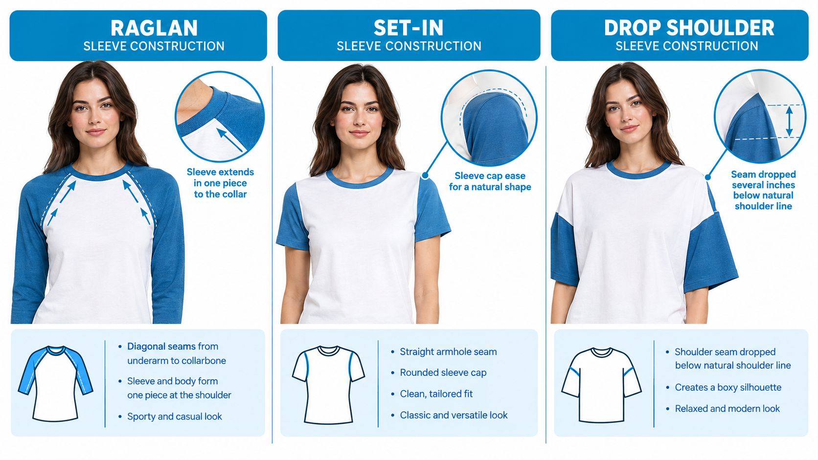
Buyers often use “baseball tee,” “contrast sleeve,” and “raglan” like they mean the same thing. They don't. On a spec sheet, these are different builds.
The oldest and most recognizable of the group is the raglan sleeve. Historical accounts trace the raglan style to the mid-19th century and commonly link it to FitzRoy James Henry Somerset, 1st Baron Raglan, who lost his right arm at the Battle of Waterloo in 1815. The design is said to have developed around 1855 to make dressing easier and improve movement, and it later moved from military tailoring into knitwear and sportswear, including baseball-style shirts, as noted in this history of the raglan sleeve.
Raglan
A raglan sleeve runs in one piece up to the collar area. You can verify it fast by looking for a diagonal seam running from underarm to collarbone. There's no standard shoulder seam sitting across the top of the shoulder.
In shop terms, a raglan gives you the classic baseball-shirt look. The color change often follows that diagonal seam, which means the seam itself becomes part of the visual identity of the shirt.
Set-in colorblock
A lot of confusion starts here. A set-in colorblock shirt has a more standard T-shirt body. The sleeve is sewn into the armhole, and you still have a shoulder seam. The sleeve fabric is a different color from the body.
That gives you a sharper shoulder line than a raglan. It also creates a cleaner, more corporate look when the buyer wants contrast without the full baseball feel.
Set-in with contrast trim
This one is the safest to misunderstand because it can look like a contrast-sleeve shirt from a distance. But the main sleeve may still be the same fabric as the body. The contrast comes from a cuff, band, or added panel.
Think of it like this:
- Raglan: one long puzzle piece reaching toward the neck
- Set-in colorblock: a separate sleeve puzzle piece attached at the armhole
- Trim style: a standard sleeve with an accent added to it
A mockup can hide construction. A seam chart won't.
Why these differences matter to decoration
A printer doesn't just care where the color changes. We care where the shirt lies flat. A diagonal raglan seam can interrupt upper chest art. A set-in shoulder seam gives you a more predictable chest field. A trim style usually leaves the body print area closest to a standard tee.
That's why a buyer should always ask for the construction name in writing, not just “same look as the sample.”
Choosing the Right Construction for Your Use Case
The right build depends on what the shirt has to do after it leaves the box. Team apparel, event merch, retail product, and staff uniforms don't all need the same thing. Some need visual energy. Some need safer reorders. Some need the easiest logo placement possible.
Side-by-side comparison
| Construction | Best For | Decoration Limits | Reorder Risk |
|---|---|---|---|
| Raglan | Teams, schools, retro branding, athletic looks | Upper chest art can run into diagonal seam lines | Moderate, because seam shape and panel color both matter |
| Set-in colorblock | Corporate merch, events, polished casual uniforms | Shoulder and armhole areas show placement errors more clearly | Higher, because panel matching needs to stay consistent |
| Set-in with contrast trim | Subtle branding, lower-risk uniforms, stock blank programs | Limited visual impact from sleeve contrast | Lower, because the base shirt is usually simpler to match |
When raglan makes sense
Raglan works well when the shirt should look active, familiar, or a little vintage. The diagonal seam gives the garment movement before you even add decoration. That's useful for schools, rec leagues, and brands that want a baseball-adjacent look.
It also photographs cleanly because the sleeve panel reads as one visual block. But there's a tradeoff. Big art pushed too high on the chest can collide with the seam.
When set-in colorblock makes more sense
A set-in colorblock shirt usually reads neater and more structured. If a company wants sleeve contrast without looking sporty, this is often the better path. The shoulder break feels more standard, so the garment fits better in branded merch programs and event uniforms.
The downside is tolerance. If one sleeve sits a little differently, or the seam alignment shifts, buyers notice faster because the break is sharp and easy to read.
When trim is enough
Some buyers don't need a full contrast sleeve. They just want a small accent that ties into a logo color. Set-in with trim is often the easiest route. You keep a familiar print field on the chest and reduce production complexity.
A simple rule helps here:
- Choose raglan when the shirt itself should carry part of the style story
- Choose set-in colorblock when you want clean contrast with a more standard silhouette
- Choose trim when decoration needs to stay easy and the contrast is secondary
Materials, Dye Lots, and Colorfastness in Contrast Sleeves
Two-tone shirts succeed or fail in the wash. That's the part many buyers don't see until the order is already in use.
The main technical risk in shirts with different color sleeves is colorfastness. Sleeve panels and body panels often use different dye classes or different fixation conditions. During laundering, dye can migrate from the deeper-colored area into the lighter area. In a two-tone shirt, even a small amount of bleed is easy to spot because the contrast makes it obvious. Industry QA references commonly check this with ISO 105-C06 or AATCC 61, and a common apparel acceptance target is gray scale 3-4 for both color change and staining, according to this summary of fabric quality control tests.
If you want a plain-language primer before reviewing lab terms with your decorator, this guide to color fastness testing is a useful starting point.
Fabric pairing changes the risk
Cotton, polyester, and blends don't behave the same under dye, heat, or washing. That matters before printing and after delivery.
| Fabric Pairing | Dye Class | Shrinkage Risk | Max Cure Temp |
|---|---|---|---|
| Cotton body with cotton sleeves | Can vary by mill and color program | Moderate if body and sleeve finish differ | Depends on garment spec and dye finish |
| Cotton body with polyester sleeves | Mixed dye behavior across zones | Higher mismatch risk between panels | Needs careful heat control |
| Cotton-poly blend body with blend sleeves | Mixed and less predictable across lots | Moderate | Must be checked against the blank and decoration method |
| Polyester body with polyester sleeves | More consistent when both panels are matched | Lower if the same program is used | Heat-sensitive compared with many cotton programs |
The table is a buying guide, not a universal lab result. Always confirm the garment's actual print window with your decorator and blank supplier.
Why shrinkage matching matters
For multi-color shirts, matched shrinkage matters almost as much as color hold. Apparel QA references commonly pair wash fastness testing with dimensional stability testing such as AATCC 135, and they note practical baseline targets for basic T-shirts of about ±3% shrinkage and wash fastness around Grade 4+ to help maintain sleeve-body alignment after laundering, as explained in this overview of textile testing standards.
If one panel contracts more than the other, the armhole and shoulder can twist or pucker. On a contrast-sleeve shirt, that distortion is easier to see because the seam is already acting like an outline.
For buyers trying to judge whether two fabric colors will stay balanced as a finished garment, More Sewing fabric coordination advice gives a helpful non-factory perspective on pairing colors and materials before production.
Keep dye-lot notes with your PO. If you reorder later, color names alone usually aren't enough.
Decoration Methods and Where to Place Your Logo
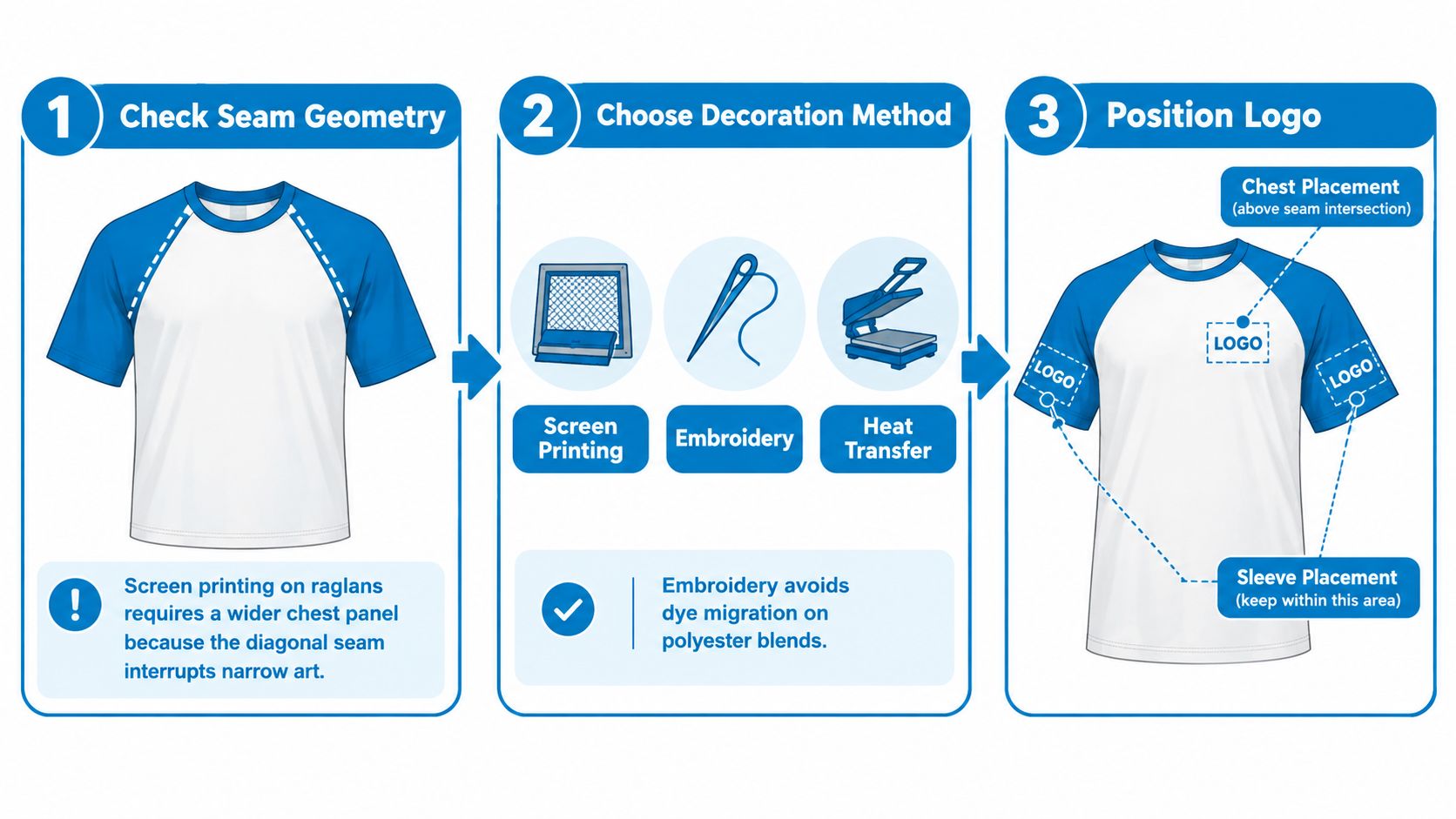
A contrast-sleeve shirt doesn't just change the look of the garment. It changes the safe decoration zones. The seam line tells you where art can live cleanly and where it starts fighting the shirt.
Screen printing
Screen printing likes a stable, flat field. On raglans, the diagonal seam can cut into upper chest space, so narrow art placed too high often looks squeezed. The safer move is to center the design on the body panel and let the seam sit outside the main image.
On set-in colorblock shirts, chest prints are easier as long as the art stays clear of the shoulder break. The seam won't print like fabric. It creates elevation and can affect contact.
DTF and heat-applied options
DTF works well for smaller runs and mixed shirt colors because the transfer can stay consistent even when garment colors vary. It's also useful when buyers need flexibility across multiple shirt combinations in one order.
But placement still matters. A transfer that bridges a bulky seam can feel uneven and may not look as clean on-wear as it does on a flat proof.
Embroidery and patches
Embroidery solves one problem and introduces another. It doesn't depend on ink opacity the same way printing does, and it isn't affected by color bleed in the same visual way. But needlework over a seam needs backing support, especially on colorblock joins where seam allowance creates extra thickness.
A left chest logo usually behaves best when it sits fully on one panel. If the logo lands across the seam, the stitch path can look distorted.
For placement basics, this embroidery placement guide is a practical reference when you're marking up a proof. Buyers who want more visual examples across shirt styles can also browse the B-Sew Inn shirt decorating guide for idea generation before finalizing placement.
Sublimation and special cases
Sublimation is a strong fit for polyester-rich garments, especially when the buyer wants decoration built into the garment color story. It's less useful on cotton-dominant pieces. If the shirt mixes fiber types across body and sleeve, the method may behave differently across zones.
One production option some buyers consider is Dirt Cheap Product, Inc., which offers screen printing, embroidery, DTF, sublimation, and custom patches across different apparel types. That matters here because contrast-sleeve garments often need the decoration method chosen around the seam layout, not after it.
Put the logo where the shirt is calm. If the seam, stretch, or panel join is doing too much, move the art.
Ordering Contrast Sleeve Shirts Without Surprises
The problems that cost time on contrast-sleeve orders are usually visible before production. Buyers just need to ask the right questions early enough.
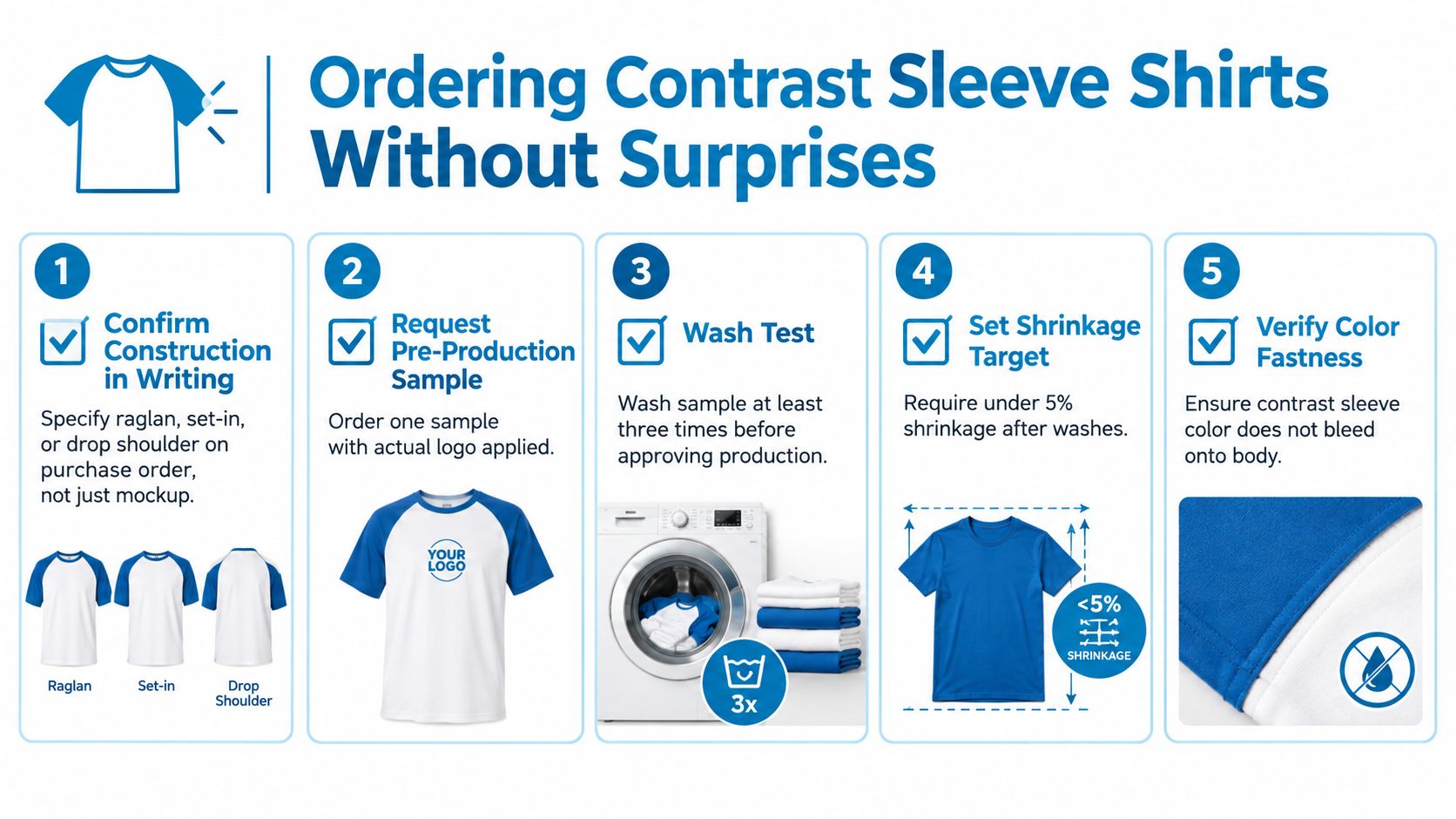
Start with the written garment description. “Two-tone tee” isn't specific enough. You want the purchase order, proof, or sample approval to state the actual construction. Raglan and set-in colorblock can share the same color story but print differently and fit differently.
What to lock before approval
A clean approval process usually includes these checkpoints:
- Construction name in writing: Raglan, set-in colorblock, or trim style should appear on the order.
- Actual decorated sample: A blank isn't enough if your logo sits near a seam.
- Wash review: Test the sample after repeated home laundering before approving the run.
- Color reference: Keep mill color names, vendor codes, and any batch details with the order file.
- Panel review: Confirm the body and sleeve fabrics are meant to work together, not just look good together.
The sample check matters most. A digital proof can show placement, but it can't show how a seam rises under embroidery, how a transfer sits over a join, or whether one panel starts to torque after washing.
This video gives a useful visual checklist mindset before full production:
The shrinkage target in this brief needs caution
You may hear people ask for under 5% shrinkage after washing. That can be used as an internal buying threshold, but for contrast garments, the more useful comparison is whether both panels shrink in a matched way. Earlier QA references in this article point to a practical baseline of about ±3% for basic tees when dimensional stability is being watched closely.
That's why one simple pass/fail number doesn't tell the whole story. A shirt can technically stay under a broad shrinkage cap and still end up with sleeve-body distortion if the panels move differently.
Questions worth putting on the PO
- Is the sleeve/body contrast achieved by raglan, set-in, or trim?
- Will my logo sit fully on one panel?
- Has the exact decorated sample been wash-checked?
- Are the reorder colors tied to supplier records, not just visual names?
- Is the garment stock-based or cut-and-sew?
Those five questions catch most of the expensive surprises before they happen.
Bringing It All Together and Next Steps
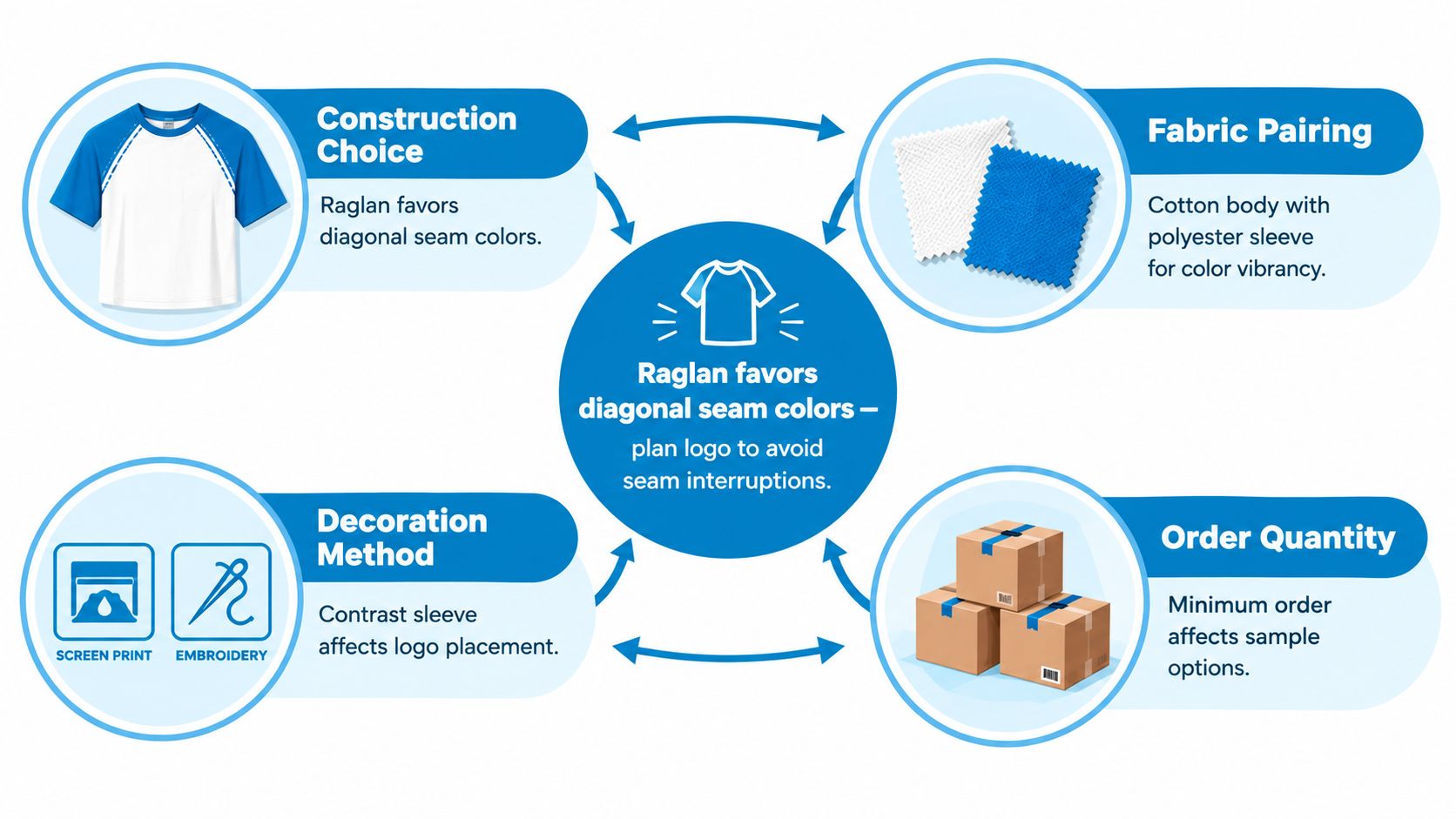
The easiest way to buy shirts with different color sleeves is to make four decisions in order. Pick the construction, confirm the fabric pairing, choose the decoration method, and then approve the order setup for reorders and QA.
Each choice affects the next one. A raglan changes the chest print field. A set-in colorblock raises the importance of panel alignment. A trim style keeps things simpler but gives you less visual contrast. Fabric choice then decides how much heat, wash stress, and dye risk the shirt can handle. After that, decoration becomes a placement problem, not just a branding problem.
A simple final filter
Use this short filter before you release any order:
- Construction fit: Does the seam layout match the look you want and the logo area you need?
- Fabric compatibility: Will the sleeve and body behave similarly enough after washing?
- Decoration match: Is the chosen method suited to the panel shape and seam height?
- Repeatability: Can the supplier reproduce the same sleeve/body relationship on the next run?
One naming detail is worth keeping in mind too. Style references often blur raglan, baseball tee, contrast sleeve, and colorblock, which leaves buyers unsure what they're ordering. Some fashion coverage points out that raglan specifically means the diagonal seam from underarm to collarbone, while “contrast sleeves” may describe only the visual effect. That buying confusion is part of why tagging both the construction type and the look helps product discovery and reorder accuracy, as noted in this discussion of contrast sleeves, raglan naming, and current styling directions.
Bring your artwork files, mark the intended logo area on a garment diagram, and ask for both a digital proof and a physical decorated sample when the order matters. That's the point where a nice mockup becomes a shirt you can trust.
Dirt Cheap Product, Inc. decorates apparel with screen printing, embroidery, DTF, sublimation, and custom patches, so buyers ordering shirts with different color sleeves can match the decoration method to the garment construction before production starts. If you need help reviewing seam layout, logo placement, or proof details on a contrast-sleeve order, visit Dirt Cheap Product, Inc..