A true vector conversion is rarely a one-click job. Even with modern tracing tools, producing a print-ready file usually requires manual node cleanup, especially when the source is a low-quality raster image.
You may be holding the only logo file your business has, a small JPEG pulled from an old website or a blurry PNG saved from a social media post. The printer asks for an AI, EPS, PDF, or SVG file, and the online converter promises an instant result. You upload the image, download the vector, and assume the problem is solved. Then the first shirt, hat, patch, or sign reveals jagged curves, hidden background shapes, substituted lettering, or details too small to reproduce.
The practical question isn't how to convert to vector. It's whether the converted artwork will survive screen printing, embroidery, signage, or another physical production process. The strongest workflow treats automated tracing as a starting point, not a finished redraw.
Table of Contents
- Understanding the Raster and Vector Divide
- Choosing the Right Conversion Method for Your Project
- Cleaning and Simplifying Vector Paths
- Managing Colors and Converting Text to Outlines
- Selecting the Optimal Export Format for Production
- Delivering Files to Printers and Embroiderers
- Common Pitfalls and Quality Control Checks
Understanding the Raster and Vector Divide
A business owner often discovers the raster problem at the worst possible time. The logo looks acceptable in an email or on a phone screen, but the enlarged version sent to a printer shows stair-stepped curves and soft edges. A raster image is built from pixels, so enlarging it beyond its native resolution exposes the grid that originally formed the artwork. Raster images lose visible quality when enlarged, while vector graphics remain resolution-independent.
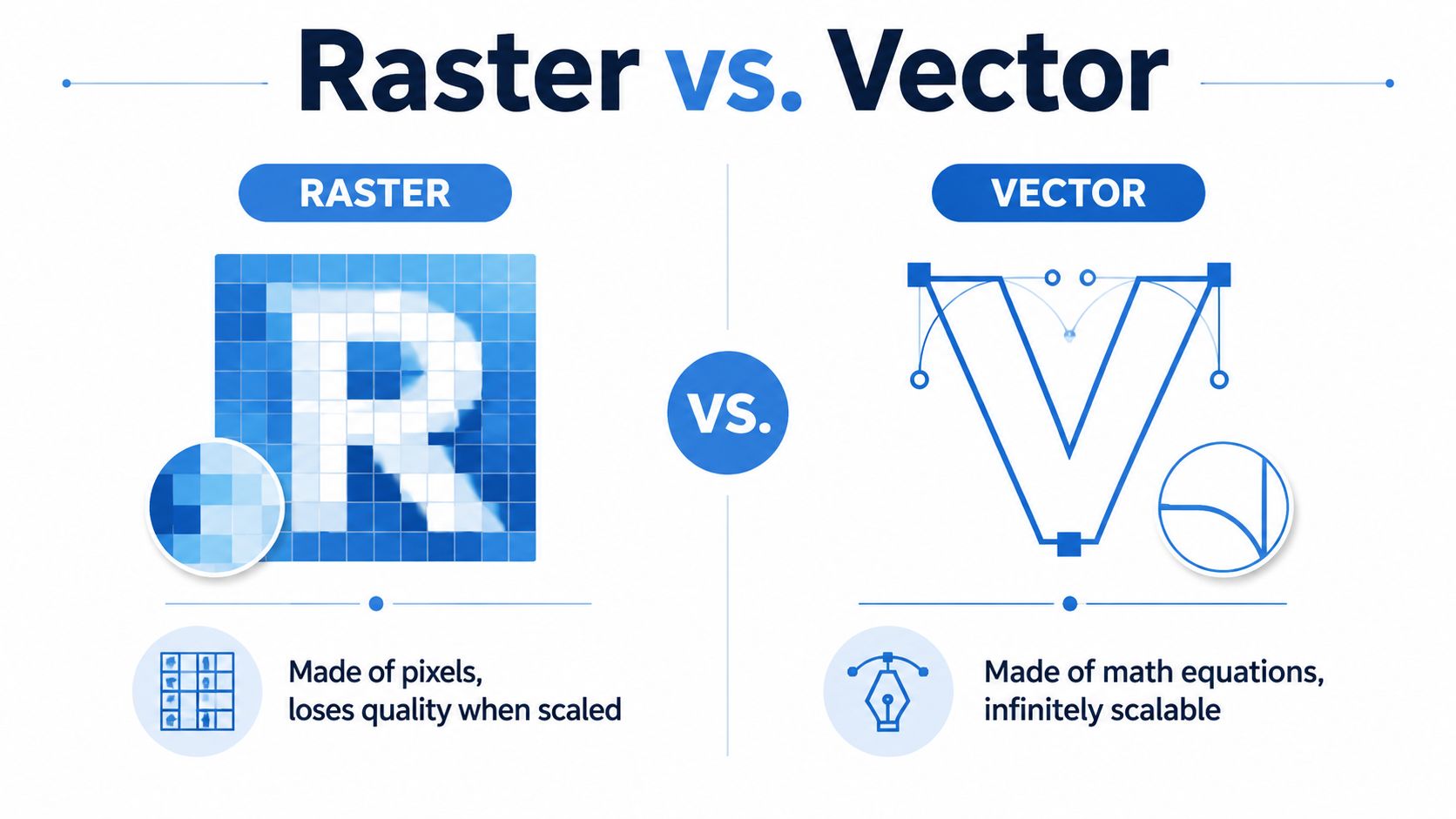
A vector file describes artwork with mathematical coordinates, paths, curves, and shapes. That geometry lets the same logo stay sharp on a small garment decoration or a large sign. It also gives a production artist something editable. Nodes can be moved, shapes can be joined, colors can be separated, and text can be converted into outlines instead of depending on a particular font installation.
Why the distinction affects production
Suppose a dark emblem contains three flat colors and a line of lettering. A trace engine may reproduce the broad silhouette effectively, yet interpret anti-aliased edges as extra color or create many small points around the letters. Screen printing may need clean color separations. Embroidery needs shapes that can be translated into stitch paths. A vector container alone doesn't guarantee either result.
A useful history explains why this distinction matters. Vector graphics trace back to Ivan Sutherland's Sketchpad at MIT in 1963, while Adobe Illustrator 1.0 arrived on March 19, 1987, and CorelDRAW followed in 1989. SVG development began with the World Wide Web Consortium in 1998 and became a W3C Recommendation by 2001, helping make resolution-independent graphics practical across the web. A history of vector graphics and conversion workflows shows how the field moved from editable on-screen geometry to everyday design production.
For hands-on Illustrator work, this guide to making logos in Illustrator can help you understand the difference between placing an image and constructing editable artwork. That distinction is the foundation of a file that can be revised later.
Choosing the Right Conversion Method for Your Project
The right method depends on the source, the artwork's complexity, and the tolerance for imperfection. A simple, high-contrast mark may trace cleanly. A detailed logo with lettering, shadows, texture, or overlapping shapes may need a redraw even when the automatic preview looks convincing.
| Method | Where it works well | Main trade-off |
|---|---|---|
| Adobe Illustrator Image Trace | Brand assets needing adjustable tracing controls | Powerful, but the result still needs inspection and cleanup |
| Inkscape Trace Bitmap | Budget-conscious or Linux-based workflows | Capable free option, with more hands-on refinement |
| Manual Pen Tool redraw | Critical logos and geometric marks | Slowest approach, but gives the strongest control |
| Online converters | Quick previews and simple artwork | Fast output can sacrifice path quality and editability |
Adobe Illustrator Image Trace is useful when you need control over thresholds, palette simplification, and the balance between detail and manageable paths. Adobe's tracing lineage includes Streamline, introduced in 1989 to convert bit-mapped images into PostScript artwork, followed by Live Trace in Illustrator CS2 and a substantially revised tracing engine by Illustrator CS6. The Illustrator CS6 tracing history helps explain why tracing became a standard part of production graphics.
Inkscape Trace Bitmap offers a practical alternative for someone who doesn't use Illustrator. It can produce workable vector paths, but free software doesn't eliminate the need to examine nodes, close gaps, remove background remnants, and simplify shapes.
Manual redraw remains the dependable choice for a trademark-style logo, custom lettering, or artwork that must look exact. Use the raster image as a visual reference, then rebuild curves with as few intentional nodes as possible. Retyping text with the correct typeface is often more accurate than tracing letter edges.
Online converters can be useful for testing whether a simple image is traceable. They shouldn't be treated as proof that the result is production-safe. A converter may preserve the appearance at normal zoom while producing an awkward structure that becomes difficult to edit or unreliable in decoration software.
Production rule: Choose the method based on the final use, not on the fastest upload screen.
Cleaning and Simplifying Vector Paths
The raw trace is where production work starts. Open the file at a useful zoom level and inspect the silhouette, interior cutouts, corners, and lettering. If the source contains compression halos or soft anti-aliasing, the software may create jagged boundaries and excessive anchor points. Logo vectorization guidance recommends beginning with a clean source, preferably a transparent PNG, and using manual correction after AI tracing.
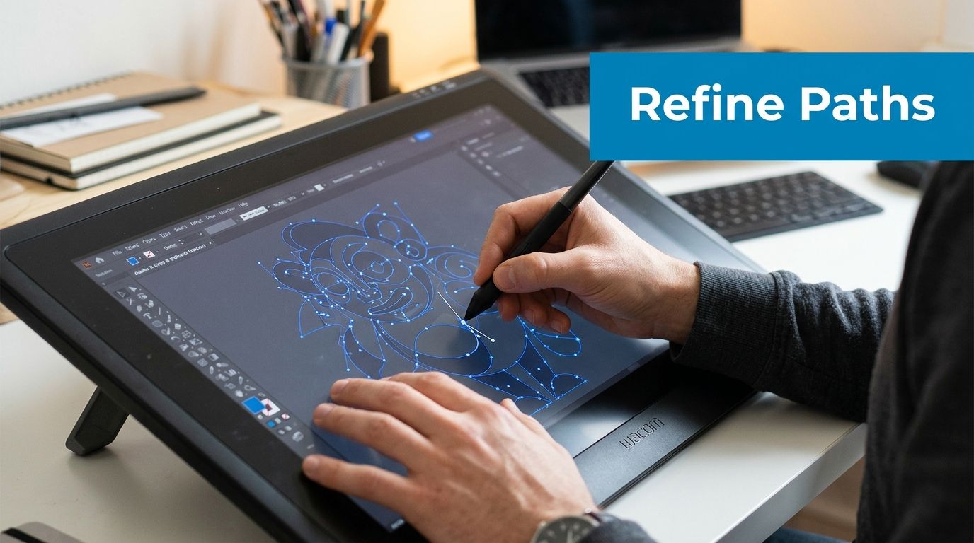
Start with the Direct Selection tool. Click individual nodes and remove points that don't control a meaningful change in direction. Too many points make curves lumpy, increase file complexity, and give later edits more opportunities to distort the shape. Keep points at purposeful locations, such as an apex, a transition between straight and curved edges, or a deliberate corner.
A practical cleanup sequence
Delete stray objects. Turn off or remove the traced background, isolated specks, and fragments outside the intended artwork. A hidden white rectangle can cover garment colors or create an unwanted box around a logo.
Correct open paths. Zoom into line ends and enclosed shapes. Close paths where a solid area should be continuous, and check that holes in letters or emblems remain intentional.
Merge overlapping shapes. Use Pathfinder or Shape Builder to combine areas that should print as one object. Overlaps can create doubled edges, unexpected color gaps, or confusing stitch boundaries.
Simplify carefully. Reduce unnecessary nodes while watching the original silhouette. Simplification should remove noise, not flatten a curve that gives the mark its identity.
Inspect at production scale. A logo can look elegant on a large monitor and fail when reduced for a small decoration. Check thin strokes, tight counters, narrow gaps, and small lettering before exporting.
The cleanup stage also exposes a key difference between tracing and redrawing. Automated conversion approximates the visible raster boundary. A professional redraw interprets the intended design and reconstructs it with cleaner geometry. Community guidance on high-accuracy image tracing emphasizes that complex logos and text often need manual cleanup or complete redrawing rather than blind reliance on a trace.
Use the following video as a visual reference for editing vector paths, but judge every result against the actual production method and decoration size.
Managing Colors and Converting Text to Outlines
Color and typography can fail even when the paths look clean. A missing font may be replaced when another computer opens the file, changing letter widths, spacing, and the overall balance of the logo. Convert finished text to outlines so each character becomes a vector shape. In Illustrator, duplicate the editable text first, then select the production copy and use Type > Create Outlines. Keep the duplicate in a clearly labeled working file, not in the delivery artwork.
Color requires the same discipline. A photograph or web graphic may contain blended tones that don't translate directly to spot-color screen printing or thread selections. For a production file, identify the intended brand colors, remove accidental shades caused by compression, and separate distinct color fields into organized shapes. Don't rely on a screenshot or an uncalibrated monitor to define the final result.
Preparing a usable color structure
- Name the palette: Use clear swatch names so a printer can identify the intended colors without guessing.
- Separate visible areas: Keep each spot-color region editable and avoid unnecessary overlaps.
- Handle gradients deliberately: Decide whether the production method supports the gradient or whether it should become discrete color fields.
- Review transparency: Remove unintended opacity and blending effects that may render differently in production software.
- Preserve a working version: Keep editable colors and text before creating the outlined delivery copy.
For print color workflows, this RGB to CMYK conversion guide provides a useful reference for managing document color profiles. Embroidery introduces another constraint. A digitizer may need to interpret the artwork as stitchable regions, so tiny color transitions, narrow details, and complex shading may require a simplified version rather than a literal reproduction.
The final file should make the intended hierarchy obvious. A production partner should be able to identify the background, logo shapes, lettering, and color groups without reverse-engineering a pile of clipped masks and hidden objects.
Selecting the Optimal Export Format for Production
Export only after the artwork has passed a visual and structural inspection. A vector format can preserve paths, but each format serves a different handoff. SVG is an open, text-based standard suited to web graphics and some digital workflows. AI and EPS are commonly used as editable masters for print and sign work, while PDF can contain vector paths, raster images, fonts, and color profiles in one portable container. This vector format reference outlines the practical roles of SVG, EPS, AI, and PDF.
Match the file to the partner
| Recipient or use | Practical delivery |
|---|---|
| Web or browser-based use | SVG |
| Sign maker or print designer needing edits | AI or EPS |
| Commercial printer requesting a portable proof | |
| Embroidery digitizer | Clean AI, EPS, PDF, or SVG, plus production notes |
For a screen printer, send an editable master when possible, along with a PDF proof that shows the intended appearance. Ask whether the shop prefers spot colors, a specific color mode, or separated artwork. For an embroiderer, the vector is a starting reference rather than a stitch file. The digitizer will convert shapes into stitches, set stitch direction, account for fabric behavior, and determine which details can survive the selected decoration size.
PDF is convenient, but don't assume every PDF is equally useful. A PDF exported from a flattened raster image may have a PDF extension without containing editable vector paths. Open the file, zoom in, and confirm that curves remain crisp and selectable before sending it.
If your artwork will be used on a large circular surface, such as an instrument graphic, review these stage-ready kick drum head tips for practical preparation considerations. The broader lesson applies to any unusual production surface: confirm dimensions, placement, bleed or safe areas, and the partner's preferred file setup before final export.
Delivering Files to Printers and Embroiderers
A production partner needs more than a file that opens. Send the clean vector, a clearly labeled proof, the intended decoration method, the placement, the finished size, and any color instructions. If the logo includes a raster texture or photograph, either provide a suitable high-resolution source or explain that the element isn't vector artwork. For logo and emblem work, vectorization guidance recommends 300 DPI as a minimum source resolution and 600 DPI as preferred for emblems.
Your delivery checklist
- Use a clean source: Transparent PNG is generally preferable to JPEG because JPEG compression can create halos around edges.
- Outline production text: Make sure the delivery copy doesn't depend on installed fonts.
- State the decoration: Tell the shop whether you want screen printing, embroidery, DTF, sublimation, or patches.
- Confirm size and placement: A chest print, sleeve mark, hat front, and patch may need different simplification.
- Attach a proof: Include a visual reference showing the expected colors and arrangement.
- Keep the master: Archive the editable AI or EPS separately from the outlined delivery copy.
Screen printing benefits from clear separations and intentional spot colors. Embroidery needs shapes that can be translated into stitches without tiny islands, overly narrow gaps, or fragile outlines. The same logo may therefore require a simplified embroidery version and a more detailed print version. That isn't a failure of the conversion. It's normal production adaptation.
For businesses preparing a logo for stitching, this guide to digitizing logos for embroidery provides relevant preparation context. A clean vector gives the digitizer a stronger foundation, but it doesn't replace a stitch test or a production conversation.
Common Pitfalls and Quality Control Checks
An online converter can produce an SVG quickly, but speed doesn't establish accuracy. Low-contrast artwork, noisy backgrounds, compression artifacts, and soft edges can force the trace engine to build excess nodes and jagged boundaries. Practical raster-to-vector guidance recommends auditing the source first, then cleaning nodes, closing paths, removing overlaps, and checking the exported formats.
A second misconception is that a vector extension guarantees a true redraw. A traced JPEG may technically contain paths while still carrying the visual defects of the source. Text may be outlined incorrectly, color separations may be accidental, and hidden objects may remain embedded in the file.
Final inspection before submission
- Zoom into curves: Look for lumps, stair-step edges, and unnecessary points.
- Check lettering: Confirm that text is outlined and that counters remain open.
- Hide the background: Verify that no unintended rectangle or white field is included.
- Review overlaps: Make sure stacked shapes won't create doubled edges or unwanted gaps.
- Test color groups: Confirm that each production color is intentional and identifiable.
- Inspect at finished size: Check whether fine details, small text, and narrow gaps are realistic for the garment or product.
- Open the export: Test the actual AI, EPS, PDF, or SVG copy you plan to send.
Quality-control standard: If you can't explain what every visible shape does, the file isn't ready for production.
Dirt Cheap Product, Inc. works with custom apparel and promotional decoration, including screen printing, embroidery, DTF, sublimation, and patches. Its team can review supplied artwork, provide proofs for color, placement, and stitching detail, and help prepare a logo for the selected product workflow.
Before sending artwork to production, compare the file against the finished item, not just the screen preview. Visit Dirt Cheap Product, Inc. to submit your logo, review custom apparel and promotional options, and get practical support for turning cleaned vector artwork into production-ready branded products.