You approve the artwork on screen. The blue looks crisp, the green pops, and the gradient feels smooth. Then the shirts arrive, and the print looks flatter than the proof you signed off on.
That gap frustrates a lot of businesses because it feels like a production mistake. Most of the time, it isn't. It's a color workflow problem. In apparel decoration, RGB to CMYK conversion is where many avoidable surprises begin.
The old advice says to convert everything to CMYK before sending it to print. That advice is outdated for a lot of apparel jobs. Modern decoration workflows often produce better results when the artwork stays in RGB until prepress, especially when the printer is working with specific equipment, inks, and garment types.
Table of Contents
- Why Your Bright Design Looks Dull on a T-Shirt
- Understanding the RGB and CMYK Color Worlds
- When Not to Convert Your Files to CMYK
- How to Convert to CMYK in Your Design Software
- Avoiding Color Disasters in Apparel Decoration
- Your Final Artwork Prepress Checklist
Why Your Bright Design Looks Dull on a T-Shirt
A common scenario goes like this. A company signs off on a bold chest print with bright reds, strong blues, and a clean digital mockup. The print arrives on cotton tees, and the result looks softer, darker, or just less alive than it did on the monitor.
That outcome usually isn't random. Color shift is a common consequence of RGB to CMYK conversion, affecting up to 30 to 40% of color-rich designs in commercial print production when no color management profile is applied, according to Want Stickers' explanation of print color shift.

The screen approved one version of the color
Your monitor builds color with light. The shirt gets decorated with ink, transfer, toner, dye, or thread on a physical surface. Those are different systems with different limits.
A bright blue hoodie mockup can look electric on screen and still print acceptably on one garment while looking muted on another. The fabric color, the decoration method, and the production profile all matter. Even garment selection affects the visual result, which is one reason teams spend time reviewing hoodie color options before production.
Practical rule: If the artwork contains vivid blues, greens, or magentas, don't assume the printed garment can match what the monitor shows.
Apparel makes the problem more obvious
Paper print buyers run into color issues, but apparel buyers feel them faster. A shirt is wearable branding. If the logo looks off, the whole item feels off.
On garments, color can lose impact for simple reasons:
- Fabric interference: Dark shirts, textured fleece, and heather blends all change how ink appears.
- Decoration method limits: Screen printing, DTF, and sublimation don't interpret the same art the same way.
- Early conversion errors: Designers often flatten the file into a generic CMYK version before anyone has matched it to the actual production setup.
The fix isn't hitting one convert button and hoping for the best. The fix is using the right workflow from the start.
Understanding the RGB and CMYK Color Worlds
The easiest way to understand RGB to CMYK conversion is to stop thinking about software first and think about physics.
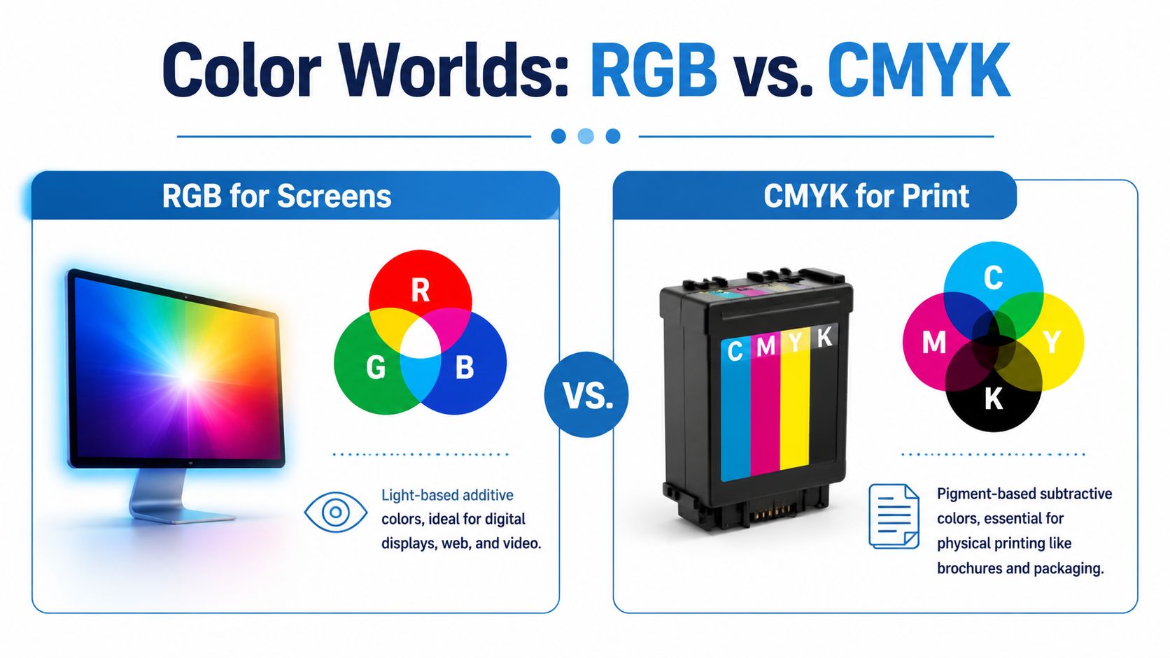
RGB stands for red, green, and blue. Screens use these channels as light. Add more light and the image gets brighter. That makes RGB ideal for monitors, phones, websites, and digital proofs.
CMYK stands for cyan, magenta, yellow, and black. Printing uses these channels as ink or pigment. Ink absorbs light instead of emitting it, so the color system works in the opposite way.
RGB is the bigger box
The most important concept is gamut, which means the range of colors a system can reproduce.
The CMYK color space contains a significantly narrower gamut than RGB, with CMYK capable of reproducing only approximately 5,000 to 7,000 distinct colors while RGB can represent over 16 million, as noted in this discussion of what is lost during conversion.
Think of RGB as a large box and CMYK as a smaller box. When you move artwork from the large box into the smaller one, some colors don't fit. The software has to replace them with the nearest printable version.
That is why electric blue, bright green, and intense magenta are regular troublemakers.
Why a formula doesn't solve the real problem
Many beginner guides reduce the issue to a formula. In real production, that isn't enough.
RGB values can be expressed on a 0 to 255 scale for each channel. CMYK is usually handled as percentages from 0% to 100% per channel in print workflows. Generic conversion math may normalize RGB first and then calculate cyan, magenta, yellow, and black. But that still doesn't answer the practical question: which press, which material, and which output profile is being targeted?
A monitor color isn't a print instruction. It's a starting point.
A pure on-screen red can convert one way in one profile and differently in another. That difference matters when you're trying to hold a brand color across tees, polos, hats, and synthetic performance wear.
Why apparel decorators care about profiles
In apparel, the substrate changes everything. Cotton absorbs and displays color differently from polyester. A smooth white performance shirt behaves differently from a dark ring-spun tee with an underbase. A cap front doesn't respond like a flat transfer panel.
That is why experienced prepress teams don't rely on a universal RGB to CMYK conversion formula. They rely on profiles, proofs, and production knowledge.
When Not to Convert Your Files to CMYK
The old habit is simple. Build the design, convert it to CMYK, export the final file, and send it out. That used to sound safe because it felt more "print ready."
For a lot of apparel work, it isn't the best move anymore.
Expert consensus reveals that the most effective practice for high-quality apparel branding is to leave in RGB and have the printer perform conversion, as early conversion by the designer can cause colors to look flat and limits the printer's ability to optimize vibrancy for the specific material, according to Printing for Less on RGB and CMYK.
Early conversion throws away options
When a designer converts too soon, the file loses color information before production even begins. That matters because the printer often has better information than the designer does at that stage.
The printer knows:
- The equipment in use: A screen print setup, a DTF workflow, and a sublimation press don't target color the same way.
- The garment surface: Cotton, polyester, bags, and outerwear all respond differently.
- The production profile: The RIP or prepress system may be tuned to a specific machine and stock.
If you flatten your art into a generic CMYK file early, the printer has less room to optimize the result.
RGB is often the safer master file
The most practical working method is straightforward. Build and keep your master art in RGB. Save the editable version in a production-friendly format such as PSD or TIFF. Export according to the printer's instructions only when you're ready to hand off final art.
That approach keeps the original file flexible. It also protects you if the same logo or design later has to move from a shirt to a tote, a hat patch, or a polyester promo item.
When the leave-it-in-RGB approach helps most
This workflow is especially useful when the design depends on vivid color, smooth blends, or photographic detail.
Jobs that often benefit:
- Sublimation graphics: Polyester decoration can hold bright color differently from traditional process printing.
- DTF artwork: The RIP may handle the final conversion better than a designer's default export settings.
- Multi-use brand assets: One logo may need to move across several garment and accessory categories.
If the print partner has a managed workflow, sending RGB artwork usually preserves more flexibility than pre-converting on your own.
There are exceptions. Some vendors will specifically request CMYK files or spot-color builds for their process. In that case, follow the production spec. But if no one has asked for a CMYK conversion yet, don't assume it's your job to do it first.
How to Convert to CMYK in Your Design Software
A designer sends over a bright athletic graphic that looked sharp on screen, then converts it to CMYK with a quick mode change because it feels like the safe print step. By the time the file reaches production, the blues are flatter, the orange has lost punch, and nobody is sure whether the problem came from the art or the print method. That is why CMYK conversion should be deliberate, and why apparel shops often prefer that you leave the master file in RGB until a specific production requirement says otherwise.
Sometimes a printer will require a CMYK file. If that happens, convert with the output profile they specify, not with a generic shortcut from your software.
Start with the printer requirement
Ask the printer one question before you touch the file. Which CMYK profile should I use for this job?
That answer matters more in apparel than many designers expect. A file prepared for a paper print standard is not automatically right for a shirt graphic, transfer, or soft signage job. Different workflows handle color differently, and your print partner may want to do the final conversion inside their RIP so they can control ink limits, black generation, and garment-specific output.
If the vendor gives you a profile, use it. If they ask for RGB, keep it RGB. If they ask for CMYK but cannot name the profile, ask again before converting.
If you are still cleaning up source files, tighten that up first. Weak vector files create print problems long before color conversion does, especially with recreated logos and inconsistent swatches. Teams that need cleaner artwork often revisit the basics of making logos in Illustrator.
Use Convert To Profile instead of a quick mode switch
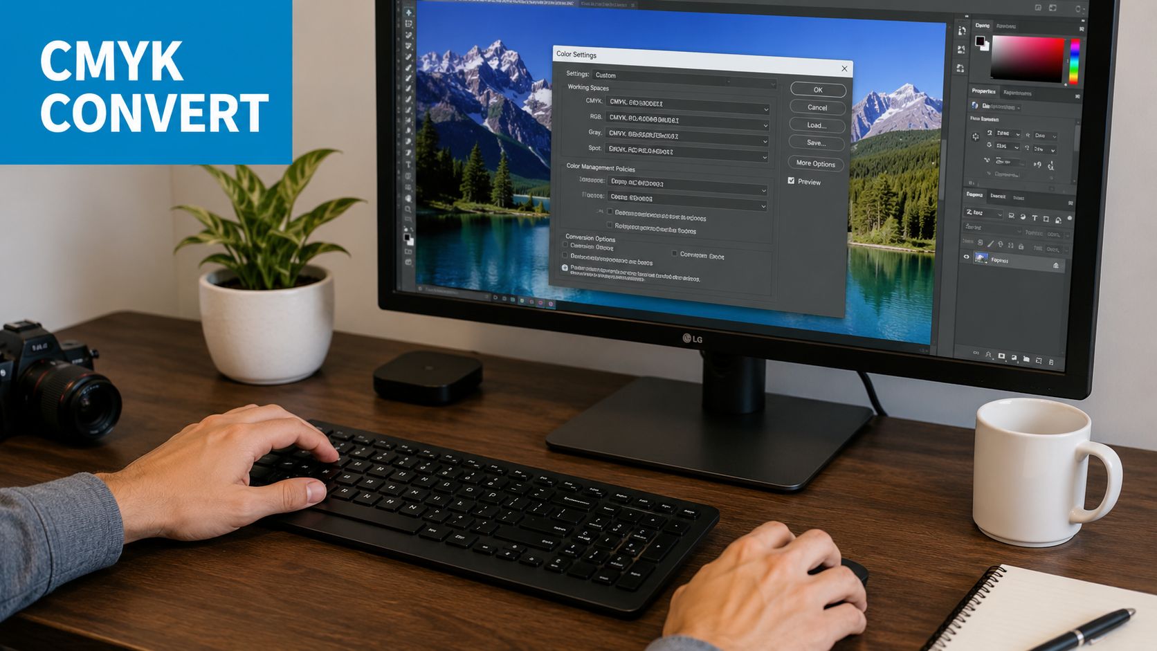
In Photoshop, use Edit > Convert To Profile. Do not rely on Image Mode > CMYK Color as your main production method unless the printer specifically tells you that their workflow is set up for it.
A practical Photoshop process looks like this:
Save an RGB master first
Keep the editable original untouched. That file is still the better master for future apparel uses.Open Edit > Convert To Profile
This gives you control over the destination profile and conversion settings.Choose the target CMYK profile
Use the printer's supplied profile whenever possible.Set the conversion options deliberately
Adobe ACE is a common choice in Adobe workflows. Relative Colorimetric is often a solid starting point for logos and graphics with defined brand colors, while Perceptual can be worth testing on photographic art or smooth blends.Review the file at full size and on dark and light backgrounds
Apparel art rarely lives on a plain white page. A design can feel balanced in the file and still print heavy on a black tee or lose contrast on heather fabric.Export only the version you need for that job
Keep the RGB source. Send the CMYK copy only when production has confirmed that requirement.
If your team wants a second checklist to ensure your artwork is print-ready, use that before final export and handoff.
Check the result before export
Conversion is only half the job. The review after conversion is where expensive mistakes get caught.
Watch for:
- Muted bright colors: Electric blues, greens, and oranges are usually the first to lose energy.
- Mud in dark areas: Heavy CMYK builds can make shadows look dirty, especially in detailed art.
- Broken gradients: Smooth blends can band or shift once the color space changes.
- Weak contrast on garments: A file may still look acceptable on screen but lose separation once printed on a colored shirt.
- Changed blacks: Text, outlines, and fills may convert into a mixed black when you really needed a cleaner build.
For teams that want a visual walk-through before touching live files, this demo is useful:
What to do in Illustrator and Affinity Designer
The same rule applies in Illustrator and Affinity Designer. Convert by profile, not by habit.
Keep the editable file in RGB unless the production spec says otherwise. Then create a separate CMYK version for that order, using the target profile the decorator or printer requested. That keeps revisions simpler and avoids baking an early color compromise into every future use of the design.
For apparel, that distinction matters. A graphic headed to screen print may need spot-color planning instead of CMYK process builds. A graphic headed to sublimation or DTF often benefits from staying in RGB until the print provider handles the final output conversion inside a managed workflow.
Convert late. Convert with the right profile. Keep the RGB master. That is the safer production habit.
Avoiding Color Disasters in Apparel Decoration
A design can look electric on a monitor, pass an internal review, then arrive on press and lose the exact quality that sold it. That happens every day in apparel because the artwork is only one part of the result. Garment color, fabric, ink behavior, transfer method, and press setup all change how color reads.
The fix is not blind CMYK conversion. For many apparel jobs, the safer workflow is to keep the master file in RGB and build the production version around the decoration method.
Screen printing needs color decisions early
Screen printing has the least room for vague color planning. If the art will run as spot colors, decide that before separations begin. If a brand color matters, call it out early. If a gradient is too subtle to survive mesh, underbase, and fabric texture, simplify it before it becomes a press problem.
Production conversations at this stage save time. They also prevent expensive redraws, re-separated files, and approvals based on a mockup that never matched the print method.
DTF and sublimation behave differently
DTF handles detailed full-color art well, but the print still depends on the RIP, the transfer build, and the shirt color underneath. A file that feels balanced on screen can print heavier once white ink and garment contrast enter the equation.
Sublimation is different again. It performs best on polyester and rewards bright, high-gamut artwork. That is one of the clearest cases for an RGB-first workflow. For sublimated jerseys, performance wear, and team apparel, keeping artwork in RGB longer usually preserves more color potential and gives the decorator more useful data than an early CMYK conversion.
Black ink and gradients need extra care
Black causes problems fast in apparel art. Small text needs clean edges. Large black fills need enough depth to look intentional, not muddy. The wrong build can make shadows look dirty or flatten detail, especially on dark garments or textured fabrics.
Gradients deserve the same skepticism. They may look smooth on screen and still break apart in production. Fabric texture, underbase choices, and ink limits all affect whether a fade stays smooth or turns into visible steps.
A practical review before approval should include:
- Garment color: White, ash, heather, and black shift contrast and color appearance in different ways.
- Fabric content: Cotton and polyester do not take decoration the same way.
- Decoration method: Screen print, DTF, sublimation, and embroidery each translate artwork differently.
- Proof realism: A digital mockup helps with layout, but it does not replace a production-minded proof.
For teams ordering branded uniforms or merch, it helps to understand the print method before approving artwork. This overview of how to print a design on a shirt gives non-designers enough context to ask better prepress questions.
The same RGB file can produce very different printed results depending on the substrate, garment, and output profile, as noted earlier. That is exactly why apparel decorators increasingly prefer receiving strong RGB masters instead of flattened, prematurely converted CMYK files.
Your Final Artwork Prepress Checklist
Good color outcomes usually come from boring discipline. The teams that avoid reprints and delays tend to run the same checks every time.
The emerging trend in professional workflows is the shift toward soft proofing with specific ICC profiles in tools like GIMP and Photoshop, rather than applying a static, universal formula, to prevent inaccurate colors, as described in this guide to RGB to CMYK workflow and soft proofing.
What to confirm before you upload files
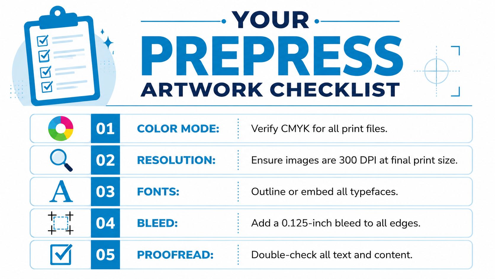
Run this list before handing off final art:
- Confirm the preferred color workflow: Ask whether the printer wants RGB artwork, a converted CMYK file, or spot colors for the job.
- Keep the RGB master: Save the editable original before any conversion.
- Soft proof critical colors: Review brand-sensitive hues against the target profile when one is available.
- Check the method against the product: A polyester sublimation piece should not be prepared the same way as a cotton screen print.
- Review black elements carefully: Large fills, tiny text, and background panels need different treatment.
- Package the file properly: Outline fonts when needed, embed or link images correctly, and export in the format the printer requested.
If your team needs a simple external reference to ensure your artwork is print-ready, use that before final upload. It helps catch basic file-prep problems before they become production delays.
What to ask if the color is critical
Some jobs need more than a standard approval. Ask these before release:
| Check | Why it matters |
|---|---|
| Which profile are you using? | It tells you how the file will actually be interpreted. |
| Should this stay in RGB? | Many apparel jobs print better when the printer handles conversion in prepress. |
| Can you soft proof or provide a realistic proof? | It exposes color loss before the full run starts. |
| Is this method right for the garment? | Decoration method and fabric type can change the final look. |
A clean prepress habit is simple. Keep the original vibrant. Convert only when required. Match the file to the actual production setup, not to a generic assumption about print.
If you need help turning artwork into production-ready apparel, Dirt Cheap Product, Inc. can help with screen printing, DTF, sublimation, embroidery, patches, and branded merchandise support. Upload your logo, get clear guidance on file setup and decoration method, and move into proofing with fewer surprises.