You've got a logo, a deadline, and maybe a box of blank polos or hats sitting nearby. The artwork looks clean on screen, so it's tempting to think the embroidery part should be simple, upload the file, press approve, and wait for finished goods. In production, that's where the first mistakes happen, because a logo that looks sharp in print or on a website can behave very differently once thread, needles, and fabric start moving.
Digitizing Logos for Embroidery is the step where art becomes stitch instructions. That difference matters, because the machine doesn't read a picture, it follows a map of stitch type, direction, density, sequencing, underlay, and compensation for how fabric shifts during sewing LogoUSA's overview of logo digitizing for embroidery. If the map is wrong, the sew-out shows it immediately, even when the original artwork looked perfect.
Table of Contents
- Why Digitizing Logos for Embroidery Is Not Just File Conversion
- How the Embroidery Digitizing Process Works
- Artwork Requirements and File Format Standards
- Size Limits and Placement Considerations for Different Garments
- Understanding the Proof and Sample Process
- Common Embroidery Digitizing Mistakes and How to Avoid Them
- Your Action Plan for Submitting Logos for Embroidery
Why Digitizing Logos for Embroidery Is Not Just File Conversion
A first-time buyer often sends a logo in PNG or PDF form and expects the embroidery shop to “make it work.” The surprise comes later, when tiny details vanish, letter edges thicken, or a clean circle turns into a lopsided shape after stitching. That doesn't happen because the machine is careless, it happens because embroidery is a physical process that needs instructions custom-fit to thread, needle, and fabric behavior.
What the digitizer actually builds
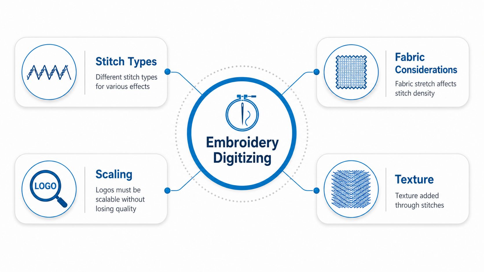
Digitizing is the manual creation of the stitch file the machine will follow. The digitizer decides stitch type, stitch direction, density, sequence, underlay, and how much compensation to add so the final design holds its shape on fabric. A JPG or PDF is artwork, but it isn't machine-readable stitch data, and a vector file still isn't enough by itself because the machine needs instructions, not just outlines.
Practical rule: if the logo can't survive thread width, fabric stretch, and needle motion, it needs more than a format conversion.
Translating a painting into a sewing pattern requires similar decisions. The original art may have gradients, hairline details, and tiny lettering, but the digitizer has to decide what can be represented with thread and what needs to be simplified. That's why embroidery digitizing is a production skill, not an export button.
If you want a broader look at how branded decoration gets planned around thread, placement, and garment type, the custom embroidery workflow on this embroidery collection page shows how digitizing sits at the start of the process. For visual inspiration that's still about logos, it can also help to compare the embroidery conversation with creative logo animation ideas, because both rely on design decisions that survive motion, scale, and context.
Why this matters for reorders
The stitch file becomes the template for repeat production. If the file is built well, the logo can be reproduced consistently across uniforms, hats, bags, and future reorder batches. If it's built loosely, every new garment becomes another round of corrections.
That's why digitizing is the first operational step, not a finishing touch. The file determines how the logo sews, what details survive, and whether the result looks like the brand on every single order.
How the Embroidery Digitizing Process Works
The cleanest way to understand the workflow is to treat it like pattern drafting for thread. A digitizer doesn't merely trace the art, they map how the machine should move across it, where the stitches should start and stop, and how the design should behave on a real garment instead of a flat screen.
From artwork to stitch path
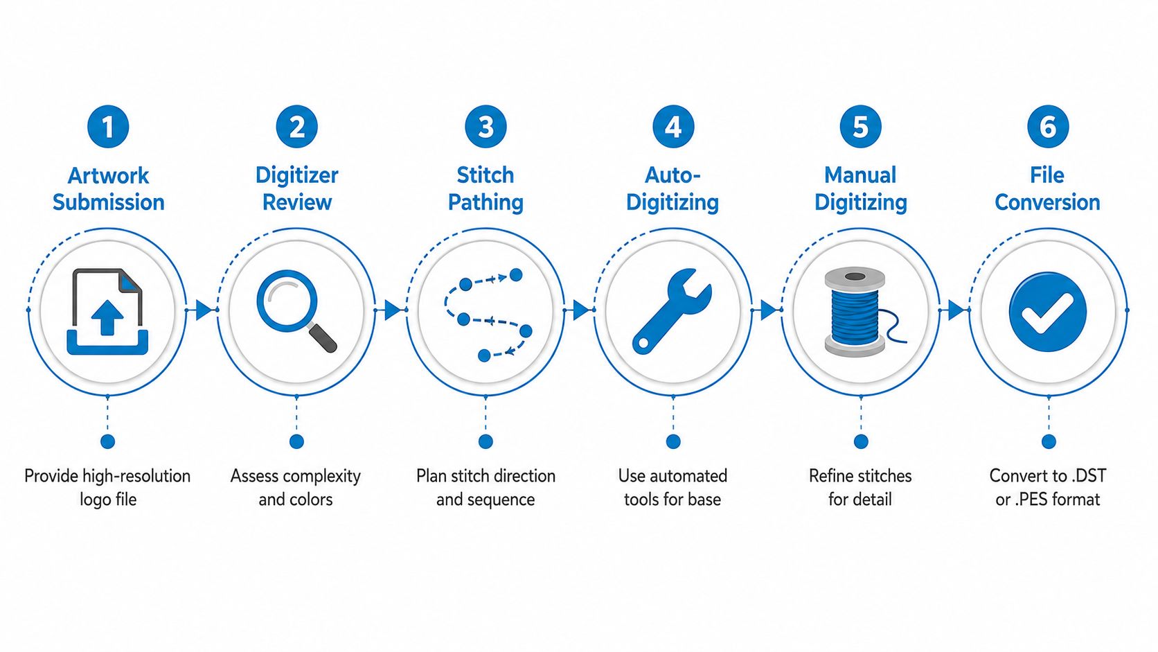
The process begins with artwork review. The digitizer studies shape complexity, color count, text size, and how the logo should be read on the chosen product. From there, stitch paths are planned, usually starting with foundation areas, then moving into details, then borders and finishing elements.
Auto-digitizing tools can help create a base, but they don't replace manual judgment. The final file still needs a human to refine stitch direction, set density, and make sure the sequence doesn't create distortion or unnecessary bulk. That's especially true on small logos, curved panels, and fabrics that move during sewing.
A good way to think about the sequence is to ask, “What should be anchored first so the rest of the design lands cleanly?” The answer changes by logo. A blocky wordmark, a circular badge, and a multi-color mark all need different planning.
The proof of whether the file is production-ready
After the stitch map is built, the file is reviewed and usually test sewn. A test sew-out shows what the design does on actual fabric, not just in software. That matters because thread changes texture, fill areas compress differently than outlines, and garment stretch can expose flaws that weren't obvious on screen.
If you're comparing service providers or just trying to understand what a real production partner handles, how to prepare embroidery files is a useful reference point for what should be ready before digitizing starts. It's the difference between sending a picture and sending a design that can be stitched.
The end result should be a machine embroidery file, such as a .DST or .PES file, ready for production. That file isn't art anymore. It's a sewing blueprint.
Artwork Requirements and File Format Standards
A logo that looks fine on a screen can still fail in thread. The reason is physical, not cosmetic. Stitching needs clear edges, readable shapes, and enough space between elements for the needle to move without crowding. If the source art is muddy, low-resolution, or packed with tiny details, the digitizer has to interpret where one shape ends and the next begins. Those interpretations can lead to extra stitches, rough edges, or details that never reproduce cleanly.
What works best and why
Vector art is the cleanest starting point because it scales without losing quality. That gives the digitizer control over the final embroidery size instead of forcing them to rebuild blurry edges by hand. If the only artwork available is raster based, resolution becomes the deciding factor. 300 DPI is the commonly recommended minimum, and 600 DPI is described as ideal in one industry guide, while 150 DPI is only a bare minimum and usually creates extra interpretive work Bighorn Threads on logo digitizing basics.
A simple comparison helps before anyone sends files to production.
| File Format | Type | Suitability | Notes |
|---|---|---|---|
| AI, EPS, SVG | Vector | High | Best for scaling and precise size setting |
| Vector or raster | Medium to high | Good only if it contains true vector art | |
| PNG | Raster | Medium | Works if resolution is high and edges are clean |
| JPG | Raster | Medium to low | Often brings background and edge issues |
| Low-resolution image | Raster | Low | Creates extra interpretation and cleanup |
What the digitizer builds
The file the digitizer creates is not a direct copy of the artwork. It is a stitch map, built around the limits of thread, needle, and fabric. A circle in a logo may need to be split into segments so it holds its shape, and small text may need to be widened so the letters do not fill in during sewing. That is why clean source art matters so much. It gives the digitizer room to make those production decisions without guessing at the original intent.
What to ask for before you submit
If the logo sits in a designer's file folder, ask for the editable vector version first. If that is not available, ask for the highest-resolution raster file they have. Then check whether small text, hairline rules, or tiny icons are part of the design, because those elements often need simplification before embroidery.
A file can be “finished” for print and still be incomplete for embroidery.
For a practical preflight list, how to prepare embroidery files is a useful reference point. It matches the reality of production, where the digitizer needs clean artwork far more than decorated artwork.
The main point is simple. Good files reduce guesswork. Bad files do more than look worse. They force the embroidery setup to compensate for problems that should have been caught before production.
Size Limits and Placement Considerations for Different Garments
A logo doesn't live in a vacuum. A design that works on a flat polo chest may need a different treatment on a structured hat, and a mark that reads clearly on a jacket back can fall apart on a small sleeve or bag panel. Placement changes how the viewer sees the logo, and garment shape changes how the stitches behave.
The size limits that protect readability
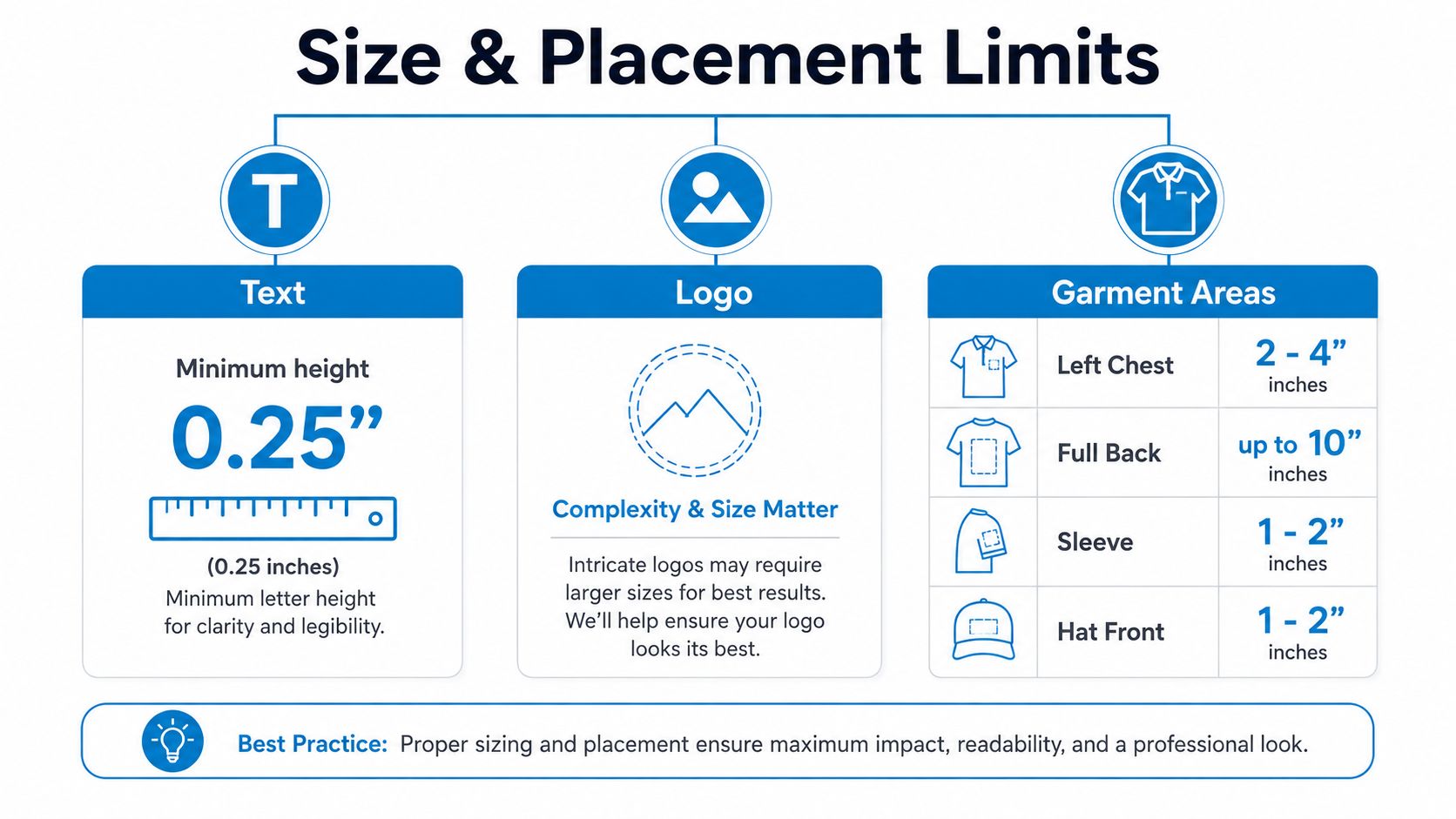
Some limits are physical, not stylistic. For legibility, text in an embroidered logo should be at least 0.25 inches tall, and no element should be thinner than 0.05 inches Maggie Frames on custom logo embroidery techniques. Another guide adds that fine details smaller than about 1.5 to 2 mm are typically not reproducible, and lines thinner than about 2 mm should usually be thickened or removed Conception Logo on preparing a logo for embroidery.
That's why small serif fonts, thin script lettering, and detailed icon outlines often need redesigning. The machine can't obey a line that's too narrow to sew cleanly.
Here's the practical comparison buyers need:
- Flat chest placements: Good for balanced logos, stacked text, and moderate detail.
- Hat fronts: Better for compact marks and bold lettering, because the surface curves and the viewing angle is more direct.
- Bags and side panels: Often need simplified artwork, since seams and folds interrupt the stitch field.
- Sleeves: Usually reward short text or tight icons, not long horizontal designs.
Placement-aware digitizing changes the file
The same logo may need a different stitch plan depending on where it's worn. A left-chest version, a hat version, and a full-back version should not always share identical stitch construction. The view angle matters too, especially on caps, where the front panel curves away from the eye and the design has to read from a different perspective.
Production note: the garment decides as much as the logo does.
The placement chart in the video below is a useful visual aid for thinking about where designs fit best on common apparel surfaces.
The internal placement guide at this embroidery placement page can help compare garment areas before you approve a layout. Once you match the logo to the product, the digitizer can decide whether the mark needs simplification, resizing, or a different stitch approach.
Understanding the Proof and Sample Process
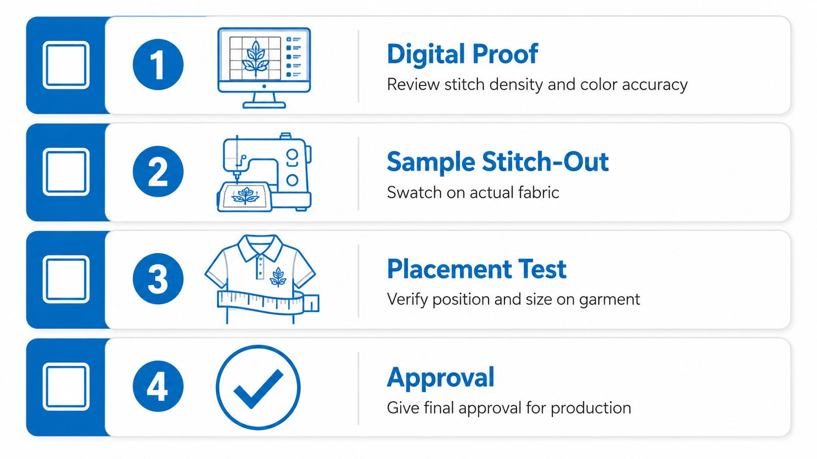
The proof stage is where a careful buyer saves money and a careless buyer spends it twice. A digital proof shows what the stitch file is planning to do, while a physical sample shows how that plan behaves on actual fabric. Those are not the same thing, and both matter.
What to check before approving
Read the proof like someone inspecting a blueprint. Check whether the stitch density looks appropriate for the fabric, whether colors match the intended thread choices, and whether text still looks readable at the final size. If the logo includes fine outlines or stacked lettering, look closely at spacing and proportion, because those details are where embroidery most often drifts from the original art.
The sample stitch-out is even more revealing. It shows whether the fabric puckers, whether the design sits flat, and whether the placement still looks balanced once the garment is on a real body or form. A good sample tells you more in one glance than a dozen screen previews.
What to ask for if something feels off
If the proof looks crowded, small, or overly dense, ask for a revision before production starts. If the sample changes the logo's legibility or makes a shape feel too heavy, ask the digitizer to adjust the file, not the finished garments. Once production begins, corrections cost more time and usually more money.
Approve the stitch behavior, not just the artwork.
That mindset is why the proof stage matters so much for first-time buyers. The question isn't just whether the logo still looks like the logo. It's whether the logo can survive thread, tension, and the exact garment it's meant for.
Common Embroidery Digitizing Mistakes and How to Avoid Them
The most common embroidery mistakes start with a simple assumption, the artwork on screen will survive thread exactly as it is. A logo can look polished in a browser window and still fail on fabric because the machine has to build it with needles, thread tension, and a real garment underneath. That is where first-time buyers usually get surprised.
When simplification beats fidelity
Fine details smaller than about 1.5 to 2 mm are usually too small to reproduce cleanly Conception Logo's embroidery preparation guide. Tiny line art, micro text, and delicate flourishes often need to be redrawn for embroidery instead of copied exactly. Other guides make the same point, small letters and thin lines can lose clarity once they are stitched Maggie Frames on digitizing logos for embroidery.
The mistake is not wanting detail. The mistake is refusing to decide which details matter most. On fabric, a bold wordmark usually protects the brand better than a crowded version that matches the artwork more closely but reads poorly from a normal viewing distance.
A good digitizer helps separate decorative detail from information. If a flourish does not help someone recognize the logo, it may need to go.
Why placement changes the answer
Another common error is treating digitizing as a single conversion step instead of a decision shaped by the item itself. A logo can work on a flat fleece chest and still need a different build on a hat crown or bag panel. Garment shape, surface tension, and viewing angle all affect how the stitches behave Eagle Digitizing on placement-aware workflows.
That matters for branded gifts and employee items too. A resource like custom monogrammed clothing gifts shows how embroidery is often used for small personal marks, where clean letters and controlled size matter more than decorative complexity.
The physical surface sets the rules. A flat panel gives thread more room to sit evenly, while a curved or structured item can push the design out of balance if the file was built without that placement in mind.
The fixes that keep jobs on track
- Simplify early: Remove tiny details before digitizing, not after the proof.
- Match the garment: Ask how the logo will behave on the exact item you are ordering.
- Prioritize legibility: Keep the words readable before worrying about exact micro-details.
- Treat the sample seriously: A sew-out tells you more than a screenshot ever will.
These are simple corrections, but they prevent the most expensive problems. Reduce complexity where thread cannot support it, and save the original artwork for uses where detail is not limited by fabric. That keeps the logo recognizable and the production run predictable.
Your Action Plan for Submitting Logos for Embroidery
Start with the cleanest file you have, ideally a vector version. If you only have a raster image, make sure it's high enough resolution to avoid guessing at the edges. Then decide where the logo will be worn, because a flat chest, a structured cap, and a bag panel are not interchangeable surfaces.
Use this submission checklist before you send anything:
- Confirm the file type: Provide vector artwork when possible, or a high-resolution raster file if that's all you have.
- Check the details: Remove or simplify elements that are too small to sew cleanly.
- Match the placement: Tell the digitizer whether the logo is for a shirt, hat, jacket, bag, or sleeve.
- Review the proof carefully: Look at stitch density, color order, spacing, and text legibility.
- Approve the sample, not just the mockup: Make sure the stitch-out looks right on the actual fabric.
If you're still deciding whether a logo needs simplification or a different placement, ask the production team before approval. That one conversation usually prevents the most expensive rework. It also keeps reorder files consistent, which matters every time the same design comes back for more garments.
For businesses that want support with embroidery setup, proofing, and production, Dirt Cheap Product, Inc. offers custom apparel decoration, including embroidery digitizing, along with embroidery, screen printing, DTF, sublimation, and patches. If you're getting ready to place a branded apparel order, visit their site and send the logo first so the stitch file can be built around the garment, not the other way around.