
You've got a promotion ready to launch, the copy is approved, the artwork looks good on screen, and then the printer asks a simple question: what size is the file?
That's the point where many marketing teams stall. The difference between Letter and A4 looks minor until text shifts, logos sit too close to the edge, or a global print run comes back trimmed wrong. Add bleed, trim, safe margin, and resolution settings, and a straightforward flyer suddenly feels technical.
Good flyer size dimensions aren't just about picking a sheet of paper. They shape how much you can say, how easy the piece is to hand out or mail, how it feels in someone's hand, and whether it prints correctly the first time.
Table of Contents
- Why Getting Flyer Dimensions Right Matters
- Standard Flyer Sizes A Quick Reference Chart
- The Critical Difference Between US Letter and A4
- How to Choose the Right Flyer Size for Your Goal
- Essential Print Specs Bleed Trim and Safe Margin
- Paper Orientation and Niche Formats
- Finalizing and Exporting Your Print Ready File
Why Getting Flyer Dimensions Right Matters
A flyer usually starts as a fast job. Someone needs an event handout, a menu insert, a service sheet, or a leave-behind for sales meetings. The problem is that speed often leads teams to grab an old template, swap in new text, and send it to print without checking whether the file fits the intended paper standard.
That's where flyer size dimensions stop being a technical detail and start affecting cost, timing, and brand presentation. The wrong format can force awkward line breaks, cramped margins, oversized white borders, or trimming that cuts too close to the headline. Even when the printer manages to make it work, the piece can still feel improvised.
What usually goes wrong
Three mistakes show up again and again:
- Teams design before they confirm the paper standard. A file built for one region doesn't always translate cleanly to another.
- Layout decisions happen too close to the edge. A design can look balanced on screen and still fail once it hits the cutter.
- Print settings get treated like export trivia. Resolution, color mode, and bleed aren't cleanup tasks. They're part of the design.
Practical rule: Choose the final flyer size dimensions before writing the layout, not after. The page format should drive the design grid, image crop, and copy length.
The upside is that none of this is complicated once the logic is clear. If you know the paper standard, the distribution method, and the print specs, the rest becomes a set of practical choices. That's what separates a flyer that merely fits on paper from one that reads cleanly, prints reliably, and feels intentional.
Standard Flyer Sizes A Quick Reference Chart
The first decision is the physical canvas. In North America, the standard flyer size dimensions are 8.5 inches by 11 inches (216 mm × 279 mm), which corresponds to U.S. Letter. Outside North America, A4 at 8.27 inches by 11.69 inches (210 mm × 297 mm) is the common baseline, as outlined in Shutterstock's guide to flyer sizes and dimensions.
The baseline sizes most teams use
A few formats show up constantly because they solve common distribution problems.
- U.S. Letter works well when you need room for a full message, multiple product photos, a schedule, or a menu-style layout.
- A4 plays the same role internationally, but it has a different proportion, which matters when you build templates for more than one market.
- A5 is compact enough for hand distribution while still giving you usable space for offers, service lists, or event details.
- DL is narrow and more formal in character. It's often chosen when presentation matters as much as capacity.
Common Flyer Size Dimensions US International
| Size Name | Dimensions (Inches) | Dimensions (Millimeters) | Dimensions (Pixels @ 300 DPI) |
|---|---|---|---|
| U.S. Letter | 8.5 × 11 | 216 × 279 | 2550 × 3300 |
| A4 | 8.27 × 11.69 | 210 × 297 | 2481 × 3507 |
| A5 | 5.8 × 8.3 | 148 × 210 | Qualitatively prepare at 300 dpi print resolution |
| DL | Approx. 3.9 × 8.3 | Approx. 99 × 210 | Qualitatively prepare at 300 dpi print resolution |
That table gives you the practical starting point. It doesn't tell you which one to pick, but it does define the page you're designing for.
A flyer that feels roomy at one size can become crowded at another without changing a single sentence. Format always changes hierarchy.
A useful habit is to think of flyer size dimensions as a layout constraint, not just a print setting. A Letter or A4 page can support denser information. A5 forces sharper editing. DL asks for a narrow visual rhythm, usually with fewer words and stronger vertical organization.
If you're choosing between these sizes early in a project, don't ask only how much content will fit. Ask how the piece will be held, where it will be seen, and what someone should understand in the first few seconds. The best format is usually the one that supports quick comprehension, not the one with the biggest printable area.
The Critical Difference Between US Letter and A4
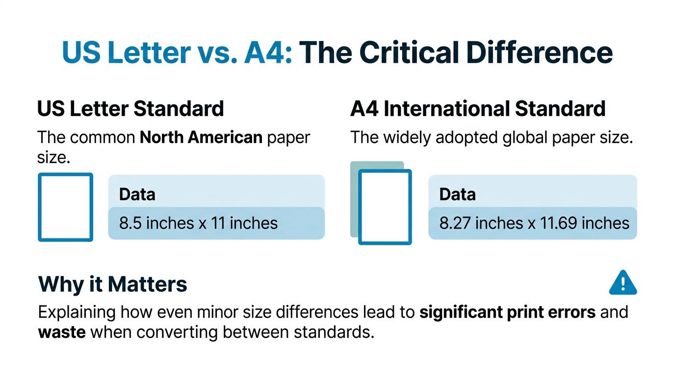
The gap between U.S. Letter and A4 looks harmless on paper. It isn't. A4 is slightly narrower and taller, and that small shift changes line length, image crops, margin balance, and where critical elements sit near the trim.
Why the mismatch causes trouble
A U.S. Letter layout often uses its extra width without the designer noticing. A headline stretches a bit farther. A logo sits comfortably near the edge. A text box lands in a position that feels balanced. Then the same file goes to an A4 printer, and the page gets narrower.
That's where problems begin. According to Color Experts, 42% of cross-border marketing campaigns experience print errors due to the dimensional nuance between U.S. Letter and A4, and only 1 in 15 generic flyer size guides warns designers to adjust bleed margins in its discussion of standard flyer size.
The biggest issue isn't dramatic cropping. It's cumulative slippage. Lines rewrap. Visual alignment shifts. Margins feel uneven. A design that looked crisp in the original file starts feeling off, even if nothing appears obviously broken.
When to build one version and when to build two
If the layout is simple, one adaptable design can work. That usually means:
- Short copy blocks that can tolerate small line changes
- Centered compositions instead of edge-sensitive layouts
- Generous internal spacing around logos, QR codes, and key text
If the flyer is dense, bilingual, highly branded, or image-led, make two versions. One for U.S. Letter. One for A4. That's usually cheaper than discovering the mismatch after approval.
The more precisely a layout is tuned, the less likely it is to survive a paper-standard swap without visible compromise.
This is one of the most expensive assumptions in print design. Teams often treat Letter and A4 as interchangeable because both are “standard.” They are standard, but they are not the same. If your campaign crosses borders, build with that fact in mind from the first draft.
How to Choose the Right Flyer Size for Your Goal
The best flyer size dimensions depend less on what looks impressive in a mockup and more on what the piece has to do in practice. A flyer handed out on a sidewalk has different demands than one mailed in an envelope or placed on a counter.
Match size to distribution first
Start with the delivery method. That choice narrows the field fast.
For general handouts, A5 is often the strongest default. Pixartprinting notes that A5 flyers at 148 × 210 mm or 5.8" × 8.3" are widely recommended as the optimal balance for general use, offering 40% less cost than A4 while retaining enough space for promotional content in its breakdown of flyer size dimensions. That makes A5 attractive when you need portability without reducing the design to a crowded card.
For premium or invitation-style pieces, DL has a different job. The same source describes DL, at approximately 99 × 210 mm, as a format reserved for premium or invitation-style communication because of its narrow, envelope-compatible shape. It can look refined, but it doesn't tolerate long copy well.
For teams trying to choose efficiently, this simple filter works:
- Need detail and breathing room: use a larger page such as Letter or A4.
- Need a practical handout: A5 usually strikes the best balance.
- Need a formal, narrow piece: DL fits that role better than a standard page.
- Need countertop visibility: a tall narrow format reads differently from a full sheet and suits display use better.
Choose for reading behavior not just space
A common mistake is to assume more room creates a better flyer. It often creates a longer flyer. If the audience only gives you a quick glance, a compact format with tight editing usually performs better than a larger sheet packed with secondary information.
This is where planning matters. Before design starts, it helps to lock down the message hierarchy, the must-have content, and the one action the flyer should drive. A solid brief prevents the layout from becoming a storage space for every stakeholder request. If your team needs a sharper process for that step, DesignStack's guide to achieving clear creative direction is a useful reference.
A flyer succeeds when the size supports the message. It fails when the page invites more content than the audience will read.
Choose based on behavior. Handouts should be easy to grab and keep. Mail pieces should fit their delivery method cleanly. Premium formats should feel intentional, not unusual. When the format matches the goal, the design almost always becomes easier to solve.
Essential Print Specs Bleed Trim and Safe Margin
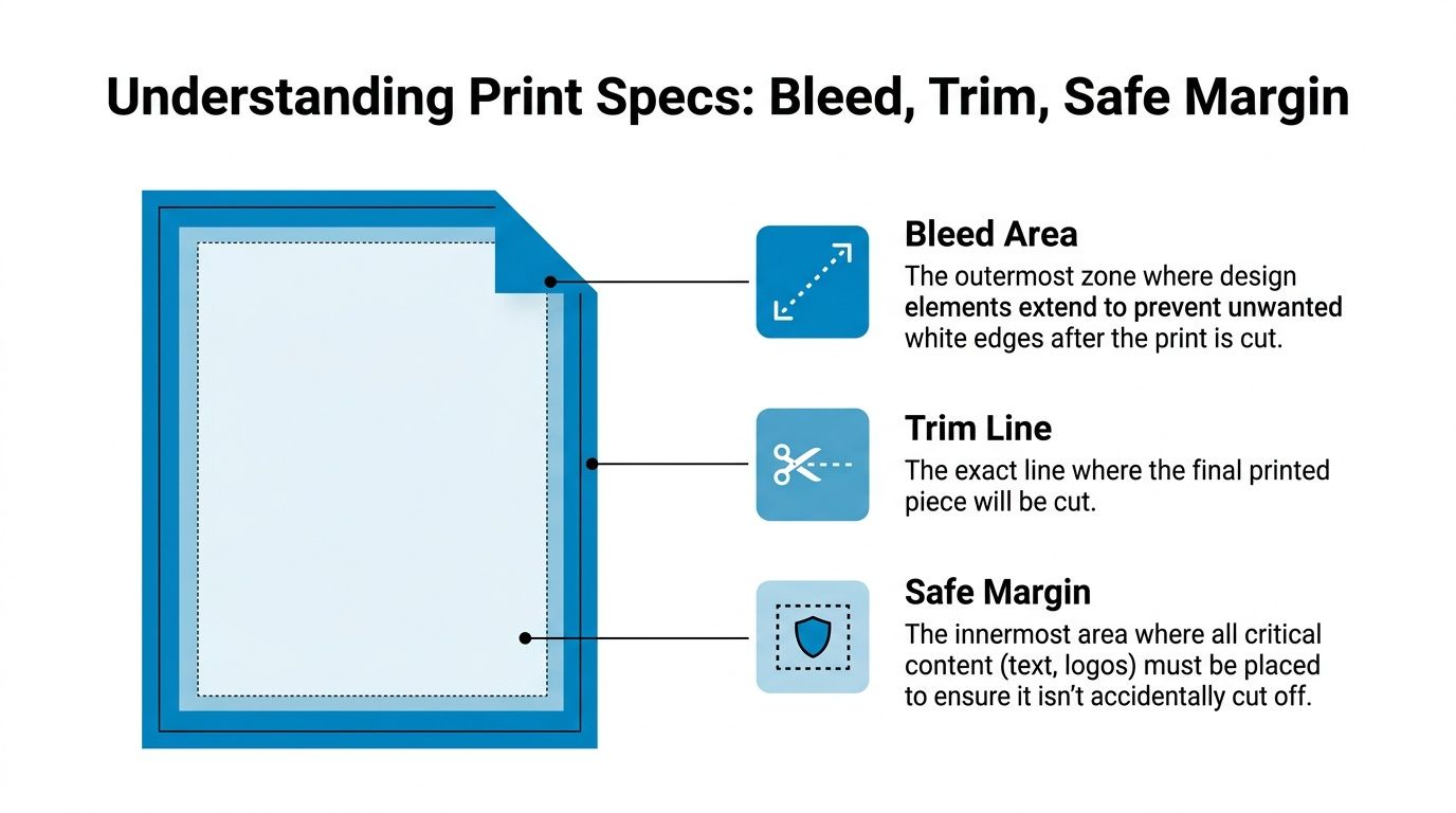
Once the flyer size dimensions are set, the file still isn't ready for press. Professional print depends on three invisible boundaries: bleed, trim, and safe margin. If those aren't respected, even a strong layout can print with white edges or clipped content.
A simple way to think about it is a picture in a frame. The artwork extends beyond what you finally see. The cutter decides the visible edge. Important details need to stay inside that edge so small movement during finishing doesn't damage the composition.
Think of the file as layers not one edge
These three terms do different jobs:
- Bleed is the extra background or image area that extends past the final edge. If your color block, photo, or texture is meant to run to the edge, it must continue beyond the trim.
- Trim line is the final cut boundary. That's where the printed sheet becomes the finished piece.
- Safe margin is the protected inner zone. Keep text, logos, QR codes, and other critical elements inside it.
Designers sometimes place content too close to the trim because the digital artboard feels precise. Print finishing isn't that exact in practice. Tiny cutting variation is normal. Safe margins absorb that reality.
A related issue is color. A flyer that looks bright and balanced on screen can shift in print if the file is still in RGB. Before export, it helps to understand how print color behaves and how to prep files for production using a guide on RGB to CMYK conversion.
The resolution rule you should not break
There's one technical rule that should never be negotiated. Adobe states that flyers for print should be designed at a minimum of 300 dpi for sharp output, while digital flyers can use 72 dpi in its overview of flyer sizes.
That means a file built for Instagram or email isn't automatically suitable for print, even if the layout looks identical. Screen graphics can hide softness that becomes obvious on paper.
A quick visual explanation helps if your team needs to align around production terminology:
Production note: If you can't confirm bleed, trim, safe margin, color mode, and resolution, the file isn't print-ready yet.
Paper Orientation and Niche Formats
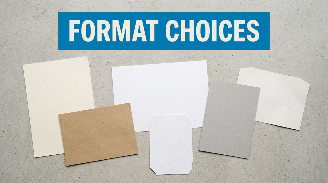
Orientation changes the pacing of a flyer before anyone reads the headline. So does the physical format. A vertical piece feels familiar and structured. A horizontal one can feel broader, more visual, and better suited to panoramic imagery or short event schedules.
Orientation changes how people scan the page
Portrait usually works better when the content stacks naturally. Think headline, subhead, image, details, call to action. It matches the common reading pattern for handouts.
Landscape can work well for:
- Wide imagery such as venue photos, food spreads, or product ranges
- Simple timelines where information needs a left-to-right rhythm
- Counter displays where the piece is meant to feel more like a mini sign than a document
Neither option is automatically better. The right one depends on whether the content wants vertical hierarchy or horizontal flow.
Format and stock change the message before anyone reads it
Paper also communicates. A thinner everyday sheet feels disposable. A heavier stock feels deliberate. Matte usually softens glare and gives a restrained finish. Gloss catches attention faster, especially with bold photography, but fingerprints and reflections can become part of the user experience.
If you're comparing sturdier options for premium handouts, menus, or mail pieces, this overview of heavy cardstock paper is a practical reference.
Square formats deserve attention too. They break the visual pattern of standard mail and handouts, and they align naturally with social platforms because they echo familiar screen crops. Conrad Mansion notes that the projected 2025 trend of square flyers in 5" × 5" or 8" × 8" formats is growing 34% annually, with 68% of small businesses reporting higher Instagram engagement when distributing square flyers with QR codes in its article on what size flyers are.
That doesn't mean every campaign should go square. It does mean the format can be smart when the print piece is meant to drive a digital action, especially scanning, sharing, or posting.
A niche format works when it supports the campaign idea. It fails when it's only there to look different.
Finalizing and Exporting Your Print Ready File
Most flyer problems show up at the end. The layout is approved, the deadline is close, and someone exports a file quickly without checking the production settings. That's how good design work turns into a preventable print issue.
A practical preflight check
Before sending a file out, confirm these points:
- Correct document size: the file matches the final flyer size dimensions you intend to print.
- CMYK color mode: the artwork is prepared for print, not left in screen color.
- Bleed included: edge-to-edge backgrounds extend beyond the trim.
- Fonts handled properly: they're embedded or outlined according to your workflow.
- Images are suitable for print: don't assume a web image will hold up on paper.
- Front and back order checked: especially on double-sided pieces.
If your team is still building confidence with production files, this introduction to beginning graphic design is a useful starting point for understanding the fundamentals behind those checks.
The file handoff that avoids last minute fixes
For most flyer jobs, a print-ready PDF is the safest handoff because it packages layout, type, and images into one predictable file. If your artwork includes logos, icons, or illustrations, it also helps to know whether each asset should stay vector or can be rasterized. Raccoon Transfers explains that distinction clearly in Raccoon Transfers' DTF guide.
One last habit matters more than people think. Open the exported PDF and inspect it as if you were the printer. Check the page count, edges, crops, image softness, and alignment. Don't trust the export blindly. Verify it.
If you need branded apparel, event merch, or promotional products that match the quality of your printed marketing materials, Dirt Cheap Product, Inc. is a practical partner to keep in your vendor list. Their team handles custom decoration across apparel and accessories with responsive proofing and fast-turnaround support, which makes it easier to keep campaigns visually consistent across print, uniforms, giveaways, and event merchandise.