
You're probably staring at a logo file, a blank mockup, and a size run that suddenly feels more complicated than it should. The artwork looked fine on your screen. Then your printer asks whether the front graphic should be center chest or full front, whether women's cuts need a separate size, and whether youth shirts are getting the same art scaled down. That's the point where many first-time apparel buyers realize t-shirt design size isn't a minor detail. It's the job.
A design can be well made and still print badly if the size is wrong for the garment. Too small, and the shirt looks cheap. Too large, and the print crowds seams, feels heavy, or wraps awkwardly under the arms. The fix isn't guessing bigger or smaller. It's using placement standards, preparing the file correctly, and adjusting for the actual garments in the order.
Table of Contents
- Why Your T-Shirt Design Size Matters
- Preparing Your Digital Canvas for Print
- A Standard Guide to T-Shirt Design Placement
- Scaling Designs for Different Garments and Cuts
- How Print Methods Affect Your Design Size
- The Right Way to Resize and Export Your Artwork
- From Plan to Perfect Print
Why Your T-Shirt Design Size Matters
A marketing manager ordering staff shirts for a trade show usually starts with the brand file, not the garment. That's understandable. The logo already exists, the event date is close, and the team just wants shirts that look clean and consistent. Then the questions start. Should the front be a small left chest logo, a center graphic, or a bigger full-front print? Will the same art look right on unisex tees, women's fitted tees, and a few youth sizes for volunteers' families?
Those choices affect how polished the final order feels. A small logo can look sharp and understated on one shirt, then disappear on a larger size if nobody adjusts the scale. A full-front graphic can look balanced on a medium and too aggressive on a narrower cut. Most expensive t-shirt mistakes aren't caused by bad taste. They come from treating all garments like they share the same printable canvas.
Branded apparel isn't a tiny niche. The global T-shirt market operates at an annual value between $74.7 billion and $185.2 billion, with the custom printing subcategory generating $4.9 billion to $7.0 billion annually. The graphic-designed T-shirt segment alone was valued at $4.1 billion in 2025 and is projected to grow, which is a good reminder that precise sizing is part of normal professional practice, not overthinking (custom T-shirt market figures).
Good apparel branding usually looks effortless. It only gets there because someone handled the measurements before production.
When the design size is right, people notice the brand, not the print problem. When it's wrong, everyone notices, even if they can't explain why.
Preparing Your Digital Canvas for Print
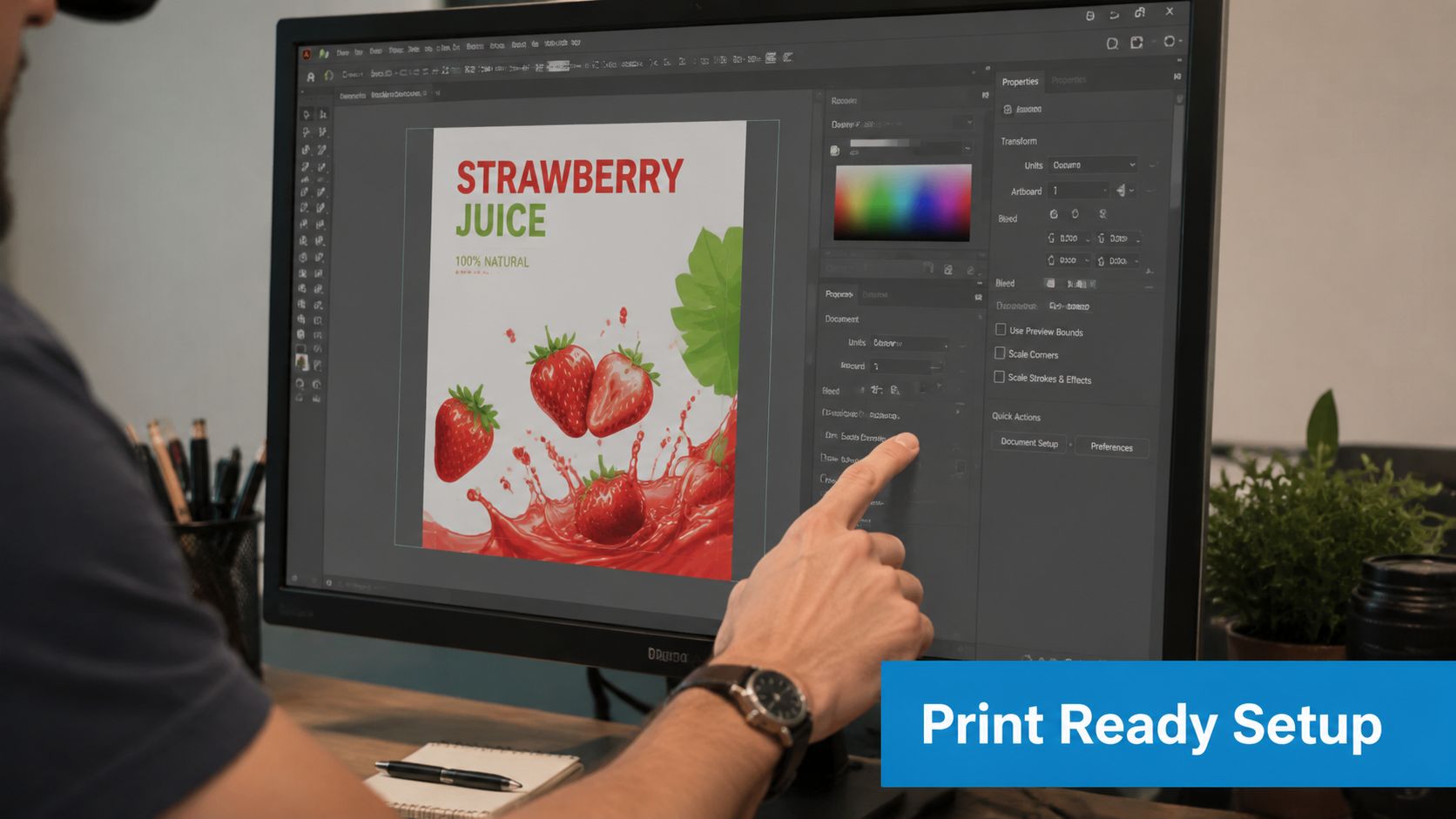
A file can look perfect on a laptop and still print poorly. I see this on first orders all the time. The art was designed for a screen, scaled up at the last minute, then forced onto three shirt cuts with very different print areas.
Build the file at full print size from the start
Set your artboard to the size you expect to print, not the size that feels convenient while designing. For a typical adult full-front print, many shops work from a large high-resolution canvas such as 4500 x 5400 pixels at 300 DPI. The exact maximum can vary by printer and method, but the rule stays the same. Start large enough for production, because enlarging a small web graphic later usually creates soft edges, muddy type, and jagged curves.
Vector art gives you more room to work. Raster art needs more discipline. If the design includes photos, texture overlays, or painted effects, check them at full size before approval.
That matters even more if the same order includes unisex tees, women's fitted tees, youth sizes, or toddler shirts. A file that is barely sharp enough for one adult print size leaves no margin when you need alternate layouts or smaller versions with cleaner spacing.
Keep important elements away from the outer edge
Printers line up garments carefully, but shirts are still fabric. They shift, stretch, and vary by brand. Keep text, faces, logos, and fine outlines comfortably inside the working area so a small placement change does not turn into a visible mistake.
A good rule in the shop is simple. If the design depends on the border landing perfectly, the design is too big for the area.
Use that safe-zone mindset for:
- Main text: Give names, dates, and slogans breathing room.
- Faces or mascots: Keep eyes, hands, and outlines away from the edge.
- Fine details: Thin strokes and small accents disappear first when they sit too close to the limit.
This is also where mockups can mislead new buyers. A graphic may look centered on a flat digital template, then feel too low on a women's cut or too wide on a youth shirt once it is worn. For teams reviewing layouts before production, this guide to garment accuracy in merch shows why garment shape changes how a print reads on the body.
Set up the file for production, not just approval
Screen colors are brighter than printed ink. Transparent effects, drop shadows, and blending modes can also behave differently once a file leaves your design software and enters a print workflow. Clean setup prevents the slow, expensive email thread where the printer asks for a corrected file the day before press.
Use a production checklist:
- Create the artboard at the intended print size.
- Keep the background transparent if the shirt color should show through.
- Inspect the artwork at actual print size, not only fit-to-screen.
- Outline fonts or package them if your printer requests it.
- Confirm the final file size for each garment group, especially if women's, youth, or toddler sizes need separate scaled versions.
That last step gets skipped often. It should not. An adult design usually cannot just be reduced by eye for smaller garments. Youth and toddler prints tend to work best when the art is rebuilt with simpler spacing and a narrower overall proportion, rather than shrunk as one block.
If you are still tightening up your file prep, this collection on beginning graphic design basics is a practical place to improve the habits that help printers produce clean files you can approve with confidence.
A Standard Guide to T-Shirt Design Placement
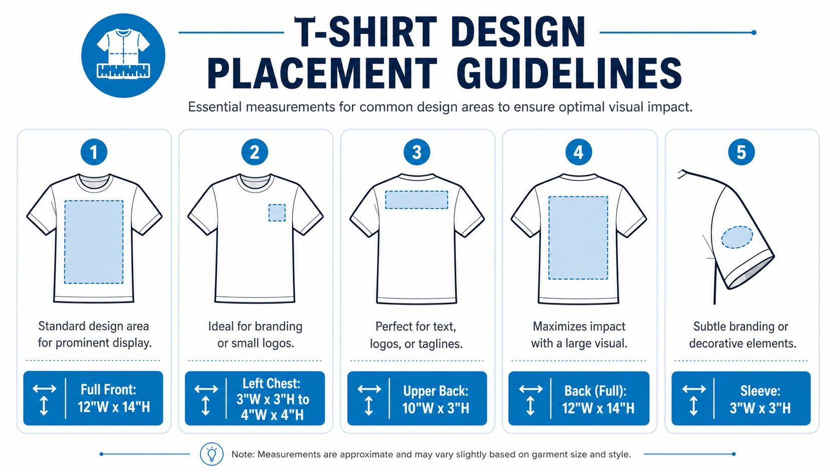
Most shirt orders use a handful of standard placements. The confusion usually comes from mixing them up. A center chest graphic is not a full front. A left chest logo isn't just a tiny center print moved sideways. Each location has its own visual job.
A quick reference helps more than guesswork. Start with these common adult unisex standards.
The adult placements most orders use
For adult t-shirts, the industry-standard center-chest graphic design size ranges from 6 to 10 inches wide, and it should generally start 2 to 3 inches below the neckline. Left-chest logos typically fall between 2.5 and 5 inches wide, while full-front designs are larger, measuring 10 to 12 inches wide (adult front placement standards).
| Placement | Typical Width | Typical Height | Positioning Notes |
|---|---|---|---|
| Full Front | 10 to 12 inches | 10 to 14 inches | Start roughly 2 to 3 inches below the neckline and keep the art visually centered |
| Center Chest | 6 to 10 inches | 6 to 8 inches | Best for logos, slogans, or compact graphics placed below the collar |
| Left Chest | 2.5 to 5 inches | Proportionate to artwork | Place on wearer's left chest with balanced spacing from collar and side |
| Full Back | 12 inches | 14 to 16 inches | Leave clear space from collar and hem so the print doesn't feel crowded |
| Sleeve | Small mark sized to artwork | Proportionate to artwork | Center on the printable sleeve area, usually for logos or accents |
The infographic below is useful if you're comparing locations with a team before artwork approval.
What the placement rules actually mean
The neckline drop matters more than most buyers expect. If the design sits too high, it feels jammed under the collar. Too low, and the graphic starts to fall into the stomach area, which weakens the visual impact.
For adult medium shirts, another common production reference puts a center chest graphic at 11 to 12 inches wide, a left chest logo at 3 to 4 inches wide, and positions center designs 3 to 4 inches below the collar, with a warning not to exceed 14 inches in width or you risk running into the armpit seam area (adult medium shirt print guidance). That's a useful reminder that “bigger” isn't the same as “better.”
A few practical readouts from the press side:
- Center chest works best when you want a clean front that doesn't dominate the shirt.
- Full front works best when the design is the main product feature.
- Left chest works best for staff uniforms, corporate apparel, and brand marks that need a restrained look.
- Full back works best when the front stays simple and the message needs room.
If a customer says, “I want the logo noticeable but not huge,” they usually mean center chest or left chest. Not full front.
The safest way to approve placement is to look at the actual garment style, not just the raw dimensions. A 10-inch graphic can read very differently depending on body width, collar shape, and fabric cut.
Scaling Designs for Different Garments and Cuts
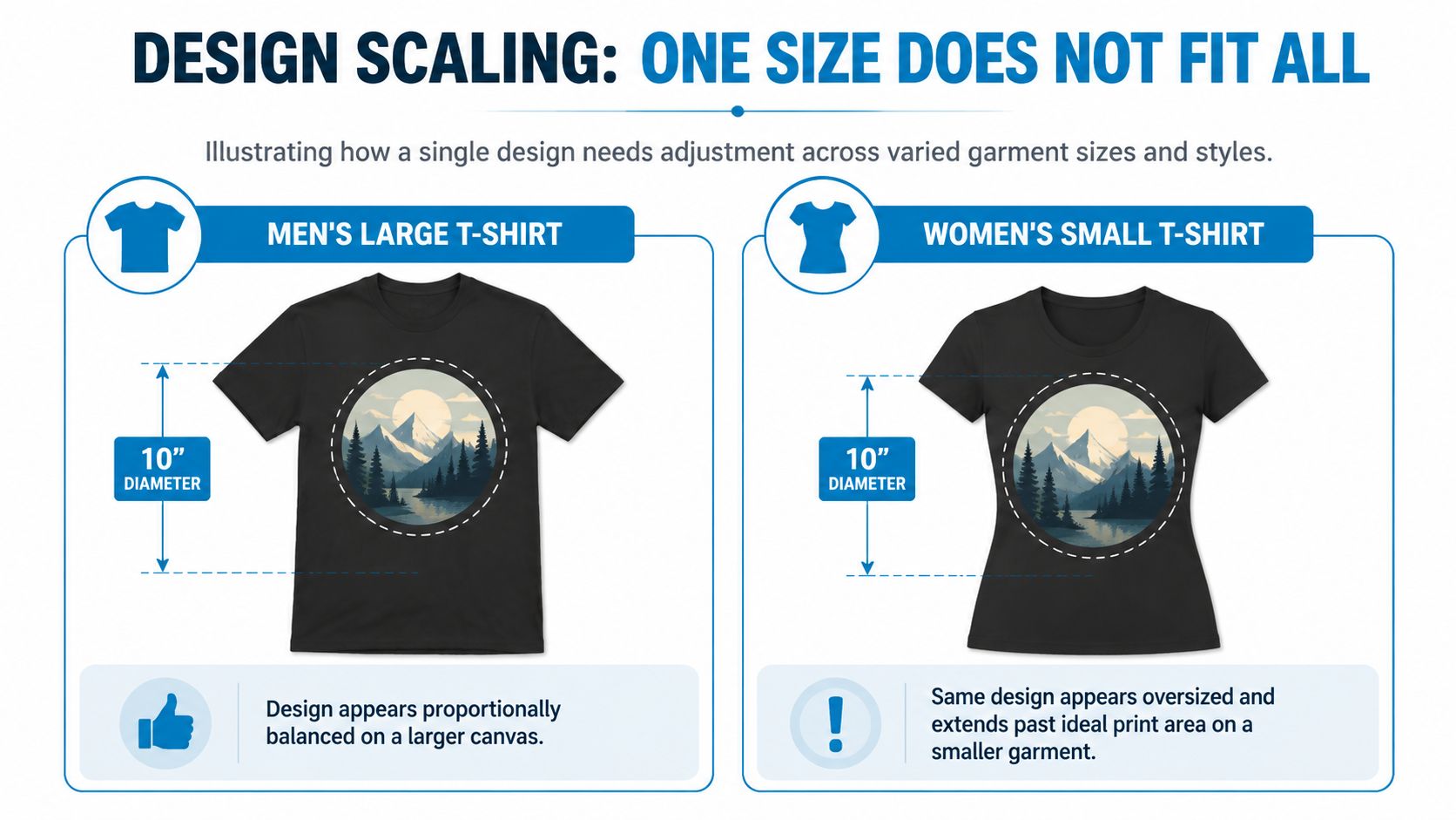
One of the fastest ways to make a mixed apparel order look inconsistent is using one design file for everything. The file may be technically correct, but the visual balance won't hold across unisex tees, women's cuts, youth shirts, and toddler sizes.
Why one file fails across a mixed order
A standard adult full front is often built around 11 to 12 inches wide, but that baseline doesn't translate cleanly to every garment. Women's cuts usually need less width because the torso is narrower. One source frames the difference clearly: men's designs often sit in the 10 to 12 inch range, while women's designs typically drop to 8 to 10 inches to avoid overwhelming the shirt, and a flexible 70% of shirt width approach often produces a better result than rigid fixed inches (garment-cut sizing differences and the 70% rule).
That rule works because it forces you to judge proportion, not just measurement. A design can be the “correct” width on paper and still look wrong on the body.
Here's what that looks like in practice:
- Unisex medium: A graphic may look balanced with standard front width.
- Women's small: The same exact graphic can dominate the front panel.
- 3XL unisex: That same file can suddenly look undersized and timid.
Use inches as a starting point. Use the garment width as the final check.
Practical size targets for youth and toddler shirts
Most generic size charts tell buyers to “scale down” for kids' apparel. That's not enough. Smaller garments need actual size limits.
For youth and toddler shirts, a better working standard is this: toddler full fronts should max out at 6 inches, with about 5 inches recommended, and youth full fronts should max out at 9 inches, with about 8 inches recommended. The same guidance also stresses a 1-inch minimum from all seams to reduce print defects (youth and toddler print size guidance).
That seam clearance matters because a design can fit the chest area and still be too close to the collar, side seam, or hem for reliable printing.
A simple approval checklist for mixed-size runs:
- Separate by garment family: Unisex, women's, youth, toddler.
- Review the narrowest garment first: If it fails there, it needs adjustment.
- Check vertical space as hard as width: Tall art gets awkward on shorter torsos fast.
- Watch seam clearance: A good design still fails if it crowds the edge.
If you want a full order to feel consistent, the goal isn't identical print size. The goal is identical visual weight.
How Print Methods Affect Your Design Size
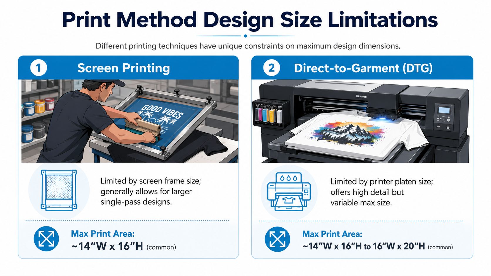
The right t-shirt design size also depends on how the shirt will be decorated. Buyers often choose placement first and print method second, but production usually works the other way around. The method sets limits on detail, feel, edge behavior, and how large the design should realistically be.
Screen printing versus DTG and DTF
Screen printing handles bold graphics well and is a strong fit for logos, spot colors, and repeat orders. Large prints are possible, but oversized solid coverage can make the shirt feel heavier. Fine details need discipline. Tiny gaps, thin strokes, and crowded artwork can become the problem, not the press.
DTG works well for highly detailed art and soft transitions. It's usually the better option when the design depends on texture, shading, or a wide color range. But file prep becomes less forgiving. If the art is soft, low-resolution, or built with muddy transparency, DTG will show that.
DTF gives you flexibility with color and placement, especially for logos and graphics that need strong edge definition. It can be a smart choice for mixed runs and difficult artwork. The trade-off is feel. A large DTF transfer can feel more noticeable on the garment than a smaller chest print.
A practical way to choose:
- Use screen printing for cleaner shapes, brand marks, and batch consistency.
- Use DTG when detail is the star and the artwork needs tonal range.
- Use DTF when the file is complex and placement flexibility matters.
If you're weighing decoration methods for a logo-heavy order, this comparison of screen printing vs vinyl for apparel decoration helps clarify where each process fits.
Where embroidery and sublimation change the decision
Embroidery changes the size conversation because thread behaves differently than ink. Small logos often work beautifully. Dense, detailed artwork usually doesn't. A left chest mark that looks perfect as a print may need simplification before it can stitch cleanly.
Sublimation is different again. It's usually chosen when the garment and artwork support full-coverage visual impact, not just a standard front print. That means the design approach, garment selection, and layout all need to match the process from the start.
The best print method isn't the one with the biggest theoretical print area. It's the one that matches the artwork without forcing it.
When a design keeps getting modified to suit the method, it's worth asking the opposite question. Maybe the method is wrong for the design.
The Right Way to Resize and Export Your Artwork
A lot of expensive reprints start here. The mockup looked sharp on screen, someone scaled the file up for 2XLs and 3XLs, and the print came out soft or jagged. In production, that usually points to one problem. The artwork was resized from the wrong source file.
Start with vector art whenever size may change
Vector files, including AI, EPS, and SVG, should be the master files for any logo, wordmark, or graphic that may be resized across a run. They scale cleanly, which matters when one order includes standard unisex tees, slimmer women's cuts, youth sizes, and a few toddler pieces. One approved design often needs several size versions, not one file stretched to fit everything.
Raster files, including PNG and JPG, have a fixed pixel size. Enlarge them too far and the edges break down fast. That problem shows up first on larger adult prints, but it also causes trouble on smaller garments when the original file is low resolution and the art has thin lines or small type.
If the only source is raster, check the pixel dimensions against the final print size before approval. Do that before anyone signs off on proofs. It is much cheaper to rebuild art than to reprint a mixed-size order.
Resize by garment type, not just by shirt size
This is one place generic size charts fall short. A design that fits a unisex adult medium does not automatically fit a women's v-neck or a youth small well. Women's cuts usually need a narrower print area. Youth and toddler garments need smaller artwork with simpler spacing, not a full-size adult design reduced blindly.
A safer workflow is to keep one master file, then export separate approved versions by garment group:
- Adult unisex: your baseline file
- Women's cuts: slightly narrower version to match the smaller print field
- Youth: reduced proportionally, with extra attention to text size and spacing
- Toddler: simplest version, often with less detail and more breathing room
That extra setup work prevents common problems like prints that sit too low on smaller sizes or artwork that feels oversized on fitted cuts.
Export files your printer can use without cleanup
The best export package is simple and clearly labeled. Send the printer the version that is ready to produce, plus the editable source when available.
A reliable handoff usually includes:
- A print-ready PNG with transparency for each approved placement
- The native vector file if the artwork was built in Illustrator or another vector program
- Separate files for each location such as front, back, left chest, or sleeve
- Clear file names tied to placement and garment group, such as
brand-front-unisex.pngorbrand-left-chest-womens.svg
Keep the background transparent unless it is part of the design. Outline fonts or package them properly. If the artwork uses special effects, check that they will reproduce the same way after export.
For shops and in-house teams building logo files from scratch, this guide to making logos in Illustrator for print-ready use is a useful reference.
One last shop rule. If your folder includes names like “final,” “final-2,” and “use-this-one,” the job is not ready to send. Clean file naming saves approval time and prevents the wrong art from reaching press.
From Plan to Perfect Print
Good t-shirt design size decisions usually come from restraint, not guesswork. Build the file at print quality. Choose a standard placement that matches the job. Scale for the actual garment instead of forcing one file onto every cut. Then match the artwork to a print method that supports it.
That's what keeps a company uniform looking polished, a merch drop looking intentional, and a big event order from turning into a pile of shirts nobody wants to wear.
If you want a second set of eyes before your order goes into production, Dirt Cheap Product, Inc. helps businesses turn artwork into clean, consistent branded apparel with fast proofs, responsive support, and decoration options that fit real-world garment orders.