
You've uploaded a clean vector logo, chosen a black hoodie, and asked for a quote. The decorator replies with one question before discussing price: spot color or process color? That answer can affect the number of screens, ink channels, artwork separations, setup work, fabric suitability, and whether the blue in your logo looks intentional or merely close.
This isn't a question reserved for packaging specialists or prepress technicians. It matters whenever you're decorating apparel, whether the job involves screen printing, DTF, sublimation, DTG, or even thread-based embroidery. A simple choice made before production can prevent rework, rushed approvals, and samples that miss your brand standard. If you're still deciding how the artwork should be printed, this guide to printing a design on a shirt gives useful production context before you request a quote.
Table of Contents
- The Spot vs Process Decision Most Buyers Skip
- What Spot Color and Process Color Are
- Side-by-Side Comparison Across the Factors That Matter
- Which Method Fits Each Apparel Decoration Process
- Preparing Artwork for Spot Color and Process Color
- Beyond the Basics Spot Inks Expanding Into Digital Workflows
- Which Path Is Right for Your Brand or Event
- Quick Answers to Common Spot vs Process Questions
The Spot vs Process Decision Most Buyers Skip
A buyer sends a two-color logo to a print shop and assumes the design is already production-ready. The artwork may look perfect on screen, but the decorator still needs to know whether those colors should be treated as individual premixed inks or as part of a CMYK build. That distinction changes how the file is separated and how the garment is printed.
Suppose the logo uses a strong blue and a warm orange. If the brand requires those colors to remain consistent on every reorder, spot color deserves serious consideration. The printer can specify each color separately, prepare the appropriate screen or digital channel, and evaluate the result against the intended reference. If the artwork contains a photograph, soft shadow, or complex gradient, process color usually makes more sense because CMYK is designed to build tonal variation.
The shop-floor consequences
Skipping the decision creates practical problems:
- Screen planning: A spot-color screen print job generally needs a separate screen for each spot ink. CMYK requires the four process separations.
- Ink selection: Spot work may require premixed or specially formulated colors. Process work relies on cyan, magenta, yellow, and black.
- Fabric behavior: Ink appearance changes with the garment color, fiber content, surface, and underbase choice.
- Approval expectations: A proof that looks accurate on a white digital page may not predict the same result on a black cotton hoodie or a polyester athletic shirt.
- Repeat orders: A defined spot reference gives the production team a clearer target when the same identity returns later.
Practical rule: Choose the color strategy before the decorator prices the job, not after the first proof looks wrong.
Spot color doesn't automatically win, and process color isn't automatically cheaper or more versatile for every apparel order. The right choice depends on the artwork, garment, quantity, decoration method, and tolerance for color variation.
What Spot Color and Process Color Are
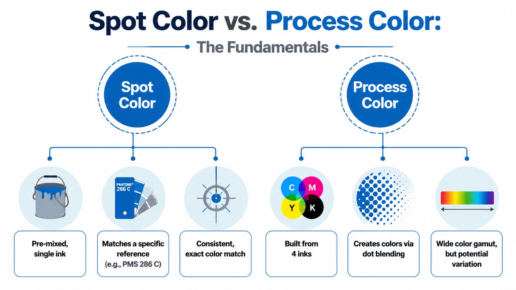
Spot color uses one premixed ink matched to a defined target. The Pantone Matching System remains a common reference for this work. Its system developed from a New York printing company in the 1950s and began standardizing ink colors in reference books in the mid-1960s. It supports spot printing, where the press applies a premixed color as one solid layer instead of building it from halftone dots. Pantone's explanation of spot and process color explains the technical distinction.
On an apparel screen-printing job, the decorator separates the artwork into solid color areas. A logo assigned to PMS 286 C becomes a defined ink target. The printer selects or formulates a production ink, loads it through the matching screen, and prints that color as a solid layer. This approach fits logos, lettering, flat illustrations, and brand elements that need sharp edges and consistent coverage. A PMS color matching guide can help buyers prepare brand references before production.
Process color combines cyan, magenta, yellow, and black, commonly written as CMYK. The artwork is divided into four channels, with each channel contributing halftone dots. Those dots blend at normal viewing distance, producing varied tones for photographs, gradients, skin tones, shadows, and detailed illustrations. Adobe describes the four-plate structure that separates CMYK production from spot-color workflows in its spot-color and process-color overview.
Why the difference matters on clothing
Spot color asks which solid ink should be applied. Process color asks how four inks can reproduce the tonal information in the artwork.
Spot inks can reach hues beyond the usual process gamut, including metallic and fluorescent effects. In apparel decoration, the same logic now appears in digital workflows through dedicated channels such as white, metallic, and primer. Screen printing still handles solid spot layers directly, while DTF and DTG systems may add specialty channels around a digital image. Sublimation remains tied to process-style color building and works within the limits of the transfer and polyester substrate.
Process color suits complex full-color artwork, but its appearance depends more heavily on calibration, profiles, ink behavior, garment fiber, and surface. A buyer choosing between methods should therefore judge the artwork and decoration process together, not treat spot and process as interchangeable print settings.
Side-by-Side Comparison Across the Factors That Matter
The choice becomes clearer when you evaluate the production factors separately. A one-color logo on a team polo has different needs from a photographic design on a dark fashion tee. The table below uses the conventional screen-printing comparison. Digital apparel systems can handle these concepts differently, especially when white or specialty channels are involved.
| Factor | Spot Color | Process Color (CMYK) |
|---|---|---|
| Color accuracy | Strong choice for a defined target and repeatable solid color | Can approximate many colors, but depends more on calibration, profiles, and fabric behavior |
| Ink cost | Efficient for a limited palette, especially when the same colors repeat | Efficient for complex full-color artwork because the four process inks build many tones |
| Setup cost | Adds production work and typically an additional screen or channel for each spot ink | Uses four process separations and four plates in conventional process production |
| Fabric compatibility | Flexible for dark garments and specialty inks, usually with an underbase where needed | Effective for complex imagery, but dark garments require careful white underbase planning |
| Turnaround | Often practical for simple logos and limited-color artwork | Often practical for gradients, photos, and artwork that would require many spot separations |
The plate calculation is straightforward in a conventional print workflow. CMYK uses four plates, while spot work uses four process plates plus one additional plate for each spot color when both systems are combined, as summarized in Printery's spot-color documentation. In screen printing, the equivalent decision appears as screen count and color passes rather than offset plates.
Where spot wins
Spot color is usually the safer choice for a small number of solid brand colors. A Pantone-matched ink gives the decorator one defined target instead of asking four process inks to approximate that target on a particular textile. It also supports metallics, fluorescents, and other colors that standard CMYK may not reproduce well, as described by Techkon's spot and process color guide.
Where process wins
Process color earns its place when the artwork contains many tones, gradients, or photographic information. Rebuilding a detailed image as numerous spot colors can create extra separations, screens, registration concerns, and approval work. CMYK keeps the color system compact while allowing the image to retain tonal transitions.
Neither method removes the need for a proof. The garment color, fiber content, pretreatment, ink opacity, curing, and surface texture can all affect the final appearance.
Which Method Fits Each Apparel Decoration Process
Apparel decoration changes the meaning of spot and process. A screen-printing press uses physical screens and ink layers, while a DTF or DTG printer may use digital channels controlled by a RIP. Sublimation dyes the garment rather than placing an opaque ink film on top. Embroidery uses thread colors and stitch construction, so it follows a different color logic altogether.
| Decoration Method | Primary Color Strategy | Best Scenario | Limitation |
|---|---|---|---|
| Screen printing | Spot color for solid logos, process for photographic or tonal artwork | Team polos, branded tees, and identity-driven apparel | Each additional screen or color adds setup and registration work |
| DTF | Primarily digital process color with white and optional specialty spot channels | Short-run logos, mixed garment colors, and detailed artwork | Digital color may need careful profiling, and the transfer has a distinct hand |
| Sublimation | Process color | Light polyester athletic wear and all-over photographic designs | It's limited to suitable polyester garments and doesn't provide a conventional opaque spot match |
| DTG | CMYK process with white as an important underbase layer | Detailed artwork on cotton garments, including small runs | Dark-garment results depend heavily on pretreatment and white-ink behavior |
| Embroidery | Thread-based spot color selection | Team polos, uniforms, hats, and durable identity marks | Thread libraries and stitch count limit fine detail and photographic reproduction |
Screen printing
Screen printing is the natural home for spot color. A solid logo with a defined palette can use one screen per Pantone ink, producing sharp edges and strong coverage. That makes spot color a practical fit for team polos, work shirts, and a recurring uniform program.
Process screen printing becomes more attractive for photographic art, blended shading, and complex illustrations. It can reproduce tonal information that would be cumbersome to rebuild as many separate spot inks. On dark garments, either approach may require a white underbase so the upper colors don't disappear into the fabric.
DTF and DTG
DTF printing generally works through digital CMYK plus a white underbase. A logo with several colors therefore behaves more like process artwork, even if the original file began as vector spot colors. Digital spot channels can add white, metallic, primer, or other specialty effects where the equipment and RIP support them.
DTG also uses process color for detailed artwork, with white ink serving as a critical layer on dark garments. A photographic design on a cotton tee is a natural DTG or DTF candidate, while a simple identity mark may still be easier to control through spot screen printing.
Sublimation and embroidery
Sublimation is process-oriented because the printer builds the image from dye colors before transferring it into suitable polyester fibers. It works well for athletic kits and light polyester garments, but it isn't a conventional route for an opaque Pantone spot match.
Embroidery should be briefed around thread colors, stitch density, lettering size, and fabric stability. A team polo with a clean chest logo may use a small selection of thread colors, but the result won't reproduce a photograph or smooth CMYK gradient.
Preparing Artwork for Spot Color and Process Color
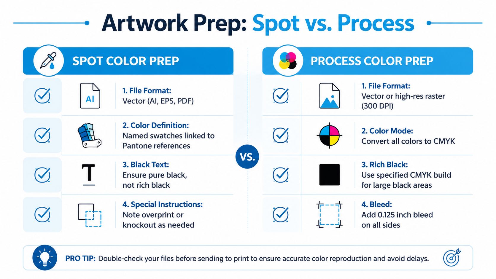
Artwork preparation determines whether the decorator receives clear production instructions or has to interpret a file under deadline. A spot-color file should generally arrive as vector artwork in AI, EPS, or PDF format, with each color saved as a named swatch tied to the intended Pantone reference. Naming the swatch protects the target even when the shop converts it to the closest available in-house ink.
Don't trust a logo that merely looks like a spot color on screen. A rasterized image, an unnamed CMYK build, or an embedded JPEG can force the production team to rebuild the separations. Spot colors must also be checked for overprint and knockout behavior, especially where one ink sits over another.
Files for process decoration
Process artwork should be supplied in the color mode and profile requested by the decorator. Some workflows begin with RGB and rely on the RIP for conversion, while others require CMYK artwork with a specified ICC profile. DTG work on cotton and sublimation work on polyester may use different profiles and separation settings, so the shop's production instructions matter more than a generic export preset.
Convert spot colors to process before submitting a process job when the printer requires pure CMYK separation. Otherwise, the RIP may interpret the spot definitions as separate channels instead of blending them into the intended process image. This RGB-to-CMYK conversion resource is useful background, but the decorator's profile and workflow should control the final conversion.
Errors that create avoidable rework
- Wrong color mode: A process job still contains live Pantone channels.
- Missing underbase: Dark shirts lack the white layer needed beneath colored ink.
- Unclear overprint: Objects overlap in a way that changes the intended color.
- Weak raster artwork: A low-resolution JPEG becomes soft or jagged at print size.
- No production proof: The buyer approves the screen preview without checking the garment, placement, and color treatment.
Ask for a pre-production proof whenever color identity matters. A useful proof should show the actual garment color, decoration method, placement, and any underbase or specialty layer that affects the result.
Beyond the Basics Spot Inks Expanding Into Digital Workflows
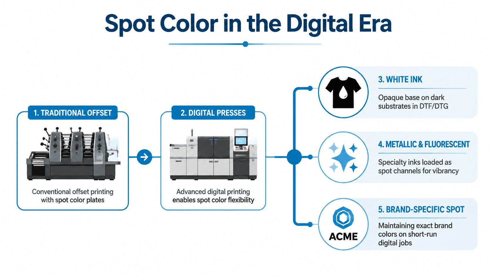
The old question, spot or process, is becoming less complete as digital apparel systems add specialty channels. A modern RIP may define a spot channel as more than a Pantone-like mixture color. It can identify white, gloss, primer, metallic silver, structural ink, or an area reserved for variable printing. Roland DG's documentation on spot colors reflects this broader digital definition.
White ink is the clearest apparel example. On a black garment, DTF or DTG may print a digital white layer beneath the CMYK artwork. That layer behaves as a deliberate spot function even though the image itself uses process color. The same workflow can support specialty effects when the printer has the relevant hardware, ink set, and RIP configuration.
The more useful buyer question
A short-run athletic design might use process color for the main artwork and a digital fluorescent accent for a specific logo area. A dark tee might use CMYK plus digital spot white. A brand may want a metallic or gloss effect without building a conventional screen sequence.
Variable printing adds another reason to think digitally. If every shirt needs a different name, number, or logo area, a digital spot workflow can define those areas without treating the entire production run as one fixed plate-based image. The practical question becomes: Which non-CMYK effect or production constraint does this job require?
That doesn't make every digital spot claim universal. Equipment capabilities differ, specialty inks can affect cost and handling, and the decorator must confirm whether the requested channel is supported. But the decision has moved beyond a simple comparison between PMS and CMYK.
Which Path Is Right for Your Brand or Event
A small streetwear brand with a limited palette and a strict identity standard should start with spot screen printing when the artwork is mostly solid shapes. A nonprofit fundraiser using a photographic design may have a better fit with DTF or DTG process color, particularly when the artwork needs tonal detail rather than a few flat inks.
Event organizers working with several garment styles or vendors should prioritize a color strategy that can be documented clearly. Spot references can give each production partner a common target, but the substrate and decoration method still need approval. Retailers and boutiques should consider spot color for repeatable logos, labels, and simple graphics, while process color is more suitable for artwork built around photos, textures, and gradients.
Corporate teams ordering uniforms year after year should weigh repeatability against setup. A consistent spot palette can simplify reorders, while process decoration may be the more practical route for complex campaign artwork or variable employee details.
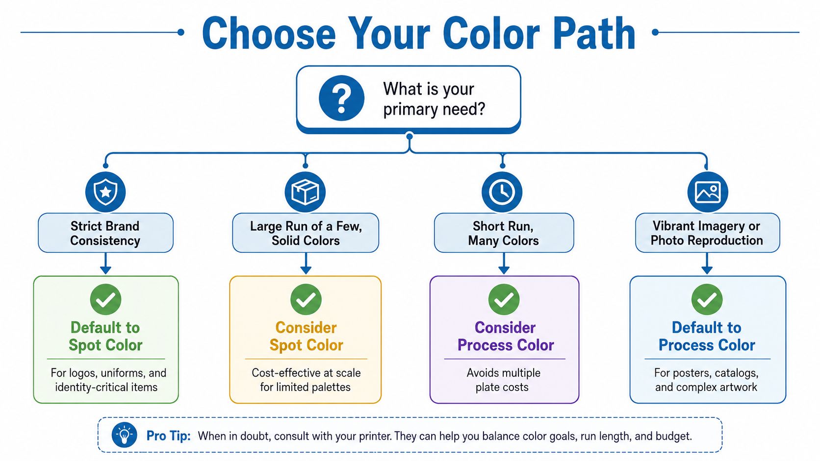
Before requesting a quote, answer five questions:
- Garment: Is it cotton, polyester, a blend, light, or dark?
- Artwork: Does it use solid colors, gradients, photographs, or specialty effects?
- Quantity: Is the order a limited run or a recurring program?
- Repeat frequency: Will the same design return across future orders?
- Color target: Does the brand require a specific Pantone match?
Send those answers with the artwork. The decorator can then recommend the actual production path instead of pricing from assumptions.
Quick Answers to Common Spot vs Process Questions
Do Pantone references require a paid book?
A Pantone reference gives the decorator a defined target, but the shop may use its own physical references, ink system, or color-management process. Ask which reference the printer uses and whether the requested coated or uncoated target is appropriate for the garment application. A screen image or hexadecimal value isn't a substitute for a production color reference.
How do minimum quantities affect the choice?
Spot screen printing carries setup work tied to screens, separations, and colors, so low-volume jobs can be less attractive when the design uses several spot inks. DTF and DTG process workflows can suit small quantities because they avoid conventional screen setup, although the per-piece production cost and finish differ. Request quotes for the same artwork through both methods when the run is small.
Why do dark garments need white?
Colored ink laid directly onto a black or dark textile can lose brightness and contrast. Screen printers may use a white spot underbase, while DTF and DTG systems may print a digital white layer beneath CMYK. The underbase must be included in the artwork and production plan.
Can spot and process appear in one design?
Yes. A photographic background can use process color while a logo uses a defined spot channel. Mark those areas clearly in the artwork, label the spot swatches, and tell the decorator which elements require a specific match.
Dirt Cheap Product, Inc. provides screen printing, embroidery, DTF, sublimation, and other apparel decoration services, with artwork review and proofs that help buyers confirm color, placement, and stitching details. Upload your logo and discuss the right spot or process workflow by visiting Dirt Cheap Product, Inc..