
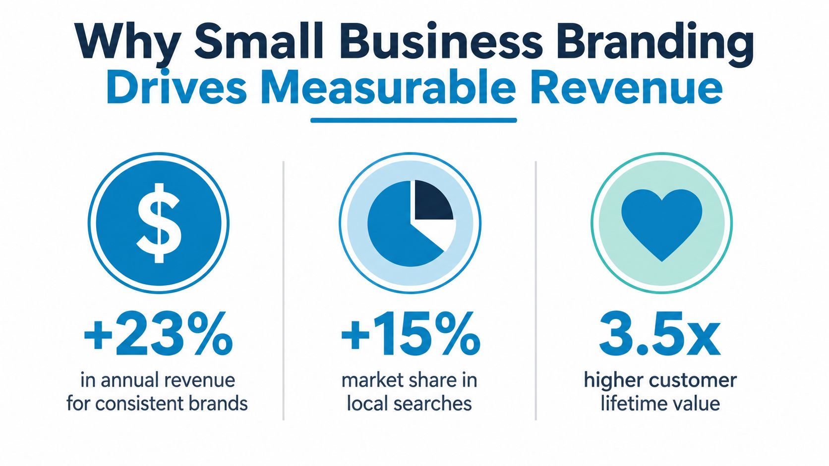
Consistent brand presentation can increase revenue by up to 23% according to the branding data roundup used here, and that single number changes how small business branding should be treated. It is not a design project. It is a revenue system that shapes whether people recognize you, trust you, and choose you again across every channel where your business shows up.
That matters because customers expect the same experience everywhere. The same look, the same tone, the same level of care, and the same promise should carry from your website to your social profiles to your packaging and uniforms. For many small businesses, that consistency is still rare, which creates a real opening for operators who can execute it cleanly.
Table of Contents
- Why Small Business Branding Drives Measurable Revenue
- The Three Strategic Pillars of a Strong Brand Identity
- Overlooked Branding Levers Most Small Businesses Miss
- Building Your Brand Style Guide and Running a Brand Audit
- Using Branded Apparel and Promotional Products to Reinforce Your Identity
- Measuring Brand Performance with Metrics That Matter
- Your 90-Day Brand Rollout Plan for Small Business Success
Why Small Business Branding Drives Measurable Revenue
Brand consistency has measurable financial impact. A small business branding statistics roundup reports that consistent brand presentation can increase revenue, and that many companies see meaningful revenue growth when their brand stays consistent across touchpoints from the small business branding statistics roundup. That is why branding deserves the same operational discipline as pricing, fulfillment, and customer service.
Branding is every touchpoint, not just the logo
A logo helps, but it is only one piece of the customer's memory. Brand consistency lives in logos, colors, tone of voice, packaging, social posts, staff apparel, email signatures, and local listings. When those touchpoints line up, customers do less work to identify you, which lowers confusion and builds trust.
The gap is real. A small number of B2B companies describe their branding as very consistent. For a small business, that is not trivia. It is a competitive opening, because a clear and repeated brand signal can stand out even when products are similar.
One practical way to look at it is this. Every inconsistent touchpoint forces the customer to re-learn who you are. Every consistent touchpoint reduces that friction.
The market already expects consistency
A widely cited consumer benchmark says most users expect the same brand experience across platforms and channels from the same small business branding data roundup. That expectation is now normal enough that inconsistency reads as sloppiness, even when the product itself is solid. Small businesses do not need luxury budgets to meet that expectation, they need discipline.
Practical rule: If a customer can find your business on three channels, those three channels should feel like the same company built them.
Budget planning matters too. If you are deciding how much to put behind social content, tools like find your social spend with Kraken Socials can help you think through trade-offs without turning branding into guesswork. The point is not to spend more, it is to spend in a way that reinforces recognition instead of scattering it.
Internal alignment matters just as much as the outward-facing work. If the owner, the front desk, and the person posting on social all describe the business differently, customers pick up on the mismatch fast. That is where a simple brand standard helps, because it gives small teams a shared way to talk, reply, and present the business without needing constant debate.
The most overlooked payoff shows up in physical touchpoints. Branded apparel, signs, packaging, and simple handouts create repeated exposure at a low cost compared with many ad buys. For a service business, a clean shirt, a vehicle decal, or a consistent invoice template can make the operation feel more established before a customer ever leaves a review.
There is also a practical reason to think about underserved audience segments early. A brand that speaks only to the obvious buyer often misses people who are easier to serve, easier to retain, or more profitable over time. When the message is clear enough to fit a narrower use case, those segments are easier to recognize, and the business can spend less time chasing the wrong lead.
The Three Strategic Pillars of a Strong Brand Identity
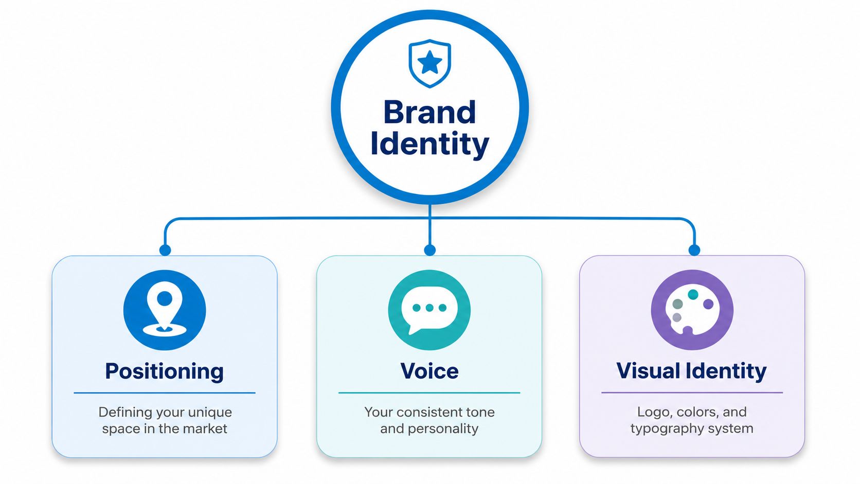
A strong identity rests on positioning, voice, and visual identity. Most owners obsess over the last one because it is visible. The better move is to treat all three as connected. If one is weak, the brand feels improvised, even if the logo looks polished.
Positioning decides why you matter
Positioning answers the question customers are asking: why should they pick you instead of the easier alternative? A bakery that positions itself around same-day celebration orders is not the same as a bakery that wins on custom design work. A local plumber that leads with emergency response is not the same as one that leads with maintenance plans.
Good positioning is specific enough to exclude some buyers. That sounds risky, but vague brands lose more often than focused ones. A small business with a crisp point of view can become easier to remember, easier to recommend, and easier to price with confidence.
Voice makes the brand feel like one company
Brand voice is the personality customers hear in emails, social posts, follow-up messages, and even service replies. If the website sounds polished, the DMs sound casual, and the customer service replies sound defensive, people feel the mismatch immediately. Voice does not need to be theatrical. It needs to be consistent.
A useful test is simple. Could a customer copy one sentence from your Instagram caption into your confirmation email and still believe it came from the same company? If the answer is no, your voice system is drifting.
Visual identity makes the brand easy to recognize
Visual identity covers your logo, color palette, typefaces, spacing rules, and layout choices. It is the fastest way to create recognition, but only when it is used with discipline. A logo with no rules becomes a random decoration. A color palette with no exact values becomes a guessing game.
Quick standard: If a designer, printer, or social media manager cannot tell what your brand should look like without asking three follow-up questions, the system is too loose.
The key is balance. Positioning gives the brand a reason to exist, voice gives it a personality, and visual identity gives it a face. When all three work together, customers don't just notice the brand, they remember it.
Overlooked Branding Levers Most Small Businesses Miss
Most small business branding advice stops at the surface. It covers the logo, the colors, and maybe the website header, then moves on. The better brands do more than look consistent. They make sure the brand is understood inside the business and aimed at the right buyers outside it.
Internal alignment keeps the promise intact
A brand breaks down fast when the team interprets it differently. One employee promises speed, another promises premium care, and a third improvises a discount to close the sale. The customer experiences that as confusion, not flexibility. That is why internal branding matters as much as external design.
The Hartford's small business branding guidance calls out alignment and internal branding as an overlooked area in its branding overview. In practice, that means hiring language, customer service scripts, packaging notes, and even how staff talk about the business should reflect the same core promise. If you sell uniforms, event merchandise, or private-label goods, the internal version of the brand has to be just as controlled as the public-facing one.
A brand is not what the owner says it is. It is what every employee repeats when the owner isn't in the room.
Underserved segments create cleaner positioning
A second blind spot is the habit of aiming at everybody. That usually leads to bland messaging. Research on underserved markets argues that businesses often miss value by assuming the obvious demographic is the only viable buyer, when the opportunity may sit in cross-purchases, total basket behavior, store-level differences, and price or promotion sensitivity from Circana's underserved markets commentary.
That lens changes the branding question. Instead of asking, “How do we appeal to a broad audience?” ask, “Which underrecognized buyer has a specific problem we can own?” A small business does not need mass-market awareness to win. It needs a defensible reason for a specific group to care.
If you want the brand to feel sharper, start with who you are not serving as well as who you are. That clarity makes the message stronger, the design simpler, and the marketing cheaper to run.
Building Your Brand Style Guide and Running a Brand Audit
A brand style guide is the operating manual that keeps a small business from drifting into mixed signals. Without one, every new hire, vendor, and social post can create another version of the company. The audit comes first, because you cannot correct what you have not checked.
Start with a touchpoint audit
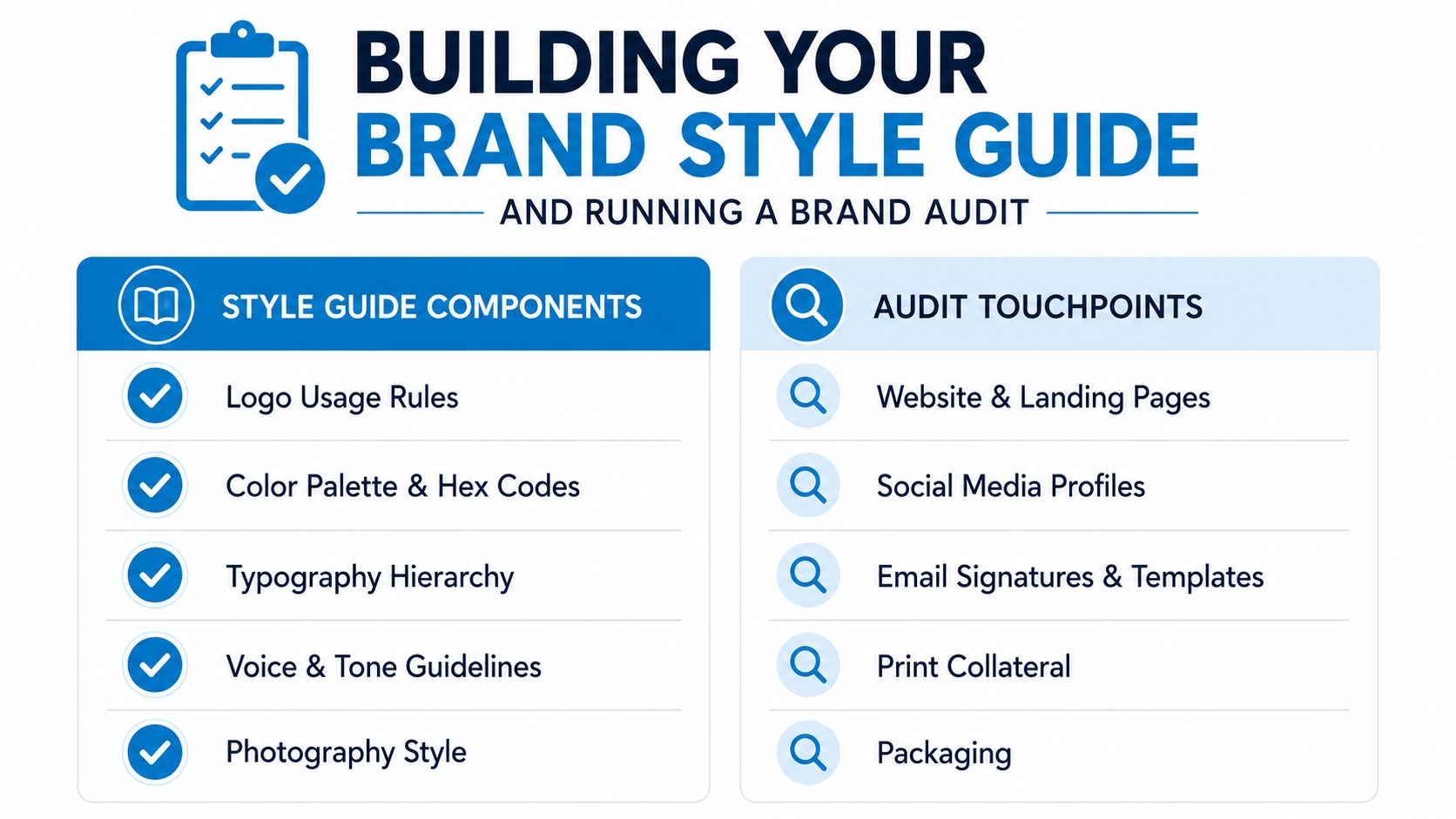
Walk through the brand as a customer would. Review the website, landing pages, social profiles, email signatures, packaging, receipts, and anything else that leaves your business in public. Look for mismatched colors, inconsistent logo use, outdated copy, and tone shifts that do not match the rest of the brand.
The goal is not perfection on day one. The goal is to expose drift. A brand audit often shows that a business has more identities than it thinks it does, especially when several people have touched the materials over time. That matters even more in small businesses, where a few inconsistent details can make the company feel less established than it is.
Build the rules you can enforce
A practical style guide should include logo minimum size, spacing rules, and misuse examples so people know what not to do. It should also document exact color values in HEX, RGB, and CMYK, because “close enough” is how consistency disappears. Typography should be defined with exact sizes and line spacing for both web and print, not just a named font.
Include these essentials:
- Logo usage rules: primary logo, secondary logo, small-size version, and examples of incorrect use.
- Color standards: exact values for digital and print so vendors can match more reliably.
- Typography hierarchy: headers, subheads, body text, and spacing rules for different formats.
- Voice and tone guidance: how the brand sounds in sales, service, and social content.
- Template rules: post layouts, packaging labels, and recurring formats.
For print color matching, a useful technical reference is this PMS color matching guide, especially when you need apparel, packaging, and marketing pieces to stay aligned. If your brand depends on exact color reproduction, this kind of reference helps reduce rework later.
The guide should also reflect how the team works in practice. If a rule cannot survive a busy shift, a rushed vendor handoff, or a last-minute event order, it will not hold up in practice. That is where internal alignment matters, because branding breaks fastest at the handoff points.
Make the guide usable, not decorative
A style guide fails when it becomes a PDF nobody opens. Keep it short enough that a new contractor can use it quickly. Store it where your team works and update it after real mistakes, not months later.
The best style guide answers the common questions before anybody has to ask them. It should help a manager approve a flyer, a designer prep a layout, and a printer match a package without guessing. For teams building from scratch, it is often worth reviewing clothing brand basics with Trendlytic alongside your own standards so the visual rules and the production choices line up.
A strong guide also gives you a clean way to correct underused audience segments without redesigning everything. You can adapt one approved system for different customer groups, store formats, or service lines while keeping the core identity intact. That is a lot easier than rebuilding the brand every time the business tries to speak to someone new.
Using Branded Apparel and Promotional Products to Reinforce Your Identity
Physical brand touchpoints do a job digital assets can't always do. They move through a room, travel to events, and show up in the background of real conversations. A well-chosen shirt, hat, or bag can carry the brand farther than a one-off ad impression because people keep seeing it.
Apparel turns staff into consistent brand signals
When employees wear branded polos or T-shirts, every customer interaction becomes a visible brand moment. That works especially well in retail, food service, field operations, and events, where staff are already in front of the public. A clean uniform system also reduces the look of improvisation, which matters more than many owners realize.
Decoration method should match the item and the order. Screen printing works well for repeat graphics and larger runs. Embroidery gives a sharper feel on polos, hats, and outerwear. Direct-to-film can handle detailed artwork on a wide range of garments, while sublimation fits certain polyester items and all-over designs.
Rule of thumb: Choose the decoration method after the garment, not before it.
Promotional items extend the brand beyond the transaction
Promotional products work when they are useful, not when they are random. A hat, tote, or wearable item keeps the brand in circulation after the first interaction. For events, trade shows, and customer giveaways, the item has to feel like part of the brand system, not an afterthought. That is where the style guide from the previous section pays off.
For teams building apparel into a larger identity program, clothing brand basics with Trendlytic is a useful reference point for thinking through garments as brand assets rather than just inventory. And if custom headwear is part of the plan, custom hats for business can be a practical way to keep the look consistent across staff and events.
Dirt Cheap Product, Inc. is one option for businesses that need custom apparel and promotional items with decoration methods like screen printing, embroidery, direct-to-film, and sublimation. The value is not just the product, it is the repeatable execution across shirts, polos, sweaters, outerwear, hats, and bags.
Measuring Brand Performance with Metrics That Matter
A brand improves only when the team measures the right signals and acts on them. Vanity numbers can make reporting look active, but they rarely show whether people remember the business or choose it over a competitor. For small businesses, the most useful metrics are the ones that connect awareness to behavior.
Branded search volume is the clearest signal
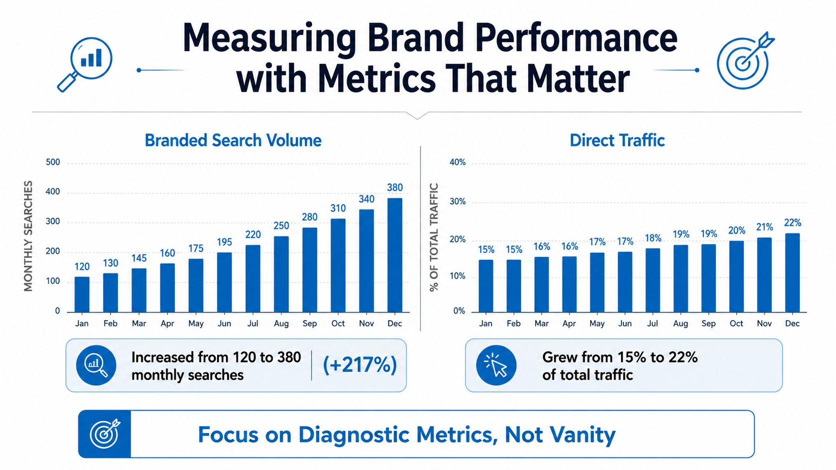
A strong KPI should reflect demand created by the brand itself. Branded search volume does that better than most metrics because it captures searches for your name, not just your category. In its KPI guidance, Databox treats branded search volume as a strong indicator of brand strength, and that view lines up with how brand metrics are often used to judge whether people know a brand, feel something about it, and act on that recognition.
That makes branded search volume especially useful for small businesses. If awareness is rising, more people should start looking for the business by name. If the brand is forgettable or too similar to competitors, that search behavior stays flat even when marketing activity is high.
Keep trendlines, not one-off snapshots
Brand measurement works best as a repeatable system. Track the same metrics on the same schedule so you can see movement tied to campaigns, product changes, staffing shifts, or market changes. Monthly checks are useful for branded search, direct traffic, and social activity. Quarterly reviews are better for larger questions, like whether the brand promise still matches how the business is showing up.
Social and video content also matter more than they used to for small business branding. From the Tailor Brands branding statistics overview, small businesses are putting money into social media marketing and video marketing as part of branding. That does not mean every company needs to be everywhere. It means digital brand activity now sits inside the operating system, not beside it.
Watch the metrics that connect to revenue
If a brand metric never affects a decision, it is too abstract to be useful. Use the numbers to decide where to invest, which message to keep, and which touchpoints need repair. A lift in branded search can justify more content. A drop in direct traffic can signal weak offline visibility, unclear signage, or a website that is harder to remember than it should be.
For event-driven businesses, these trade show giveaway ideas can help turn a physical impression into something you can see later through recall and search. That is the kind of branding work that compounds because it shows up in memory and in the data.
Your 90-Day Brand Rollout Plan for Small Business Success
A brand rollout gets messy when it tries to do everything at once. The smarter path is phased, visible, and realistic. Three months is enough time to build a solid foundation if the work is sequenced well.
Days 1 to 30 focus on clarity
Start with the brand audit, then define positioning, voice, and visual identity. Decide what the brand stands for, who it is for, and what it should sound like. This first month is also when you identify the touchpoints that cause the most confusion, because those are the first ones to fix.
Do not overbuild assets yet. You need decisions before decoration.
Days 31 to 60 lock the system down
Build the style guide, create the template set, and order the first round of branded apparel or promotional items. Update the highest-visibility digital touchpoints, especially the homepage, social headers, and profile bios. If you use staff uniforms or customer-facing merch, bring those into the same visual system so the offline and online versions match.
Practical sequence: Fix the most public touchpoints first, then move toward the less visible ones.
This is also the right phase to get team buy-in. Share the rules, explain the why, and make sure people know what gets approved and what gets rejected. A brand only stays consistent when the team can repeat the logic without escalation.
Days 61 to 90 make it repeatable
Launch a consistent social content rhythm, train the team on the voice rules, and set up the measurement system. Pick the metrics you will review monthly, then assign someone to own the check-in. If budget is tight, prioritize the items customers see most often before you touch lower-impact assets.
The rollout should end with a clear list of what is done, what still needs work, and what can wait. That keeps the brand moving without making the business feel like it is constantly in rebrand mode.
Dirt Cheap Product, Inc. helps businesses turn branding into something people can see and wear, with custom apparel and promotional items like shirts, hats, polos, bags, and other event-ready pieces. If you need branded products that keep your visual identity consistent across uniforms, merch, and giveaways, visit Dirt Cheap Product, Inc. and review what they can produce for your next rollout.