You're probably here because the apron seems simple, but the order doesn't. You need something your staff will readily wear, your logo needs to look clean, and you don't want to pay for the wrong print method because nobody asked the right questions upfront.
That's exactly where most first apron orders go sideways. The apron itself, the fabric, the logo file, the print location, and the order size all affect the result. Good printing on aprons starts before ink or thread ever touches the garment.
Table of Contents
- Choosing the Right Apron for Your Brand
- Decoding Custom Apron Decoration Methods
- Artwork Guidelines for a Perfect Print
- Understanding Pricing Volume and Timelines
- How to Order Custom Aprons with a Supplier
- A Buyer's Checklist for Success and Apron Care
Choosing the Right Apron for Your Brand
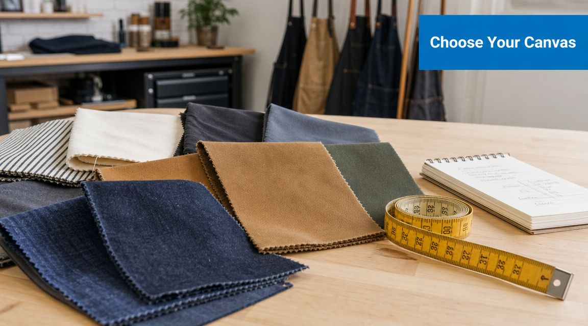
Most buyers start with color and price. Printers start with fabric and use case. That's the right order, because the apron is your print surface, your workwear, and your brand display all at once.
Printed aprons have been doing this job for a long time. Their print history is tied to use as a low-cost, high-visibility alternative to full uniforms, and by the mid-20th century mass production had turned aprons into common consumer and promotional items, which helped establish them as a practical canvas for logos and branding, as noted in the American Antiquarian Society proceedings on apron and printing history.
Match the fabric to the job
If your team works around flour, oils, sauces, or general retail mess, the fabric matters as much as the logo.
- Cotton works well for comfort: Cotton usually feels softer and more natural, which makes it a solid choice for cafés, bakeries, gift shops, and front-of-house settings where comfort matters.
- Polyester handles hard wear better: Polyester or poly-heavy blends are often easier to live with in active environments because they tend to be more resilient in repeated commercial use.
- Blends sit in the middle: A cotton-poly blend is often the safest first order when you need balanced comfort, easier care, and broad decoration compatibility.
A good apron choice solves two problems at once. It supports the print method and it fits the shift your staff actually works.
Pick the apron style your team will wear
Not every apron has the same branding value once it's on a person.
Bib aprons give you the clearest chest print area. They're the most common choice for kitchens, tasting rooms, baristas, and vendors because they protect more of the body and show the logo well.
Bistro aprons make sense for servers and hospitality staff who need waist-down coverage and easy movement. They look cleaner in dining environments, but they limit prominent chest branding because there is no upper panel.
Waist aprons are useful for retail counters, events, and fast service roles where staff need pockets and a lighter uniform piece. They're practical, but they give you less room for a larger logo.
For businesses comparing full uniform systems, this roadmap to understanding NZ chef uniforms is helpful because it shows how aprons fit into a broader hospitality uniform decision, especially when consistency across roles matters.
Think beyond the first order
A smart buyer doesn't only ask, “Will this look good?” Ask, “Will I want to reorder this exact apron later?”
Use this quick filter before you choose:
- Check stock continuity: Ask whether the apron style is commonly restocked.
- Check color consistency: Black, navy, and neutral tones are usually easier to match on repeat orders than trend colors.
- Check size and strap adjustability: Staff adoption drops fast when the apron fits awkwardly.
- Check bulk planning: If you expect turnover, seasonal staff, or event reorders, it helps to review bulk apron options for branded programs.
The right apron isn't the cheapest blank. It's the one that still looks right after repeated wear, still fits your brand, and still works with the decoration method you need.
Decoding Custom Apron Decoration Methods
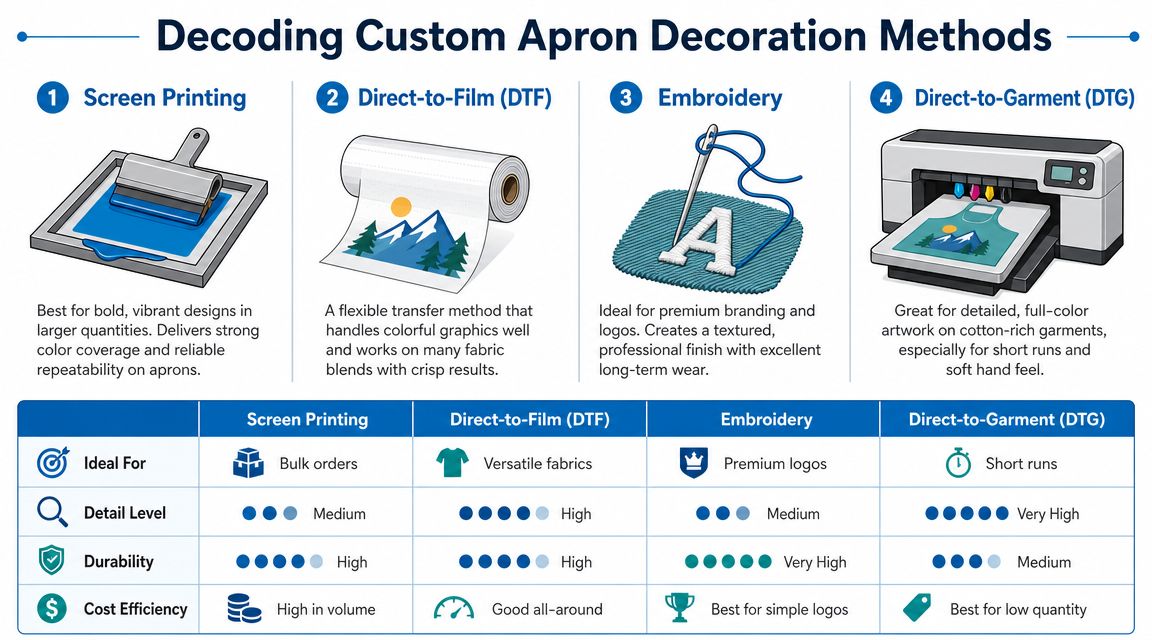
Clients usually ask which method is best. The better question is which method is best for your fabric, artwork, and order size.
Start with the fabric, not the logo
For aprons, fabric chemistry decides what will work. Polyester fibers are suited to dye-sublimation, where heat turns ink into gas that bonds with the fabric. Cotton doesn't sublimate, so it needs surface-bonding methods such as screen printing or DTF, as explained in this apron printing technical video demonstration.
That one fact clears up a lot of confusion. If someone wants a soft all-over polyester print, sublimation may be a fit. If they bring in cotton bib aprons with a chest logo, you're generally looking at methods like screen printing, transfers, or embroidery.
Apron Decoration Method Comparison
| Method | Best For | Feel on Fabric | Durability | Cost at Low Volume | Cost at High Volume |
|---|---|---|---|---|---|
| Screen Printing | Simple logos and repeat orders | Ink sits on surface | Strong when matched to fabric and use | Usually less favorable | Usually more favorable |
| Direct-to-Film (DTF) | Full-color logos and short runs | Transfer sits on surface | Good when applied correctly | Usually more favorable | Can be less efficient than screen print |
| Embroidery | Premium uniform branding | Textured and raised | Strong for many workwear uses | Higher | Still higher than basic print methods |
| Dye-Sublimation | Polyester aprons and full-coverage color | No surface hand | Excellent wash durability on polyester | Depends on blank and setup | Strong when product and artwork fit |
For buyers comparing logo methods more broadly across workwear, this guide to screen printing vs embroidery helps frame the visual and budget trade-offs.
Screen printing
Think of screen printing like a controlled stencil process. Ink is pushed through a prepared screen and laid onto the apron in a defined shape.
Screen printing shines when the logo is bold, clean, and not overloaded with tiny detail. If your design is one-color or a few solid colors and you're ordering for a whole team, this is often the most efficient route.
What works:
- Simple artwork: Wordmarks, icons, and bold chest logos print cleanly.
- Larger runs: Setup is easier to justify when quantity climbs.
- Consistent branding: Repeat jobs are straightforward if the artwork stays the same.
What doesn't:
- Tiny gradients and photo effects: It's not the easiest fit for that kind of art on a work apron.
- Frequent artwork changes: If every apron needs different names or designs, this method becomes less convenient.
Direct-to-Film DTF
DTF works like a high-quality transfer system. The design is printed to film, then heat-applied to the garment.
For many first-time apron buyers, DTF is the practical middle ground. It handles multi-color logos well, doesn't require the same setup logic as screen printing, and works on cotton where sublimation won't.
Practical rule: If your order is small, your logo has multiple colors, and you need flexibility, DTF is usually one of the first methods worth pricing.
What works:
- Short runs: Useful for small teams, pop-ups, and trial orders.
- Complex logos: Better for gradients and detailed color transitions.
- Mixed quantities: Easier when you don't want to commit to a larger order.
What to watch:
- Surface feel: You'll feel the transfer on the fabric.
- Heat discipline: Poor application creates lifting, weak adhesion, or other finishing issues.
Embroidery
Embroidery isn't printing, but buyers often compare it directly because it competes for the same budget.
It gives aprons a more formal, uniform-ready look. A stitched logo on the upper chest can look excellent for restaurants, breweries, host teams, and premium retail environments.
Best use cases:
- Simple marks: Clean logos, initials, and short business names.
- Durable presentation: Strong for repeated wear when the apron fabric can support stitching.
- Brand image: If you want a polished look more than a large graphic statement, embroidery often wins.
Limits:
- Fine detail: Small text and intricate shading can get lost.
- Large fills: Big embroidered areas can feel heavy and stiff on an apron panel.
Dye-sublimation
Sublimation is the specialist option. It's excellent when the apron is polyester and the project calls for color integrated into the fabric rather than sitting on top of it.
That creates a very different finish from transfers or ink deposits. The print has no surface hand, and on the right polyester blank it holds up very well in washing because the color bonds into the fiber itself.
What works best:
- Polyester aprons only: This is the key gatekeeper.
- Bright, full-color artwork: Especially where a smooth, integrated print matters.
- Retail, event, or merch-style aprons: Good fit when design impact matters as much as uniform function.
What doesn't:
- Cotton aprons: Not a match.
- Fabric uncertainty: If the apron composition is unclear, don't assume sublimation will work.
The strongest apron jobs come from narrowing choices early. Fabric first. Artwork second. Quantity third. Once those are clear, the print method usually becomes obvious.
Artwork Guidelines for a Perfect Print
Most print problems start in the file, not on the press. A logo can look sharp on a screen and still print poorly if the artwork isn't built for production.

What printers want from your file
For professional apron printing, a standard technical workflow often requires CMYK artwork, 300 to 450 dpi resolution, and 5 mm bleed on all sides, according to this personalised aprons production guide. Those specs help prevent visible pixelation and edge clipping during production.
That doesn't mean every client needs to become a prepress operator. It means you should know what matters before approval.
Use this checklist:
- Vector first: AI, EPS, or PDF files are usually the cleanest starting point for logos because they scale without going blurry.
- Raster only if high quality: If you only have PNG or JPG artwork, it needs to be high resolution at final print size.
- CMYK for print planning: Screen colors and print colors aren't the same thing.
- Fonts outlined: If text isn't converted to outlines, font substitution can change the job.
- Background removed: A white box around the logo is one of the most common customer file mistakes.
If your design will use softer-hand inks on apparel beyond aprons, this overview of water-based ink printing is useful for understanding how artwork choices can affect finish and feel.
Placement mistakes that show up on the finished apron
Aprons don't behave like flat T-shirts. The neck strap shifts the visible print area downward when the apron is worn, and seams or pockets can create pressure problems during application. In practice, chest prints usually need to sit higher than many first-time buyers expect.
That's one of the reasons digital proofs matter so much on aprons. A logo that looks centered on a flat mockup can look low once somebody puts the garment on.
Put the logo where people will actually see it when the apron is worn, not where it looks centered on a tabletop.
A few placement rules save a lot of disappointment:
- Center chest is the safe standard: Best for logos that need visibility from a distance.
- Left chest works for subtle branding: Better when the logo is compact and the environment is more premium or formal.
- Pocket prints need caution: Pockets interrupt pressure and alignment. They can look great, but only when the print area is planned correctly.
- Large lower prints are often wasted: Hands, counters, and body movement block them during normal use.
Artwork complexity also affects production choices. A simple one-color logo gives you more flexibility. A detailed multi-color crest with fine outlines narrows the decoration methods fast and can push the project into a different cost bracket.
The cleanest jobs usually come from restraint. Strong logo, readable text, disciplined placement.
Understanding Pricing Volume and Timelines
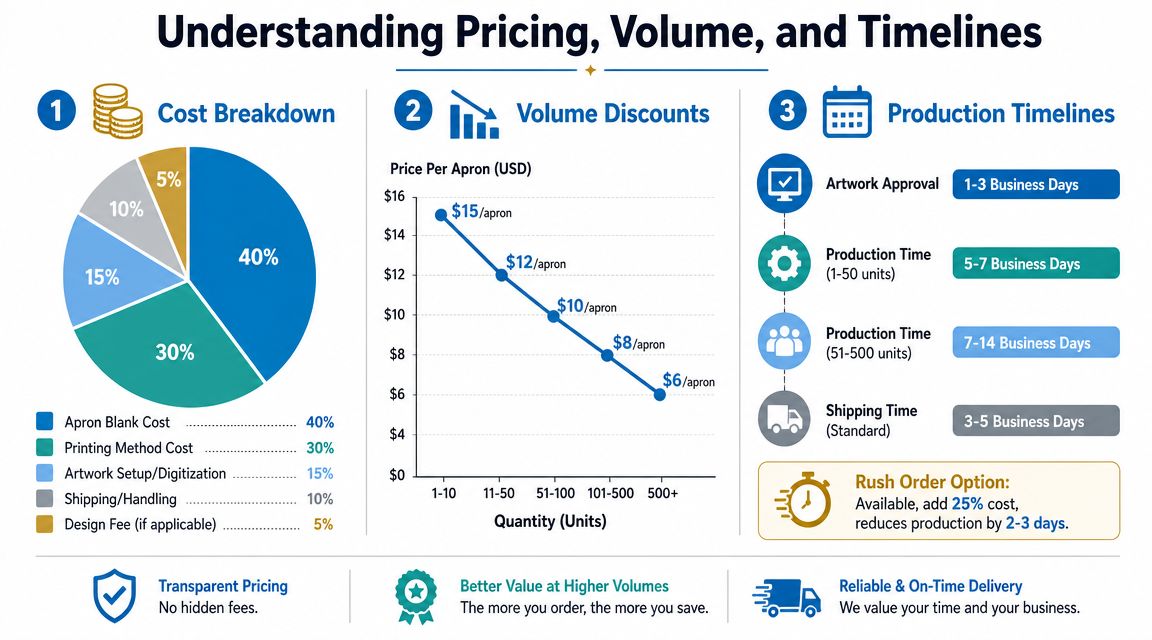
A first apron quote often catches new buyers off guard. The price is shaped by the garment, the decoration method, the artwork condition, and the way the order is built. Change any one of those, and the cost can move more than expected.
What Your Quote Includes
A typical quote covers more than a blank apron with a logo added on top.
- The apron itself: Fabric, construction, color, and brand all affect the base cost.
- The decoration process: Screen printing, DTF, embroidery, and sublimation have different setup steps, labor time, and material costs.
- Artwork preparation: File cleanup, redraw work, and embroidery digitizing may be needed before production starts.
- Print locations and detail level: One chest logo is straightforward. Multiple placements, personal names, or dense stitched artwork add time and handling.
- Freight and schedule: Rush production and expedited shipping usually cost more.
This is the part many first-time buyers miss. A cheaper apron can end up costing more to decorate if the fabric is difficult, the logo needs extra prep, or the artwork pushes the job into a slower method. The best value comes from matching the apron, the logo, and the print method early, before the quote turns into revisions.
Why short runs and large runs price differently
Volume changes the math because setup cost does not disappear. It gets spread out.
For larger orders, screen printing often makes more sense because the setup is paid once and shared across more pieces. For smaller runs, DTF is often easier to justify because it handles full-color art without the same setup structure. Embroidery follows a different pattern. It gives a premium look, but stitch count and runtime matter more than color count, so a detailed logo can stay expensive even when the order grows.
That is the real decision point. Simple art on a bigger order usually rewards standardization. Complex art on a smaller order usually rewards flexibility.
Small runs usually cost more per apron because you are paying for setup efficiency you cannot spread very far.
If budget is tight, there are usually three ways to bring the unit price down: raise the quantity, simplify the artwork, or choose a decoration method that better fits the order size. Those are practical trade-offs, not sales tactics.
Turnaround depends on order readiness
Lead time is shaped as much by decision speed as by shop capacity. Two apron orders placed on the same day can finish on very different schedules if one arrives with clean files and clear approvals, while the other needs artwork repair, sourcing changes, and multiple proof rounds.
Five factors usually control the schedule:
Blank stock availability
Production cannot start until the apron is available in the right style, color, and quantity.Artwork condition
A production-ready vector file moves faster than a low-resolution image pulled from a website or social profile.Proof approval time
Shops can prepare the order quickly, but the job usually pauses until the proof is approved.Decoration method
Some methods are faster to set up and schedule than others.Order complexity
Individual names, mixed print locations, or split shipments add handling time.
The cleanest way to protect your deadline is to share the event date, target quantity, and final artwork at the start. If the date is fixed, a good supplier can usually tell you which apron style and decoration method give you the best chance of hitting it without paying for avoidable rush charges.
How to Order Custom Aprons with a Supplier
A smooth apron order usually follows the same pattern. Trouble starts when a buyer skips details early and then tries to fix them after the proof.
The quote stage
Send four things first: the logo file, the apron style you want, the quantity, and the in-hands date. If you don't know the print method yet, that's fine. A supplier can usually recommend one once they know the fabric and artwork.
Useful details to include:
- Your environment: Restaurant, bakery, retail, events, workshop, or merch.
- Your logo goal: Small uniform mark, larger brand statement, or premium stitched look.
- Your reorder needs: One-time event or ongoing staff uniform.
- Your budget direction: Not an exact number if you don't have one, but at least whether cost control is the top priority.
The proof stage
This is the checkpoint that prevents expensive mistakes. Review the digital proof carefully and look at the details buyers often ignore the first time.
Check these items one by one:
- Spelling: Company name, slogan, names, and location text.
- Placement: Especially chest position on bib aprons.
- Scale: A logo can be technically correct and still look too small.
- Color intent: Printed color on fabric won't look exactly like a backlit phone screen.
- Garment color: Contrast is part of the design.
Don't just glance and reply “looks good.” Compare the proof to what staff will wear in real use.
Approval and production
Once you approve the proof, most suppliers move the job into production. That's when changes become harder, slower, or impossible without extra cost.
A good approval process is simple:
- One person on your team owns final sign-off.
- That person checks logo, garment, placement, and count.
- Approval is sent clearly and in writing.
- The supplier confirms production.
If multiple managers are involved, collect feedback before replying. Split approvals create delays and increase the chance that the wrong version gets printed.
Ordering custom aprons doesn't need to be complicated. It just needs one clear decision-maker and complete information at the start.
A Buyer's Checklist for Success and Apron Care
A successful apron order usually comes down to a few disciplined choices. Most mistakes aren't technical disasters. They're small oversights that pile up, like choosing the wrong fabric for the method, approving a low-resolution logo, or placing the print too low on the chest.
Final pre-order checklist
Use this before you approve anything:
- Confirm the work environment: Heat, spills, front-of-house presentation, and wash frequency should all influence apron choice.
- Match the fabric to the decoration: Don't choose the print method first and hope the apron will cooperate.
- Simplify the logo if needed: Fine detail often looks worse on workwear than on a screen.
- Approve placement on the actual apron style: A bib, bistro, and waist apron do not present the logo the same way.
- Plan reorders early: If this is a staff uniform, keep the exact style, color, and decoration notes on file.
- Ask who will wash them: Home laundering and commercial laundering affect how conservative you should be with decoration choices.
If your team sends uniforms out rather than washing in-house, services like Gold Coast wash and fold services show the kind of outsourced garment care setup many businesses use when they want to keep staff wear in rotation without adding more internal workload.
Care that protects the decoration
Once the aprons arrive, maintenance matters. Good printing on aprons can be shortened quickly by rough wash habits.
Basic care rules that help most decorated aprons last longer:
- Wash with care: Cold or moderate wash settings are usually safer than aggressive heat-heavy cycles.
- Turn decorated aprons inside out when practical: This reduces surface abrasion on printed areas.
- Avoid high-heat drying: Excess heat is hard on transfers, prints, and sometimes the apron fabric itself.
- Separate heavily soiled loads when possible: Grease, chemicals, and rough items can wear down decoration faster.
- Follow method-specific guidance: Embroidery, transfers, and sublimated polyester don't all respond the same way to laundering.
The print method gets the attention on day one. The wash routine decides how the aprons look months later.
Treat apron ordering like any other branded uniform purchase. Choose for the job, approve with care, and maintain them like they matter. That's how you get a result that looks professional past the first week.
If you're ready to price out custom aprons, Dirt Cheap Product, Inc. can help compare apron styles, decoration methods, and artwork requirements so you can choose a setup that fits your budget, brand, and turnaround needs.