
You've got a logo you already use on your website, email signature, and social profiles. Then you try to order branded T-shirts, hats, mugs, or tote bags, and the simple part ends fast. The printer asks for a vector file, wants Pantone colors, mentions safe zones, and sends back a proof that somehow makes your brand look different from what you approved on screen.
That's where most first merchandise orders go sideways. The logo itself isn't always the problem. The problem is that a logo made for digital use isn't automatically a good logo for gifts. Production has different rules, and those rules exist for a reason. They determine whether your mark looks crisp on a polo, muddy on a bag, or unreadable on a cap.
That matters because branded gifting keeps growing as a business tool. The global corporate gifting market was valued at $765.46 billion in 2023 and is projected to reach $839.57 billion in 2024, which shows how important branded items have become for client relationships and brand recognition, according to corporate gifting market data. If your team is also weighing presentation, durability, and environmental choices, a practical resource on sustainable gifting for HR teams can help you think beyond the logo itself and into the full gift experience.
Table of Contents
- Why Your Standard Logo Is Not Ready for Gifts
- Get Your Logo File Ready for Any Product
- Adapt Your Logo for Maximum Impact
- Match Your Logo to the Best Decoration Technique
- Perfecting Logo Placement and Size on Gifts
- Your Pre-Order Proofing Checklist
Why Your Standard Logo Is Not Ready for Gifts
A logo that looks sharp on a laptop screen can fail badly on fabric or hard goods. Screen graphics live in a clean, backlit environment. Decorated products deal with thread, ink spread, seams, fabric texture, curved surfaces, and viewing distance.
That's why the “upload your logo” step often feels harder than choosing the product. Most businesses have a PNG, maybe a JPG, and a brand color that “looks right” online. Production needs more than that. It needs a file that can scale without breaking, colors that can be matched physically, and artwork that stays recognizable when it gets much smaller than it ever appears on your homepage.
Practical rule: A good website logo is a starting point. A good logo for gifts is a production asset.
The biggest mistake I see is treating all uses as equal. They aren't. A left chest embroidery on a polo asks different things from a full-front screen print on a T-shirt. A mug wrap asks different things from a woven patch on a beanie. If you send one generic file to every vendor, you're leaving quality to chance.
Three things usually go wrong first:
- The file is too limited. A low-resolution image may look acceptable on screen but won't hold up in print.
- The colors aren't defined for production. “Navy” on a monitor isn't the same as a specified print or thread color.
- The logo is too detailed. Fine lines, tiny type, and soft gradients often collapse on smaller gift items.
When those issues show up together, the final piece can look cheap even if the blank product is good. That's frustrating because the fix usually isn't a full rebrand. It's preparation. Once the logo is built for production, ordering branded gifts gets much easier and much more consistent.
Get Your Logo File Ready for Any Product
Start with the source file
A vendor can only print or stitch what the file allows.
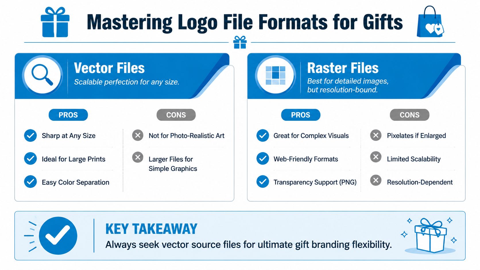
For branded gifts, the best starting point is a vector file such as AI, EPS, or SVG. Vector artwork is built from paths, so it can scale up or down without losing edge quality. That matters because the same logo may need to appear on a small pen barrel, a mid-size mug, and a larger tote. If the file stays clean at every size, the finished product looks intentional instead of improvised.
Raster files such as PNG and JPG work differently. They are made of pixels, so they have a hard limit. Once a file is enlarged past that limit, curves start to break, small type softens, and the logo can look cheaply reproduced even when the product itself is good.
I see this problem often with logos pulled from websites or social profiles. They were built to look fine on screen, not to hold up in production.
If your logo was created without organized source files, it helps to understand what rebuilding involves before you place an order. This practical guide to making logos in Illustrator explains why cleaned-up artwork leads to more consistent decoration across different products and vendors.
Know what 300 DPI changes
300 DPI is not a random file request. It affects how much detail survives when ink, toner, or transfer processes turn digital art into a physical item.
Here is the practical reason vendors ask for it:
- On T-shirts, low-resolution artwork produces soft edges and weak-looking text.
- On small printed items, a fuzzy file makes the logo look slightly off, even if the layout is correct.
- On embroidery prep, a poor raster reference forces the digitizer to guess where edges begin and end, which can change the shape of letters or small icons.
That last point matters more than many first-time buyers expect. Embroidery does not reproduce a logo the way a screen does. The digitizer interprets it into stitches. If the source art is blurry, the stitch file starts from a bad reference, and the final result can drift from your brand before the machine even starts.
Keep the vector file as the master. Export a high-resolution raster version only when a specific production method requires it.
Use the right color language
Color specs are where brands often lose consistency.
Your website logo may be defined in RGB or HEX, which is fine for digital use. Physical products usually need CMYK for print or Pantone Matching System (PMS) references when color matching needs to stay tight across runs and materials. Thread charts for embroidery add another layer, because thread is matched to the nearest available color, not reproduced like light on a screen.
That is the why behind the spec sheet. Without clear color references, a navy shirt print can come out too purple, a mug logo can look flat, and embroidered thread can feel disconnected from the rest of your brand. None of those errors may be dramatic on their own, but together they make the merchandise look less controlled.
A solid handoff package should include:
- Vector master file in AI, EPS, or SVG
- High-resolution backup in PNG or TIFF at 300 DPI or higher
- Color references for PMS, CMYK, and RGB/HEX
- Font details or outlined text to prevent substitutions
- Approved logo versions such as full color, one color, and reversed white
Each item on that list protects a different part of the final product. Sharp files prevent blurry prints. Defined colors reduce off-brand results. Approved variations stop a vendor from improvising when your full logo does not fit the decoration method. That preparation saves time, avoids rework, and gives you a much better chance of liking the proof the first time.
Adapt Your Logo for Maximum Impact
You approve a logo on screen, then see the first stitched sample on a cap and realize the name is hard to read, the border looks uneven, and the whole mark feels smaller than expected. That usually happens because the standard brand logo was sent to production without adapting it for the actual imprint area.
Gift products reward clarity. Small print zones, textured materials, curved surfaces, and decoration limits all strip away fine detail. The version that performs best is usually the one built to survive those conditions while still looking recognisably on-brand.
Small items expose weak logo choices
A logo does not fail at small size because the brand is weak. It fails because the artwork relies on details that only hold up on screens or larger formats. Thin rules, tiny taglines, layered outlines, gradients, and dense badges are common trouble spots.
That matters for quality, not just aesthetics.
If a line is too thin, embroidery can turn it into broken stitching. If text gets too small, print can fill in the counters and make letters look muddy. If a gradient carries too much of the identity, a one-color decoration can flatten the logo into something generic. The technical spec affects what the recipient sees in hand.
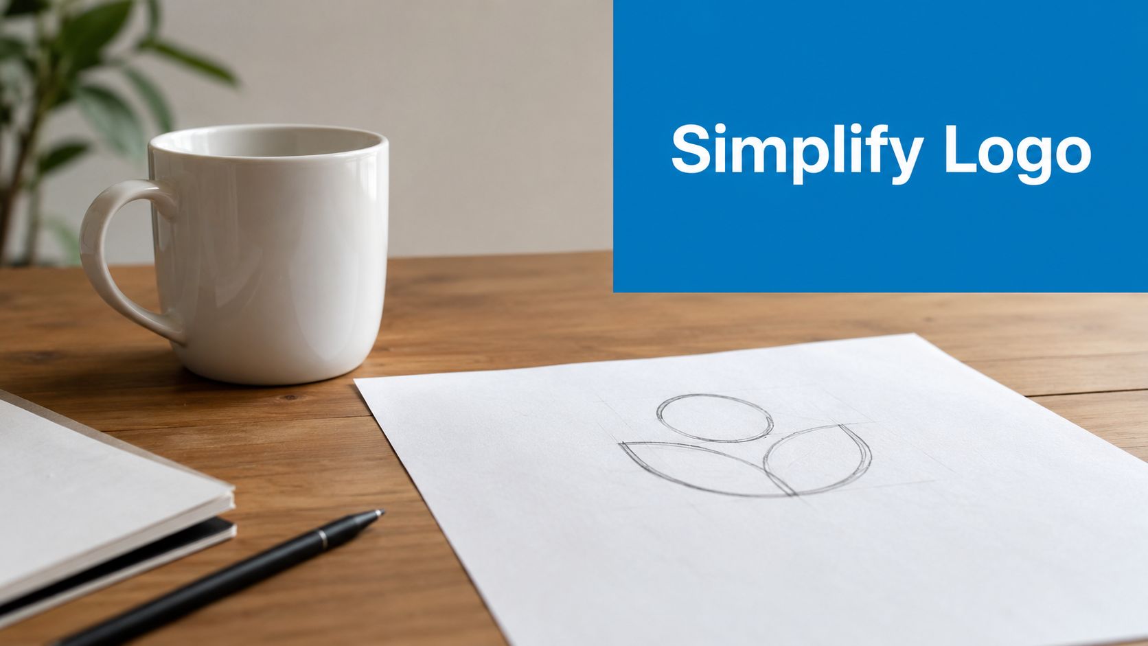
A quick screen test helps. Reduce the logo until it matches the imprint area of a pen, keychain, patch, or chest print. If the name blurs, the silhouette collapses, or the icon loses its shape, use a simplified version. As noted earlier, small-scale legibility is a practical production check, not a design preference.
For another practical overview of how logos need to scale, this logo scalability video overview is useful.
At small size, recognition comes from silhouette, spacing, and contrast long before anyone notices fine detail.
A short visual example helps when you're judging simplification choices:
Build reduced versions before the vendor has to improvise
The safest approach is to approve a small set of logo variants before ordering merchandise. Vendors make substitutions when they are missing a usable version. That is how taglines disappear without approval, spacing gets compressed, or a full-color mark gets converted poorly for a one-color application.
A practical logo kit for gifts usually includes:
- Primary logo for larger, cleaner print areas
- Simplified lockup with fewer details for compact placements
- Icon or monogram for very limited spaces
- One-color artwork for decoration methods that cannot reproduce the full build cleanly
Each version has a job. That is the point.
If you are deciding what to remove, cut elements the customer will not notice at normal viewing distance. Start with tiny separators, hairline borders, fine shadows, small legal text, and secondary taglines. Keep the parts that carry recognition: the core shape, distinctive letterforms, and the color relationship when the decoration method can hold it.
This decision also affects perceived quality. A clean monogram engraved on a tumbler often looks more deliberate than a crowded full logo squeezed into the same space. Brands selling premium corporate gifts or researching personalised gift ideas for him often get better results from restraint than from trying to force every brand element onto every item.
If you need help choosing which logo version fits which product, this guide on how to choose the right logo decoration method is a good next reference.
Match Your Logo to the Best Decoration Technique
A logo that looks sharp on screen can fail fast on the wrong product. The usual problem is not the logo alone. It is the mismatch between the artwork specs, the decoration method, and the material underneath.
Technical prep starts to affect the finished gift in a very visible way. Vector files help printers keep edges crisp at larger sizes. Simplified art prevents thread from filling in small gaps during embroidery. Correct color builds help avoid a navy logo turning purple on a shirt or a subtle gradient breaking into bands on a transfer.
Decoration Method Comparison
| Method | Best For | Feel / Texture | Logo Suitability | Durability |
|---|---|---|---|---|
| Screen printing | T-shirts, tote bags, straightforward apparel runs | Ink sits on fabric | Bold graphics, cleaner shapes, limited color sets | Strong when properly produced |
| Embroidery | Polos, hats, jackets, uniforms | Raised stitched texture | Simple marks, icons, short names, strong shapes | Very durable |
| Direct-to-film (DTF) | Detailed apparel graphics and flexible short-run work | Applied transfer with visible surface feel | More complex artwork and multicolor logos | Good for many apparel uses |
| Sublimation | Performance wear and compatible polyester items | No heavy surface feel when done on suitable material | Full-color art and logos needing smooth color transitions | Long-lasting on the right substrate |
| Custom patches | Hats, outerwear, bags, uniforms | Separate applied patch texture | Logos that benefit from a badge look or structured edge | Durable and easy to standardize |
A lot of gift programs also combine decorated products with finishing touches such as boxes, notes, or tags. If you're building a more personal bundle, these personalised gift ideas for him are useful for thinking about how branded items can sit alongside more individual keepsakes without feeling generic.
How each method behaves in production
Screen printing rewards discipline. Clean vector artwork, solid spot colors, and enough line weight give you a logo that reads clearly from a normal viewing distance. Fine details, soft gradients, and tiny reversed text are where jobs start to fall apart, especially on textured garments. If brand color accuracy matters, specify Pantone references early instead of approving a proof from an RGB screenshot.
Embroidery gives apparel a more permanent, premium feel, but thread is not ink. Satin stitches need width. Small counters close up. Tight spacing fills in. That is why a simplified logo file usually produces a better cap or polo than the full brand lockup. I often advise clients to judge embroidered art by silhouette first. If the shape is still recognizable from a few feet away, the stitch version is doing its job.
DTF handles detail that embroidery cannot hold and short runs that do not justify screen setup. It is a practical option for multicolor logos, small quantities, and artwork with thin lines. The trade-off is surface feel and finish. On some garments, that applied layer is completely acceptable. On soft retail-style apparel, it can feel more promotional than premium if the transfer area is too large.
Sublimation works best when the product is built for it. On compatible polyester surfaces, color becomes part of the material instead of sitting on top, which is why gradients and full-color artwork stay smooth. But the file still matters. Low-resolution raster art will still print soft, and color expectations need to match the white or light base that sublimation depends on.
Custom patches solve a different problem. They give a logo a controlled border, hide some material inconsistencies, and create one repeatable branded piece that can be applied across hats, bags, and jackets. This is often the safer choice for marks that look weak when stitched directly into rough or heavily textured fabrics.
If you are still weighing methods by product, artwork detail, and finish, this guide to choosing the right logo decoration method gives a useful side-by-side breakdown.
The right choice comes down to what you need the recipient to notice. Sharp print detail. Rich thread texture. Smooth color transitions. A badge-style finish. Choose the method that protects that priority, and the specs behind your file start making sense instead of feeling like supplier admin.
Perfecting Logo Placement and Size on Gifts
A logo can be technically correct and still fail on the finished gift.
I see this in first orders all the time. The file is clean, the colors are approved, and the decoration method is fine. Then the logo goes too close to a seam, wraps into a mug handle, or gets scaled down until the small text closes up. The result is a product that feels cheaper than the brand behind it.
Placement and size decide whether the specs you prepared survive production. They affect how the logo reads at arm's length, how balanced the item feels in hand, and whether details stay sharp on the final surface.
Placement affects readability before anyone notices the design
Standard positions exist because they usually work with how the product is used.
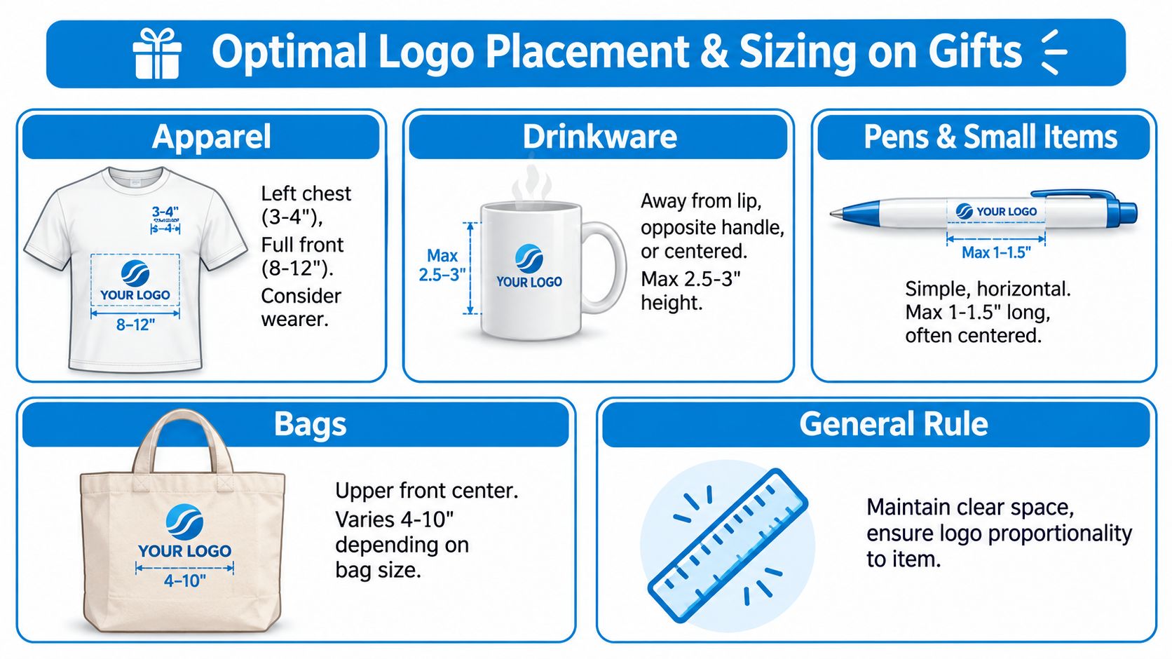
- Apparel: Left chest reads understated and professional. Full front gets more attention, but it also magnifies any issue with scale, color contrast, or print feel.
- Drinkware: The logo needs to sit where it stays visible without falling into a handle, taper, lid line, or curved wrap area that distorts the mark.
- Pens and small items: Wide, simple logo versions reproduce more clearly than stacked marks or artwork with fine detail.
- Bags: Upper front placement usually stays visible while the bag is carried and avoids visual conflict with pockets, zippers, and folds.
Those are starting points, not fixed rules. A tote with thick seams, a jacket with a chest pocket, or a bottle with a strong curve can all change the safest position. Good placement work is less about centering the logo on a mockup and more about checking where the product bends, hangs, closes, and gets handled.
Packaging also affects presentation. If your order includes gift sets, handouts, or labeled bundles, small finishing pieces can change how polished the whole kit feels. This practical guide on how to choose and use sticker tags is useful for those final presentation decisions.
Use clear space to protect the mark on the actual product
Clear space is not only a brand guideline issue. It is a production safeguard.
On screen, a logo can look neatly centered. On the physical product, that same art may sit too close to a hem, zipper, handle attachment, or stitching line. Once that happens, even a high-quality vector file will not save the result. The logo looks crowded, and crowded branding tends to read as lower quality.
A quick rule I use with new clients is simple. If the logo feels squeezed in the proof, it will usually feel worse in hand.
Check these points before approval:
- Margin around the mark: Leave enough room so the logo is not competing with seams, closures, hardware, or other graphics.
- Actual product shape: Flat proofs can hide how a logo shifts on a curved mug, tapered bottle, structured cap, or folded bag.
- Viewing distance: A small giveaway item needs a simpler, bolder mark than a back print or large tote panel.
- Orientation in use: A logo that looks straight on a flat mockup can appear tilted once the item is worn or carried.
For stitched products, placement gets even less forgiving because fabric structure changes how the logo sits after sewing. This placement guide for embroidery is a practical reference for chest, sleeve, hat, and bag positions before you approve the proof.
Your Pre-Order Proofing Checklist
The proof is your last cheap correction. After production starts, fixes get expensive fast.
A lot of buyers review proofs too casually because the artwork already feels familiar. That's exactly why mistakes slip through. Your brain reads what it expects to see. A careful proof review catches what your brand memory misses.
What to verify before approval
Brand guidelines should define minimum size and clear space requirements so the logo doesn't get distorted or crowded, according to this brand guidelines reference. In practice, that means checking the proof with production eyes, not just brand eyes.
Use this checklist line by line:
- Spelling and wording: Check every letter, tagline, department name, and event date.
- Correct logo version: Make sure the proof uses the approved full-color, one-color, or simplified mark for that product.
- Orientation: Confirm the logo isn't mirrored, rotated, or placed on the wrong panel.
- Scale: Ask whether the mark is large enough to read, but not so large that it overwhelms the item.
- Clear space: Look for crowding near seams, handles, collars, closures, or print edges.
- Color translation: If brand color matters, verify the intended PMS or print color reference is listed or clearly confirmed.
- Decoration method fit: Make sure the chosen method still makes sense for the artwork shown on the proof.
- Material interaction: Fleece, pique polos, nylon bags, and hard drinkware all affect how logos read.
- Quantity-critical details: If multiple sizes or product colors are in the order, confirm the logo treatment still works across all of them.
Approving a proof means approving the exact interpretation, not the general idea.
When a physical proof is worth it
For straightforward orders, a digital proof may be enough. For high-visibility uniforms, executive gifts, retail merchandise, or any order where color and texture matter, a physical sample is often the better call.
You're looking for the things screens hide:
- Thread density on embroidery
- Ink feel on fabric
- Real color under normal lighting
- Actual placement on the finished product
- How the logo reads at arm's length
If something feels slightly off in the sample, trust that reaction. Minor visual discomfort tends to multiply across a full run. The cleanest orders usually come from buyers who slow down for one careful proof cycle instead of rushing to production.
If you want help turning a website logo into a production-ready logo for gifts, Dirt Cheap Product, Inc. can help with apparel and promotional items, fast proofs, and decoration methods that match the product instead of fighting it. That's the difference between branded merch that feels disposable and branded merch people keep.