You've approved the logo, chosen a shirt color, and asked for a quote. Then the production questions arrive. Is that pastel mint an actual ink match? Will the tri-blend keep its shape after laundering? Does the order qualify for the decorator's minimum? A corporate t-shirt design becomes useful only when the artwork, garment, print method, quantity, and care requirements agree.
That production perspective matters because custom apparel has become a scaled branding channel, not a novelty purchase. One industry estimate valued the global custom T-shirt printing market at USD 5.16 billion in 2024, with a projection of USD 9.82 billion by 2030 and an 11.5% annual growth rate from 2025 to 2030 (Ken Research market estimate). The practical lesson is simple: your shirt should be specified like a small product program, not treated as a graphic pasted onto a blank.
Table of Contents
- When a Logo Idea Meets a Real Production Order
- Turning Brand Identity into Wearable Specs
- Matching Print Method to Your Program
- Color, Fabric and File Prep Essentials
- Sizing, Fit and Order Quantity Tradeoffs
- Proofing, Approval and Final Production Steps
- Pre-Order Checklist and Common Buyer Questions
When a Logo Idea Meets a Real Production Order
The trouble usually starts with a polished Canva mockup. It looks perfect on a screen, but the decorator needs more than a pleasing preview. They need an artwork file, garment specification, placement, ink or thread instructions, quantity by size, and an agreed production method.
A buyer often discovers the gap when a pastel mint hex code doesn't correspond neatly to a physical Pantone reference. The shirt may also be a soft tri-blend with a stated 5% dryer shrinkage, while the preferred screen-printing route has a 48-piece color-setup minimum. Those details can change the garment, the artwork, or the budget before production begins.
Convert the concept before requesting a quote
Start by turning the visual idea into a production brief:
- Identify the artwork format. A vector logo is easier to scale and separate than a flattened screenshot. If the existing mark needs cleanup, creating logos in Illustrator provides a more dependable starting point than tracing a small web image.
- Name the garment. Record the brand, style, fiber content, weight, cut, and color. “Black T-shirt” isn't enough when cotton, polyester, heavyweight, and garment-dyed options behave differently.
- Lock the decoration area. State whether the mark belongs on the left chest, full front, back, sleeve, or nape. Placement affects both readability and the usable artwork size.
- Count the colors and variants. A one-color chest mark and a full-color event graphic may need different processes, even when they share the same brand.
- Confirm quantity by decoration version. The total order may look large, but each garment color, size range, and artwork variation can affect setup economics.
Screen printing remains especially important for repeatable corporate programs. A 2026 forecast reported screen printing at 46.0% of printing-technique sales, graphic design at 61.0% of the design segment, and offline channels at 58.0% of sales channels (Future Market Insights market forecast). That mix reflects what production teams see every day, durable methods and practical artwork still matter.
Production rule: Approve the garment and print method before polishing the mockup. A beautiful design on the wrong substrate is still a failed order.
The vocabulary in this guide should help you speak clearly with a sales representative or decorator. You'll be able to ask about spot colors, underbases, mesh, transfer feel, embroidery backing, shrinkage, strike-offs, and size ratios without reducing the conversation to “Can you make it look like this?”
Turning Brand Identity into Wearable Specs
A brand guide describes intent. A decorator needs measurable instructions. The job is to translate “confident and refined” into a garment color, decoration method, artwork scale, type treatment, and tolerance that someone can reproduce across a run.
Begin with a brand-kit audit. Pull the primary logo, approved secondary marks, color references, font files, spacing rules, and any light-background or dark-background variations. Then test the identity at the size people will really wear, not only at the large scale used in a presentation deck.
Audit the artwork before it leaves your office
A restrained logo often performs better than a rainbow lockup. A tight two-color mark usually gives the decorator clearer separations, fewer registration concerns, and more predictable repeat orders than a six-color graphic. That doesn't mean complex artwork is wrong. It means complexity should earn its place through recognition, storytelling, or a retail purpose.
Corporate placement also needs a decision, not a default. Left-chest artwork is common for uniforms and business apparel, with a typical artwork width of 3 to 4 inches, positioned about 7 to 9 inches below the shoulder seam and 4 to 5 inches from center (French Press Custom placement guidance). Full-front designs commonly measure 10 to 12 inches wide, while full-back designs are often 10 to 14 inches wide. Sleeve marks generally sit at 3 to 4 inches, and nape marks at 2 to 3 inches.
Typography needs the same scrutiny. Thin serifs and delicate script can lose counters, joins, and small interior spaces when reduced. A condensed sans serif with sturdy strokes generally survives better on a T-shirt, while embroidery requires an even stricter test. Very small lettering can become thread congestion, especially on lightweight fabric.
| Brand Element | Production Spec | Minimum Tolerance | Common Mistake |
|---|---|---|---|
| Primary logo | Vector artwork with defined color separations | Clear shapes at final size | Sending a low-resolution website image |
| Typography | Approved font, outlined for print, simplified for embroidery | Open counters and readable small text | Using thin serif text in a tiny chest mark |
| Color system | Pantone references linked to garment color | Physical proof approved before bulk | Trusting a monitor preview |
| Placement | Named location and measured artwork width | Consistent position across sizes | Scaling the mark without checking proportions |
| Secondary mark | Sleeve, nape, or back application | Separate file and decoration note | Combining every brand element into one crowded graphic |
Use the same audit when choosing best corporate swag ideas, especially if a shirt will sit alongside other onboarding or event items. The useful question isn't which idea looks fashionable. It's whether the item can carry the same identity with consistent color, placement, and perceived quality.
Write down five answers before sending files: the logo version, placement, font list, color count, and shoulder case. That short record prevents most avoidable revisions because it exposes missing decisions while changes are still inexpensive.
Matching Print Method to Your Program
No decoration method wins every corporate order. The right choice depends on the blank garment, run size, artwork, expected laundering, and how much surface texture the wearer will tolerate.
Screen printing is usually the efficient choice for standardized programs with 50 or more pieces and 1 to 3 spot colors. Each color needs its own screen, so a simple mark becomes economical as quantity rises, while a large multicolor illustration can introduce setup and registration work. With plastisol ink on cotton, one technical comparison reports 100 or more washes before visible wear. Water-based screen printing is listed at 50 to 80 washes, and discharge ink at 60 to 80 washes (print durability comparison).
DTF handles detailed, multicolor artwork and small quantities, potentially down to one piece. It creates a bonded transfer layer, so the print can feel more present on the garment and may be less suitable for heavily used uniforms. The same comparison places DTF at roughly 50 to 60 washes under proper pressing and care.
Embroidery suits polos, quarter-zips, jackets, hats, and premium staff layers. It tolerates rough use well, but thread can't reproduce gradients or photographic detail. Fine type below approximately 5 millimeters can also become difficult to stitch cleanly, particularly on thin cotton.
Sublimation is a specialist process. It works on polyester and is most useful for all-over performance tees and event apparel. It isn't the general solution for a cotton corporate uniform.
| Method | Best Run Size | Fabric Compatibility | Color Count | Durability | Indicative Cost per Print at 50 pcs |
|---|---|---|---|---|---|
| Screen printing | 50+ standardized pieces | Cotton, blends, selected performance fabrics | Best with 1 to 3 spot colors | Strong, with method and ink dependent on fabric | Usually the lowest at this quantity, quote required |
| DTF | Single pieces to small and mixed runs | Broad compatibility, subject to testing | Detailed full-color artwork | Around 50 to 60 washes under proper care | Often practical for short runs, quote required |
| Embroidery | Small to large logo programs | Polos, outerwear, hats, structured garments | Thread-based, not gradients | Strong for repeated wear | Setup and stitch complexity affect the quote |
| Sublimation | Event and all-over programs | Polyester only | Full-color artwork | Integrated into suitable polyester | Depends on coverage and garment, quote required |
A booth team may need coordinated apparel alongside graphics, signage, and visitor-facing materials. Reviewing an exhibition booth design resource can help align shirt placement with the wider event environment, especially when staff need to remain identifiable from a distance.
For a hands-on production overview, see how to print a design on a shirt. The decision rule is straightforward: match the method to fabric, run size, color count, and wash frequency, rather than choosing the process because its sample looks attractive on a screen.
Color, Fabric and File Prep Essentials
Garment choice, color matching, and file preparation form one workflow. Separating them creates predictable problems, such as a correct ink color that disappears on the selected garment or a clean logo that migrates on a polyester blend.
Start with fiber content and fabric weight. 100% combed ringspun cotton usually accepts screen-print ink cleanly. Tri-blends offer a soft drape, but the polyester component can require a suitable underbase or transfer strategy. Performance polyester pushes the specification toward sublimation or carefully selected heat-applied decoration.
Lock color against the garment
Choose the garment color before finalizing the ink palette. A Pantone reference that looks crisp on white may become muddy on safety green or a dark heather. Specify whether the target is Pantone Solid Coated or Pantone Solid Uncoated, and approve a physical strike-off with an agreed ±1 shade tolerance where the decorator can support that standard. Monitor RGB values are useful for design previews, not for making final production decisions.
A practical guide for poly-cotton production recommends adjusting ink film thickness, underbase mesh, off-contact, and squeegee pressure to limit dye migration and preserve edge sharpness. One reference specifies a 156 mesh for a white underbase and 230 mesh for overprint colors on poly-cotton fabric (American Apparel poly-cotton production guidance). Those are production settings for a decorator to evaluate, not universal values to copy onto every order.
| Fabric | Best Print Method | Notes |
|---|---|---|
| 100% cotton | Screen printing or DTG | Clean ink reception and broad artwork flexibility |
| Cotton-poly blend | Screen printing or DTF | Test for dye migration and manage ink deposit |
| Tri-blend | DTF or carefully tested screen printing | Soft hand feel, but blend behavior matters |
| Performance polyester | Sublimation or compatible transfer | Moisture-wicking fabric can require specialized decoration |
| Structured polo or outerwear | Embroidery | Stabilizer and backing affect comfort and appearance |
Prepare files for the process
Send AI, EPS, or PDF vector files at actual size with fonts outlined and images embedded. DTF artwork should use embedded raster images at 300 dpi at the intended print size, with transparent backgrounds around the print area. Screen printing needs separated color information, while embroidery requires a digitized stitch file created from the approved artwork.
Build in a 0.25-inch bleed where the design reaches an edge or requires trimming, and ask the decorator to confirm minimum type sizes for the selected process. The PMS color matching guide can help organize the color conversation, but the physical garment and approved sample remain the final reference.
Sizing, Fit and Order Quantity Tradeoffs
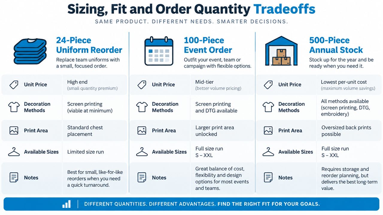
Quantity changes more than unit price. It determines which decoration methods make sense, how much setup can be absorbed, whether custom garment development is realistic, and how much inventory risk the buyer accepts.
Three order scenarios
A 24-piece uniform reorder needs restraint. A screen-printing provider lists a 24-piece minimum for custom screen printing (screen-printing order threshold). Another textile-printing service lists minimums of 12 pieces for screen printing and embroidery. At this quantity, embroidery setup can be difficult to amortize, especially for a detailed logo. DTF may be the practical cost choice when the mark has several colors or the order includes only a few pieces per size.
A 96-piece company event gives the design more room. Screen printing can become more attractive, and a four-color logo or back print may be justified if the event needs a stronger visual statement. Confirm the full size range before ordering and keep a buffer for exchanges, late additions, and fit uncertainty.
A 500-plus-piece branded capsule or onboarding program supports more deliberate product planning. The buyer can explore custom-dyed garments, mill-direct blanks, and fiber-level Pantone control, but those choices introduce storage, forecasting, and reorder commitments. A retail-style fit deserves graded samples, not one approved sample in a single size.
Fit changes the operational picture too. Unisex blanks generally simplify purchasing and reduce style fragmentation. Women's fitted cuts create more size and grading variables, while performance cuts should be sampled because shoulder width, torso length, and fabric stretch vary widely between suppliers.
Protect the size run
Collect size preferences instead of guessing from a headcount. A size-up buffer can protect the order from exchanges and shrinkage, but the exact amount should come from your roster and supplier policy rather than a universal formula. For recurring programs, record what was issued and what people requested later.
The garment should also match the audience. Recent corporate swag coverage points toward heavyweight tees, garment-dyed colors, boxy cuts, subtle branding, oversized fits, and tone-on-tone embroidery. A 2026 swag survey reported 62% planning to try heavyweight materials, 50% wanting softer vintage-wash aesthetics, and 46% preferring boxy silhouettes (Custom Ink swag trends survey). Use those signals as design context, not as a reason to force a fashion cut onto staff who need a dependable uniform.
Proofing, Approval and Final Production Steps
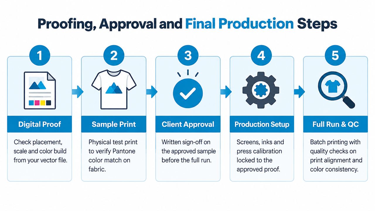
A digital mockup is necessary, but it isn't proof that the finished shirt will match the screen. I treat approval as a chain of evidence, with every stage tied to the actual garment and production method.
Use three distinct approvals
Step one is the digital proof. Check the artwork version, placement, scale, color build, spelling, and decoration location. Confirm that the proof shows the intended garment style, not a generic substitute.
Step two is the garment mockup. Place the design on a photograph or accurate rendering of the actual blank. This catches contrast problems, such as a dark logo disappearing into a heather fabric, that a flat artwork proof won't reveal.
Step three is the physical strike-off or sample print. It's the only stage that shows ink-to-garment color drift, edge quality, coverage, and hand feel. For embroidery, inspect stitch density, backing, thread tension, and whether the backing creates an uncomfortable stiff patch.
Require written sign-off by the approving person's name and date at each stage. Verbal approval creates ambiguity when someone remembers a different color or placement during production.
Approval standard: The sample is the reference for the run. If the production team changes the blank, ink system, or artwork after approval, request a new approval rather than relying on the old sign-off.
Before the press starts, confirm the blank SKU, garment color name, artwork version, screen count, ink system, or DTF roll output. Long orders deserve a mid-run check so alignment and color consistency don't drift unnoticed.
Show the decorator how the finished cartons should be packed. Confirm folding, polybagging, size ratio, carton labels, and whether shirts need to arrive sorted by department or location. At delivery, count the pieces, compare the size distribution with the purchase order, inspect placement, and look for visible color variation or missed decoration.
A placement variance under 1/8 inch is a useful inspection target when the decorator agrees to it in advance. Record any overage allowance in the quote and inspect samples from the beginning, middle, and end of a long run.
For a visual explanation of the production sequence, use the following embedded walkthrough:
Pre-Order Checklist and Common Buyer Questions
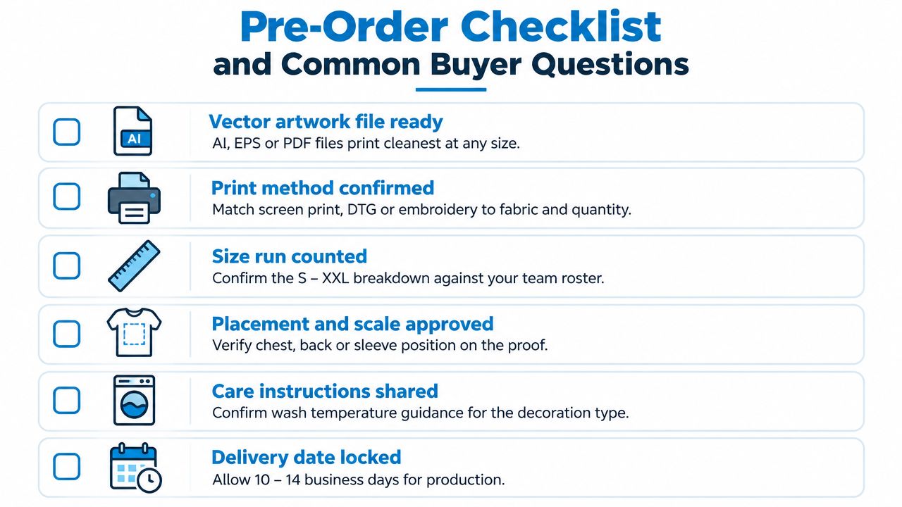
The order is ready when the decisions are documented, not when the mockup looks attractive. Run this checklist before sending the purchase order:
- Brand-kit audit: Confirm the approved logo, fonts, color roles, and alternate artwork versions.
- Color references: Lock Pantone references and garment colors together.
- Print method: Justify screen printing, DTF, embroidery, or sublimation by quantity, fabric, artwork, and expected washing.
- Garment specification: Record the blank SKU, fiber content, weight, cut, colorway, and care label.
- Artwork package: Attach vector files, actual-size dimensions, placement notes, transparent print areas, and separated colors where needed.
- Size breakdown: Count each size against the roster and document your exchange or late-hire plan.
- Approval record: Sign off on the digital proof, garment mockup, and physical strike-off or sample.
- Delivery details: Confirm date, address, packing requirements, carton labels, and inspection contact.
- Reorder plan: Save the approved artwork, blank SKU, color references, and production notes in one location.
Questions that cost money when left late
Should you order extras? Usually, a small reserve is sensible for late hires, exchanges, and damaged items, but base it on your roster, program turnover, and reorder difficulty. A reorder may use the same artwork but still incur setup costs if the file, garment, colorway, or decoration method changes.
How does reprint pricing compare with the first run? The original order may absorb screens, digitization, sampling, or setup across more pieces. A smaller reprint can therefore carry a higher per-piece price even when the artwork is unchanged.
How should shrinkage be handled? Approve the sample on the exact blank and ask the decorator how the garment is pretreated, cured, or heat pressed. Don't compare a washed sample with an unwashed bulk garment without recording that difference.
Will embroidery backing feel stiff? It can on lightweight cotton, especially with a dense design. Ask for a backing choice and test the inside of the garment before approving a large logo.
How long will production take? The answer depends on garment availability, decoration method, artwork revisions, sampling, quantity, and shipping. The checklist artwork references 10 to 14 business days for production, but confirm the current timeline in writing before committing to an event. For broader creative planning, fashion and beauty design brief samples can help structure the same kind of clear handoff used in apparel production.
Dirt Cheap Product, Inc. provides custom screen printing, embroidery, DTF, sublimation, and custom patches across T-shirts, polos, outerwear, hats, bags, and other branded goods. Upload your logo, review a production proof, and visit Dirt Cheap Product, Inc. to discuss a corporate apparel order built around your garment, quantity, decoration method, and delivery requirements.