You're probably looking at a stack of plain sleeves, a box of hot cups, or a logo file on your desktop and thinking the same thing most first-time buyers think: this should be simple. Put the logo on the sleeve, place the order, hand them out, done.
That's the part that looks easy.
The part that decides whether coffee sleeve printing helps your business is everything around the print file. Sleeve size. Cup fit. Whether staff use them. Whether customers keep them on the cup. Whether the message on the sleeve does anything beyond filling space. A bad sleeve order doesn't usually fail in production. It fails in use.
I've seen businesses focus hard on artwork and ignore the practical questions that make the job pay off. If you get those decisions right, a sleeve becomes a working part of the drink experience. If you get them wrong, it becomes packaging customers toss aside.
Table of Contents
- Why Custom Coffee Sleeves Are Powerful Marketing Tools
- Planning Your Sleeve Strategy Beyond the Logo
- From Dieline to Digital File Your Artwork Guide
- Material and Print Options That Fit Your Brand
- Navigating Quotes Minimums and Turnaround Times
- Beyond the Box Tips for a Successful Sleeve Launch
Why Custom Coffee Sleeves Are Powerful Marketing Tools
A blank hot cup leaves the counter and disappears into traffic. A branded sleeve leaves with it.
That's why sleeves matter. They sit in the customer's hand, face outward in photos, ride into offices, cars, meetings, and job sites, and stay visible longer than commonly anticipated. For a café, roaster, pop-up, hotel kiosk, or event coffee station, that small band of print space does real work when it's used well.
The strongest sleeve programs don't treat the sleeve as decoration. They treat it as packaging that carries a message. Sometimes that message is simple brand recognition. Sometimes it pushes a seasonal drink, a loyalty offer, or a QR code campaign. Sometimes it just makes the cup feel finished and deliberate instead of generic.
A small print area can still do a lot
The sleeve works because it solves two problems at once. It protects hands from heat, and it gives your brand a place to speak without changing the cup itself.
That second part matters for businesses that want flexibility. A shop can keep one cup style and rotate sleeve messaging around it. That's often easier operationally than changing every cup order just because a promotion changed.
A good sleeve doesn't look like an ad pasted onto packaging. It looks like the packaging was designed to carry that message from the start.
What works in the real world
The sleeves that perform best usually do one of these jobs well:
- Reinforce the brand: Name, mark, color palette, and a clear visual identity.
- Promote one action: Loyalty signup, seasonal item, social handle, or QR destination.
- Improve the cup experience: Better grip, cleaner handling, stronger heat cue.
What doesn't work is trying to force every idea onto one piece of board. If the sleeve has the logo, a slogan, a menu, a QR code, a promo, social icons, and legal copy, the message gets muddy fast. Print space is tight. Clarity wins.
Planning Your Sleeve Strategy Beyond the Logo
A café places its first custom sleeve order, approves a clean logo layout, and expects the sleeve to do the marketing on its own. Two weeks later, staff are handing out drinks during the morning rush, some cups go out without sleeves, some customers remove them, and the printed stack by the register turns into cost instead of exposure.
That is the main planning problem.
A sleeve earns its budget only when it gets used consistently and gives the customer a reason to keep it on the cup. BriteVision's comparison of coffee sleeve and cup printing points out that many customers skip optional sleeves. If usage is inconsistent, brand reach drops with it. The job is not just to print sleeves. The job is to build a sleeve program people use.
Start with the business goal, not the artwork
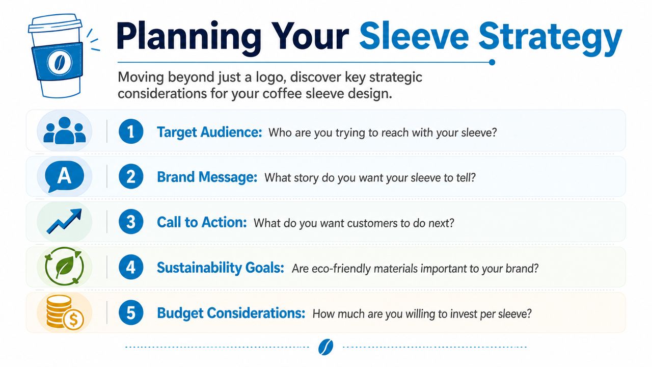
Before design starts, define what success looks like at the counter. Brand recognition, loyalty signups, seasonal promotion, event tie-in, and perceived quality all lead to different sleeve decisions.
I usually ask clients four practical questions first. What cup sizes will use the sleeve? Who is receiving the drink? What action matters after handoff? Can staff apply the sleeve quickly during peak periods?
Those answers shape the program more than the logo does.
A commuter-heavy coffee bar needs a fast read, high contrast, and one clear prompt. A hotel café may get better value from polished branding and location cues. An event operator may care more about sponsor visibility and short-run flexibility than long-term identity consistency.
Plan for usage rate, not print quantity
Sleeve programs often fail here. The order quantity looks fine on paper, but usage at store level is weak.
If the cup is comfortable to hold without a sleeve, customers may leave it off. If staff have to stop and fit sleeves one by one during a rush, application rates slip. If the message is buried under decorative graphics, the sleeve carries cost without producing much return.
Good sleeve strategy accounts for all three.
Use the sleeve only when it has a clear role in the drink experience. That role can be heat protection, better grip, a cleaner handoff, or a simple reward prompt such as a QR code tied to loyalty. Keep the ask narrow. One action is enough. On a small print area, extra messages compete with each other.
A sleeve should solve a handling problem, support a brand goal, or do both. If it does neither, customers and staff will treat it as optional.
Build the design around real counter conditions
Screen proofs do not show what happens under café lighting, on kraft stock, at 7:30 a.m., with a line forming.
Small text gets lost fast. Low-contrast color choices look weaker once they print on unbleached board. QR codes need enough quiet space to scan from a curved surface in a customer's hand. If your designer built the file in RGB, convert and check color early so brand tones do not shift unexpectedly in production. A quick RGB to CMYK conversion guide for print files helps avoid that problem before approval.
I also recommend testing the message against arm's-length viewing. If a customer cannot understand the sleeve in two seconds, simplify it.
Decide whether sleeves or cups should carry the campaign
Sleeves work best as a flexible message layer. They let you change promotions, seasonal art, and partnerships without stranding cup inventory. That matters if your menu changes often, if you run local collaborations, or if you want to test one offer in one location before rolling it out wider.
Direct cup printing fits a different model. It suits brands with stable identity systems, long purchasing cycles, and fewer campaign changes. The print is always present, but every revision is slower and more expensive to roll through inventory.
For a first custom order, sleeves are usually the safer choice when you need to learn what customers respond to. They give you room to test message, offer, and timing without rebuilding your whole packaging system.
From Dieline to Digital File Your Artwork Guide
Sleeve production problems often start in the artwork file, not on the press.
A sleeve can print cleanly and still fail in use if the file was built on the wrong template, if key text lands near the seam, or if the artwork was approved without checking the actual cup fit. That is why I push clients to treat artwork setup as a production step, not a design formality. If the sleeve does not fit the cup sizes you sell or the message disappears once wrapped, the order has no marketing value no matter how sharp the print looks.
Start with the supplier's dieline, not your designer's canvas
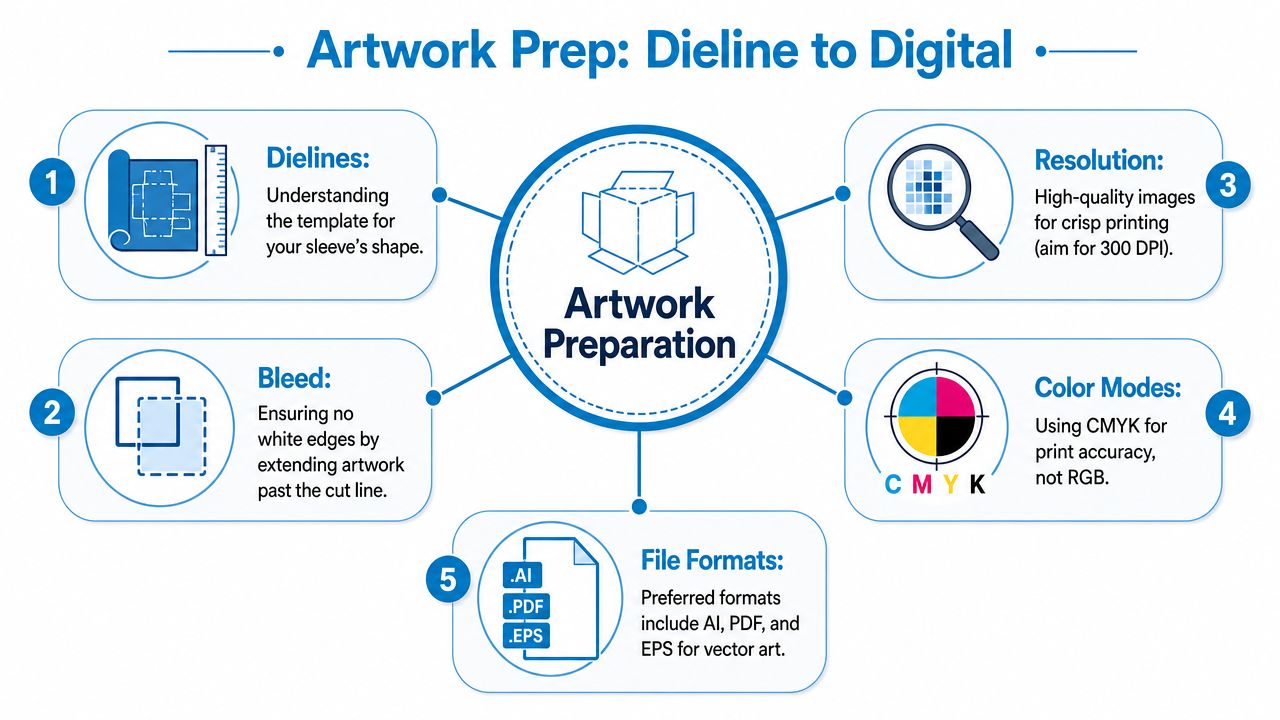
The dieline shows the cut, fold, and live area for that specific sleeve. It is the production template your artwork has to follow. Designers who start with a blank rectangle usually create problems that only show up after the sleeve is folded and glued.
Axiom Print's coffee sleeve specifications list a common sleeve size of 5 inches by 2.75 inches for many 12 oz. to 20 oz. hot cups. Use that as a reference point only. Different manufacturers change panel width, curvature, overlap, and glue area, so final art should always be built on the exact dieline from the vendor you are ordering from.
Fit is another place where first orders go wrong. Newprint's coffee cup sleeve printing page notes that sleeves made for standard single-wall hot cups can fit 12 oz. to 24 oz. sizes but do not fit 8 oz. paper hot cups. If your store sells a meaningful number of small drinks, confirm that before art approval. A sleeve that only works on part of the menu gets skipped at the counter, which kills the campaign before customers ever see it.
If you want a useful comparison for how paper templates and stock specs affect print handling, RevMenue's guide to menu paper is worth reviewing. The product is different, but the production logic is the same. Stock, folds, and finish all influence how artwork performs in practice.
Build the file for print use
Sleeve art needs to survive trimming, wrapping, heat, hand contact, and quick reading at a counter. Screen-ready files are rarely enough.
Use this checklist before sending final artwork:
- CMYK color mode: Print devices run in CMYK. If the file was designed in RGB, convert it early and compare brand colors before proof approval. This RGB to CMYK conversion guide for print files covers the common shift issues.
- 300 DPI images: Low-resolution photos and textures go soft fast on a small printed piece.
- Vector logos where possible: AI, PDF, and EPS files keep edges cleaner than flattened image files.
- Bleed beyond the cut line: Extend backgrounds past trim so you do not get white edges after finishing.
- Safety margin inside the live area: Keep type, QR codes, and marks away from folds, edges, and the seam.
I also tell clients to check hierarchy with the sleeve wrapped, not flat. A promotion that looks balanced on screen can become unreadable once the curve pulls text apart. If the offer is the reason for printing the sleeve, that offer needs the safest position on the template.
If a logo or QR code already feels tight on the PDF proof, it is too tight for production. Pull it inward before approval.
A short production video also helps if you haven't seen how sleeves move through print and finishing.
Check the assembled proof, not just the flat proof
This approval step is where a lot of wasted sleeve orders start. The file looks correct. The printed carton arrives. Staff use only part of it because the message reads upside down in hand, the seam cuts through the logo, or the fit feels awkward on certain drinks.
Check these three points before signoff:
Visual center on the wrapped sleeve
Art should look centered after assembly, not just centered on the dieline.Reading direction in the customer's hand
The logo, offer, and call to action should read naturally when the cup is picked up.Clear separation from seam and glue zones
Keep important elements out of any overlap area noted on the template.
Print a paper mockup and wrap it around your real cups. Do it at the counter, with your actual drink sizes, before final approval. That quick test catches more business mistakes than another round of email comments. It also answers the larger question behind this whole section: will the sleeve be something staff want to use and customers can understand immediately, or just another printed item sitting in a box?
Material and Print Options That Fit Your Brand
The feel of the sleeve in a customer's hand, kraft paper versus white paperboard, does as much brand work as the printed design. I have seen perfectly good artwork underperform because the stock sent the wrong signal or the print method did not match how the business planned to use the sleeves at the counter.
Choose the substrate before you obsess over ink
Most first-time buyers start with color and logo placement. Production usually goes better when you start with the board.
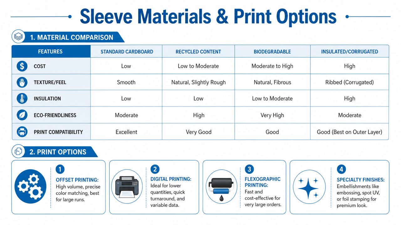
Kraft paper gives you a warmer, more tactile look. It suits independent cafés, roasters, organic brands, and any shop that wants packaging to feel grounded instead of glossy. The trade-off is print appearance. Colors read duller on kraft, small type gets harder to hold, and light inks do not show as cleanly. Bold layouts and dark ink usually perform better.
White paperboard gives you a brighter base and more predictable color. If your brand depends on light tints, crisp contrast, cleaner photography, or fine line detail, white stock gives you more control. It also tends to look more polished in office coffee service, franchise environments, and retail programs where consistency matters more than texture.
That choice affects more than appearance. It influences whether customers notice the sleeve, whether staff feel good handing it out, and whether the piece feels like part of the drink experience or an afterthought.
If you're comparing stock feel across other printed brand materials, RevMenue's guide to menu paper is a helpful reference. It explains how paper choice affects handling, readability, and finish in ways that carry over to sleeves. For a broader sense of stiffness and board feel, this guide to heavy cardstock paper is useful background.
Match the print method to your actual program
Print method is a business decision first.
Digital printing usually makes sense for shorter runs, test programs, seasonal campaigns, multi-location variations, and artwork that changes often. It gives you more flexibility with versioning and lowers the risk of sitting on outdated inventory. If you are still figuring out whether staff will consistently use sleeves, digital is often the safer place to start.
Flexographic printing fits established programs with stable artwork and predictable volume. Unit cost usually improves as quantities rise, and it is a practical choice when the sleeve design will stay in market long enough to justify a larger run. The trade-off is less agility. Frequent design updates, limited-time offers, or version-heavy campaigns can get expensive and operationally messy.
That distinction matters for ROI. A sleeve only pays back if it gets used. If you order a long flexo run before the store team has a sleeve habit, or before you know which cup sizes move fastest, boxes can sit in storage while the message never reaches the customer.
Build for the way the sleeve will be used
Suppliers may describe their print options with different labels, but the split is usually simple. One tier is meant for straightforward branding. The other is meant for cleaner detail, stronger color control, or fuller coverage.
A basic one- or two-color mark can be enough if the sleeve's job is brand recognition. A higher-detail print spec makes more sense when the sleeve also carries a promotion, QR code, campaign message, or design elements that customers need to read quickly. If the print gets too busy, staff stop noticing it and customers stop reading it.
Here is the practical rule I give new buyers. Put the money where the customer's hand and eye go first. Spend on the stock and print quality that support the message. Skip decorative upgrades unless the sleeve already works as a usable brand touchpoint.
Comparing sleeve materials and printing methods
| Attribute | Kraft Paper | White Paperboard | Digital Printing | Flexographic Printing |
|---|---|---|---|---|
| Visual style | Natural, warm, rustic | Clean, bright, polished | Best for flexible artwork programs | Best for stable large-run programs |
| Color presentation | Better for simpler, stronger contrast art | Better for bright, detailed artwork | Good for variable designs | Good for repeat production |
| Best use case | Café, craft, organic positioning | Corporate, modern, premium branding | Shorter runs and campaign changes | Larger runs with consistent art |
| Order flexibility | Depends on supplier stock | Depends on supplier stock | Lower-risk entry for new programs | Better fit for committed repeat orders |
| Change between versions | Artwork may need simplification | Supports more detail and cleaner versioning | Easy to swap versions | Less efficient for frequent design changes |
Shop-floor advice: Pick the sleeve material with your hand first, then choose the print method based on forecast, storage space, and how certain you are that staff will use every case.
Some suppliers also offer specialty finishes or embellishments. Those can improve appearance, but they do not fix a weak sleeve program. If the stock feels off, the copy is crowded, or the team treats sleeves as optional, better finishing only makes an unused item look more expensive.
Navigating Quotes Minimums and Turnaround Times
A vague quote leads to vague expectations and missed deadlines.
I see this on first sleeve orders all the time. A buyer asks for pricing, gets a number back, approves it quickly, and only later finds out the quoted lead time started after proof approval, not after deposit. Or the unit price looked fine until case counts, freight, and rush handling showed up separately. By then, the launch date is already under pressure.

What a good quote should answer
Ask for more than a price. Ask for a production plan in quote form.
A useful quote should clarify:
- Print method: Digital or flexographic.
- Quantity structure: Case count, pack count, and any order breakpoints.
- Coverage level: One-color mark, partial print, or full coverage.
- Material type: Kraft, white, or another board option.
- Proofing process: Digital proof, physical sample, or both.
- Lead time: Production time and shipping time as separate items.
It also helps to ask two questions buyers often miss. First, what triggers the clock: payment, artwork approval, or final proof signoff? Second, what happens if the file needs repair? That tells you whether the supplier has padded the schedule or whether your team is carrying the risk.
If sleeves are one piece of a larger branded order, review the broader bulk merchandise ordering process early so proofs, approvals, and freight dates line up across every item.
How to judge minimums and price breaks
Minimum order quantities matter for more than budget. They affect storage, version control, and whether the sleeves will get used.
A low minimum usually gives you an easier first run. That helps when you are still testing staff compliance, cup mix, and customer response. A higher minimum can lower the unit cost, but it raises the cost of being wrong. If the artwork changes, the promo expires, or the team only sleeves some drinks, leftover cartons turn into dead stock fast.
That is the ROI question many buyers skip. Cheap per unit is not cheap if half the cases sit in the back room.
Ask suppliers to quote at two or three realistic quantity levels. Then compare total spend against actual monthly cup volume, not your best-case forecast. If one location burns through sleeves consistently and another uses them only on selected drinks, split the estimate by store before you commit.
Standard and premium only matter if the artwork earns it
Suppliers often separate sleeve programs into standard and premium print tiers. Use that distinction to match the file to the job, not to buy the most expensive option by default.
Choose standard production for bold, simple artwork that reads clearly at arm's length. Choose premium production when the design depends on fine lines, smoother tonal transitions, or tighter brand presentation.
A common mistake is buying premium production for average artwork. Better print reproduction does not fix weak hierarchy, poor contrast, or copy that no one can read while holding a hot cup. If the sleeve is supposed to drive scans, repeat visits, or offer redemption, clarity beats decoration.
Ask which tier fits the file you have today, not the brand image you want the quote to imply.
What slows orders down
Press time is rarely the problem. Approvals are.
The delays I deal with most often come from four places:
Late artwork cleanup
Low-resolution logos, RGB files, missing fonts, and badly built PDFs can stop a job in prepress.Unconfirmed cup compatibility
If the sleeve size is not matched to the actual cup wall and lid setup, production may pause while samples are checked.Too many approvers
Marketing, operations, and ownership often review in sequence instead of at the same time. That adds days quickly.Slow proof approval
A proof sitting unanswered over a weekend can push the ship date even if the printer had press capacity ready.
A normal workflow looks like this: inquiry, quote, dieline release, artwork setup, proof review, approval, production, packing, and shipping. Every stage is manageable if one person owns the decisions on your side.
If timing is tight, ask one direct question early. What is the latest approval date that still protects the in-hand date? That answer matters more than the headline turnaround on the quote.
Beyond the Box Tips for a Successful Sleeve Launch
Once the sleeves arrive, a successful launch depends on two things: staff consistency and measurable response.
I have seen well-printed sleeve programs fail for a simple reason. The sleeves stayed in the carton, got used only on random drinks, or carried an offer the bar team never mentioned. At that point, the print quality no longer matters. ROI comes from daily use, clear handling rules, and a message customers can act on in a few seconds.
Train the counter before launch day
Start with operations, not design.
Decide which drinks always get a sleeve, which drinks never do, and whether the rule changes for dine-in, takeaway, or delivery. If staff have to guess, usage drops fast. The best launch is boring from an execution standpoint. Every hot cup that qualifies gets the sleeve, in the same orientation, at the same point in service.
Give the team a short briefing before rollout and keep it practical:
- Staging: Store sleeves at the exact handoff station, not in back stock.
- Usage rule: Define the drink sizes and cup builds that require a sleeve.
- Orientation: Keep the logo, QR code, or offer facing outward at handoff.
- Customer prompt: Give staff one sentence to use if the sleeve includes a promotion.
If the sleeve includes a QR code, discount, loyalty push, or limited offer, script that line in advance. Staff do not need a sales pitch. They need a simple prompt such as, "The offer is on the sleeve if you want to scan it later." That keeps the interaction quick and gives the printed message a better chance of being noticed.
Make the sleeve part of the drink experience
A sleeve works best when it feels useful, not decorative.
That matters more than many first-time buyers expect. Customers keep sleeves on cups because they need the grip and heat protection. That gives the printed message more time in hand than many other short-run promo pieces. Use that attention well. One clear action usually performs better than a crowded design with a logo, social icons, a slogan, and a coupon fighting for space.
Good sleeve programs also match the moment of use. A morning commuter offer should read instantly. A loyalty prompt can ask for a scan. A seasonal campaign can support a limited drink without forcing a full cup reprint. That flexibility is one of the strongest business reasons to use sleeves in the first place.
Track response and fix weak points early
Treat the first order like a live test.
Watch what happens in the first week. Are sleeves making it onto cups? Are customers removing them right away? Are scans, redemptions, or repeat visits showing up if the sleeve asks for an action? If response is weak, check the execution before blaming the concept. In practice, the problem is often poor placement at the counter, inconsistent use by staff, or a call to action that is too small to notice.
Focus on a few signals:
- Usage rate: How often qualifying drinks leave with a sleeve
- Offer response: Scans, redemptions, or visits tied to the sleeve message
- Handling behavior: Whether customers keep the sleeve on long enough to see the content
- Message clarity: Whether the main point is readable at a glance
Do not scrap the whole program after one weak result. Adjust the message, the offer, or the staff prompt first. Sleeves are one of the easier packaging tools to improve between runs because you can test a better call to action without changing the cup itself.
A successful sleeve launch is not the day the cartons land. It is the point when the sleeve becomes a standard part of service and gives you a measurable return.
If you need a reliable custom branding partner for apparel, uniforms, and promotional items, Dirt Cheap Product, Inc. is worth a look. They help companies, retailers, events, and marketing teams produce branded products with responsive support, fast proofs, and decoration options that include screen printing, embroidery, DTF, sublimation, and custom patches.