
You've got a logo that looks sharp on your laptop, and now you need to put it on a shirt without ending up with fuzzy edges, crooked placement, or a garment your team won't wear. The right result depends on more than choosing a blank tee and uploading an image. Decoration method, fabric, artwork format, logo size, and placement all affect the finished product.
A logo on shirt can work as a uniform mark, retail detail, event identifier, or moving advertisement. The modern promotional T-shirt developed after shirts shifted from undergarments to visible outerwear, and businesses soon began printing logos and slogans on them. The 1977 “I Love New York” shirt designed by Milton Glaser became a widely recognized example of apparel turning a graphic into a mass-recognition symbol, while brands such as Nike and Adidas helped make prominent chest logos part of everyday sportswear and streetwear during the 1980s and 1990s, as outlined in this history of T-shirt logo design.
Table of Contents
- Choosing the Right Decoration Method
- Preparing Artwork for Flawless Production
- Strategic Logo Placement and Sizing
- Reviewing Proofs and Matching Colors
- Ordering Logistics and Compliance Rules
- Garment Care and Long-Term Value
Choosing the Right Decoration Method
The decoration method should follow the logo and the garment, not the other way around. A simple one-color mark on a large run needs a different production solution from a detailed full-color illustration on a lightweight performance shirt.
Compare the main methods
Screen printing remains a strong choice for bold, simple artwork and larger orders. Ink is pushed through a prepared screen onto the garment, producing a direct, opaque finish that works especially well for T-shirts, sweatshirts, and event apparel. It usually becomes more attractive as the order gets larger, but extra colors and complex artwork add preparation and registration demands. Fine gradients, tiny details, and photographic effects can be difficult to reproduce cleanly.
Embroidery creates a raised, stitched surface that gives polos, button-downs, jackets, hats, and heavier shirts a more premium appearance. It handles wear well when the logo is designed for stitching, but thread has physical limits. Very small lettering, thin lines, and intricate details can close up or lose clarity after digitizing. A logo that looks elegant as a flat vector may need simplification before it becomes a readable embroidered mark.
Direct-to-film, or DTF, uses a printed transfer applied with heat. It suits small and medium runs, detailed logos, gradients, and full-color artwork without the screen setup associated with traditional printing. DTF can work across many garment colors and fabric types, but the transfer has a different hand feel from ink absorbed into the fabric. The artwork, film quality, pressing conditions, and garment surface all influence the result.
Heat transfer vinyl works well for sharp, single-color names, numbers, simple shapes, and personalization. It's useful when each garment needs different text or when the design has clean cut lines. It becomes less suitable for detailed logos, large quantities, or artwork with many separate pieces.
Custom patches offer another option for workwear, outerwear, and garments where a removable or textured badge fits the brand. Sublimation can make sense for suitable performance fabrics and all-over color work, but it isn't a universal solution for every shirt. Ask the decorator to evaluate the specific fabric before committing.
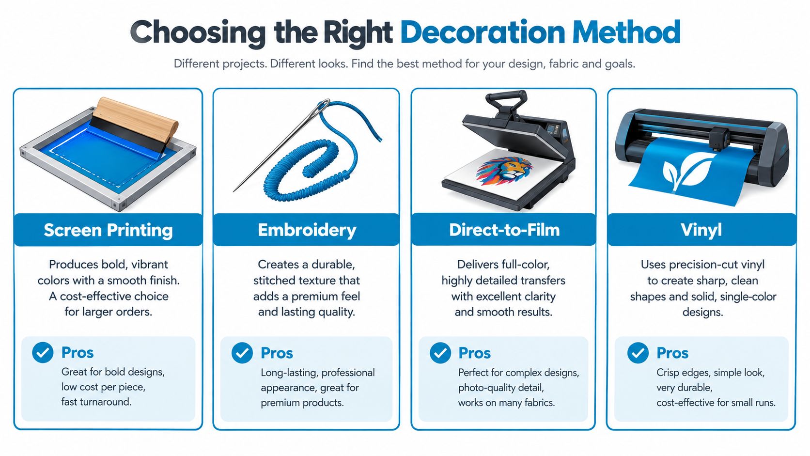
| Decoration Method | Best For | Durability | Ideal Order Size |
|---|---|---|---|
| Screen printing | Bold, simple logos and solid-color graphics | Strong when properly applied | Larger runs |
| Embroidery | Premium chest marks, polos, jackets, and workwear | Strong for suitable artwork and fabric | Small to large runs |
| DTF | Detailed, full-color logos and short runs | Good when pressed and cared for correctly | Small to medium runs |
| Vinyl | Sharp single-color shapes, names, and numbers | Good for suitable applications | Small runs and personalization |
Current trend reporting shows growing demand for premium-feel decoration, including embroidered shirts, raised puff ink, tonal designs, and retail-quality apparel that employees will wear beyond work, according to this apparel branding guidance. That shift matters for a small business. A cheaper decoration method that makes the shirt uncomfortable or visually disposable can reduce how often people wear it.
Practical rule: Choose the decoration method after you choose the garment category and inspect the logo at its actual production size.
For a broader look at how branded merchandise fits into a direct-to-consumer content system, scaling DTC content with AI offers useful context. For the production decision itself, compare your artwork and garment against this logo decoration method guide. Request a sample or pre-production proof whenever the result depends on small lettering, an unusual fabric, or a premium finish.
Preparing Artwork for Flawless Production
A screen preview can hide problems that become obvious on fabric. Thin lines may disappear, small text may fill in, and a transparent background may turn into an unwanted box if the file hasn't been prepared correctly.
Start with the right file
Vector artwork is the preferred starting point for logos because it can scale without losing quality. AI, EPS, SVG, and PDF files can preserve clean edges and allow a production team to separate shapes, colors, and lettering more reliably. Vector artwork is particularly valuable when the same identity mark must appear as a small chest print, a larger back graphic, and an embroidered version.
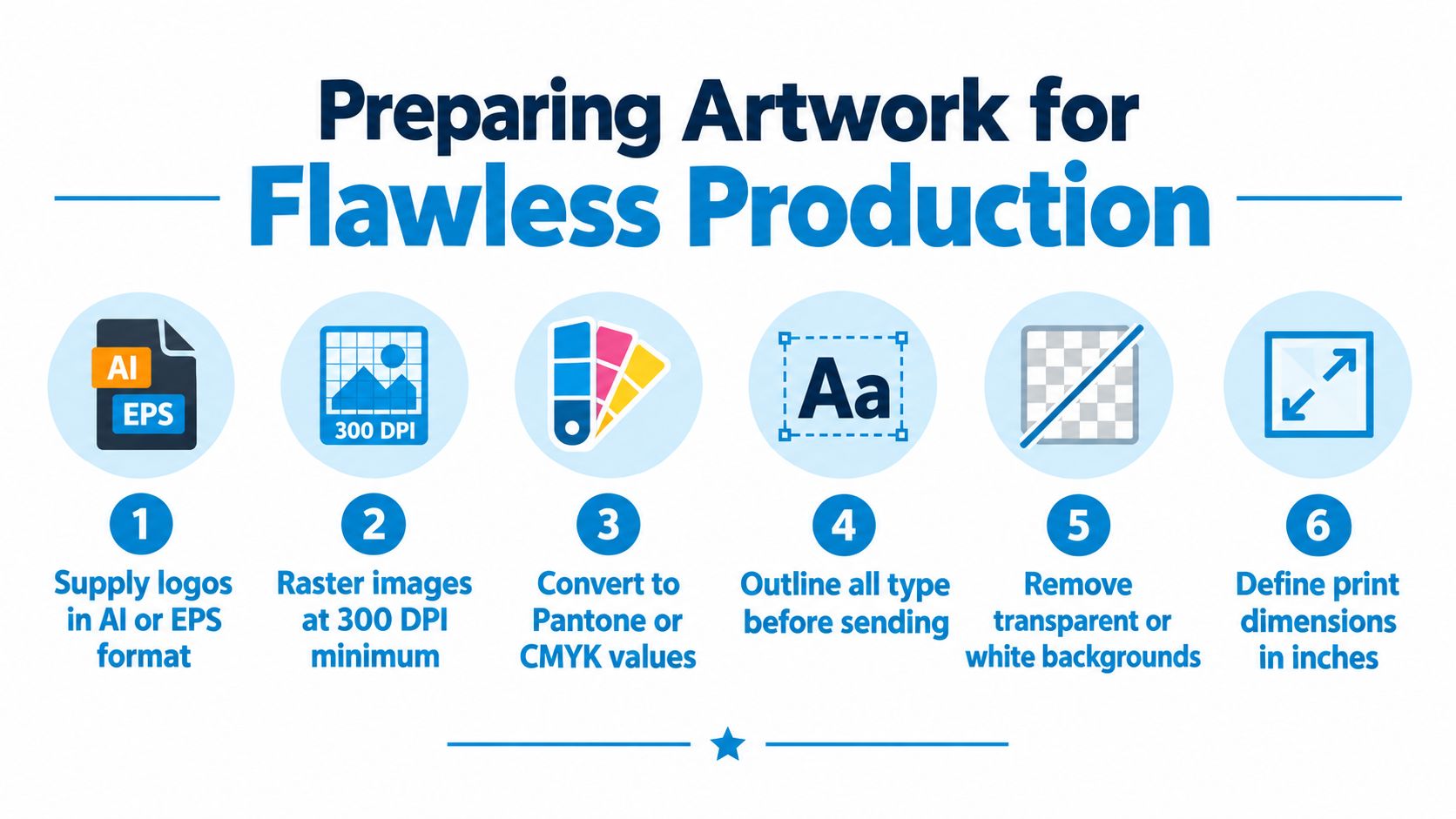
Raster artwork is made from pixels. If that's all you have, supply it at 300 DPI at the final size, a resolution requirement emphasized in expert logo artwork guidance. A small web image enlarged for a shirt won't become sharper because the production file is saved as a PDF. It will usually reveal blurred edges or visible pixelation.
Audit the file before sending it
Use a practical preflight checklist:
- Outline type: Convert fonts to outlines or supply the font files so lettering doesn't substitute unexpectedly.
- Separate colors: Identify the intended colors clearly, especially for screen printing.
- Remove unwanted backgrounds: Confirm whether white areas are part of the design or only the canvas behind it.
- Define dimensions: Tell the decorator the intended print width and height rather than relying on an automatic scaling decision.
- Inspect small details: Review thin strokes, gaps, counters in letters, and fine outlines at the finished size.
- Create decoration-specific versions: The best print file may not be the best embroidery file. Keep a simplified stitched version when necessary.
Color mode also deserves attention. A monitor emits light, while ink, thread, and transfer film have physical surfaces. Your decorator may need spot-color references or CMYK values for a closer production match, and a proof should show how the logo will look on the selected garment rather than on a white artboard.
If you're refining the original mark yourself, this guide to making logos in Illustrator can help you build a cleaner production file. Don't flatten every element before approval. Editable artwork gives the decorator more room to adjust separations, simplify embroidery details, or correct a background issue without rebuilding the logo.
Strategic Logo Placement and Sizing
A left-chest logo may look right on a polo and disappear on a loose sweatshirt. A pocket, seam, heavy fleece, or stretchy knit can change the result just as much as the artwork itself. Choose placement only after considering the decoration method, fabric, garment construction, and the distance at which people will see the shirt.
Independent research on logotype prominence found no significant differences in emotions, attitudes, intentions, or quality perceptions for specific logo placements across high-end and low-end brands. That finding challenges the assumption that a left-chest logo is automatically more persuasive. Placement works as part of a system that includes decoration, size, fabric, garment construction, and audience.
Measure from garment landmarks
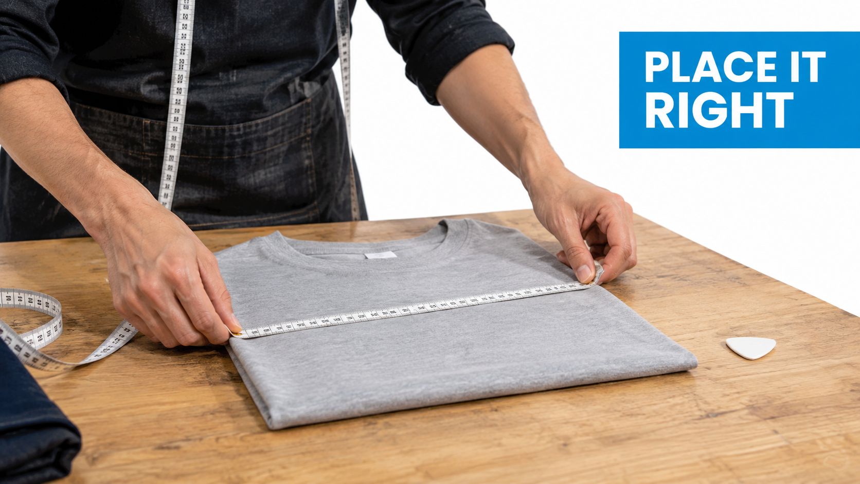
Measure from stable construction points, not the loose edge of a shirt laid casually on a table. Fabric edges shift with the cut, while the shoulder seam, collar seam, and center line provide more reliable references.
For adult shirts, placement guidance commonly starts left-chest logos roughly 7 to 9 inches down from the shoulder seam and 4 to 6 inches from center, using garment landmarks rather than fabric edges, as detailed in this shirt logo placement guide. Center-chest artwork commonly starts about 2 to 3 inches below the collar seam. Use these measurements as starting points. Check the actual cut, collar shape, pocket position, and logo proportions before approving production.
Build a placement system
A practical apparel range might use a small front mark, a larger back graphic, a sleeve detail, or a tonal version that changes with the garment. Small left-chest marks paired with larger back or sleeve graphics create different viewing priorities without forcing one placement onto every shirt. Decide what the front should communicate up close and what the back should communicate across a room.
Decoration affects the choice. A dense embroidered mark needs room for stitch coverage and may require more separation from seams. Screen printing needs a stable, reasonably flat print area. Transfers can show edges or adhesion problems when placed over construction details. Fabric stretch, texture, and pile can also change perceived size and sharpness.
Check the garment before approving the position:
- Pockets: Move a left-chest mark above, beside, or away from the pocket opening when necessary.
- Seams: Keep printed or transferred edges off seams that can disrupt pressure and adhesion.
- Zippers and plackets: Adjust center graphics on quarter-zips, jackets, and buttoned garments.
- Heavy fleece: Recheck scale and vertical position because a thin-tee layout may look too small or too high on a hoodie.
- Audience and setting: A retail customer may prefer a subtle mark, while an event team may need stronger identification from across a room.
For teams applying one identity across several garments and channels, building consistency in branding offers a useful framework. Consistency does not require identical placement everywhere. Set repeatable rules for logo versions, scale, color, and visual hierarchy, then adapt them to the decoration method and garment.
Reviewing Proofs and Matching Colors
A proof isn't a formality. It's the point where you can still fix a logo that's too small, too close to a seam, or visually weak against the garment color.
Start by checking the proof at the intended production dimensions. Ask whether the displayed size is the finished size, whether the placement is measured from the shoulder or collar seam, and whether the image shows the actual garment style. A generic flat mockup can hide a pocket, curved seam, zipper, or neckline that affects the final result.
Inspect decoration-specific details
For screen printing, review the number of colors, registration between color layers, fine lines, and contrast against the garment. Halftones and subtle artwork may behave differently on dark, textured, or stretch fabrics. For DTF and heat transfers, inspect small isolated pieces that could lift or feel visually disconnected. For embroidery, request a digitized sew-out or equivalent production preview when the logo contains small type, thin lines, or tight spacing.
Ask the decorator to confirm:
- Placement: Is the mark aligned to the garment landmarks rather than the mockup canvas?
- Scale: Does the logo remain legible without dominating the shirt?
- Seams: Will any part of the artwork cross a pocket, collar, zipper, or seam?
- Stitching: Is the density appropriate for the fabric, with no crowded areas likely to pucker?
- Color: Are the thread, ink, or transfer colors being matched to a defined reference?
- Version control: Is the proof using the approved logo file and not an older variation?
Your screen uses RGB light, while printed ink and thread reflect physical color. A logo that appears bright on a monitor can look different on a navy cotton shirt or a heathered fabric. Give the production team defined brand references, and use PMS color matching guidance when a close color match matters.
A physical sample is especially valuable for brand colors, unusual garments, and orders where the shirt itself is part of the retail experience. Digital proofs can confirm position and approximate appearance, but they can't fully show hand feel, thread height, ink coverage, or how the material hangs on a person. For broader color-system advice, RemotionAI's branding advice offers helpful background on organizing a consistent palette.
Approval habit: Save the final proof with the garment style, decoration method, logo dimensions, color references, and approval date. That file becomes the baseline for the next reorder.
Ordering Logistics and Compliance Rules
A smooth custom apparel order starts before production. Decide who will wear the shirts, where they'll be worn, whether they're uniforms or merchandise, and how often you expect to reorder. Those answers guide the blank garment, decoration method, size range, packaging, and proofing process.
Wholesale apparel catalogs can help small businesses compare blank shirts, polos, sweaters, outerwear, hats, and bags across brands, styles, colors, and fabric weights. Don't select a garment from a thumbnail alone. Check the cut, surface texture, available sizes, care requirements, and whether the material suits the planned decoration.
Separate merchandise from solicitation
A shirt sold as merchandise and a shirt worn to solicit professional services may be treated differently by an organization's compliance process. Florida lawyer-advertising rules apply to many print and electronic formats, and the relevant handbook explicitly lists business cards and flyers passed out to passers-by as covered communication forms. That broad framework means branded apparel used to solicit business or public attention can require review under applicable advertising rules, as explained in the Florida Bar advertising handbook.
This doesn't mean every company shirt needs the same disclosure. It means the intended use matters. A staff uniform, a retail product, a nonprofit event shirt, and a garment handed out to attract clients can raise different questions.
For regulated teams, create an approval path before ordering:
- Classify the use: Record whether the garment is internal apparel, merchandise, a giveaway, or solicitation material.
- Ask the compliance owner: Have the firm, carrier, agency, or organization confirm the applicable rules.
- Confirm required details: Check whether an office address, disclaimer, license information, or other disclosure must appear.
- Provide approved artwork: Send the production partner the exact version cleared for use.
- Approve the proof: Verify that required text remains legible and hasn't been reduced or crowded by the logo.
- Document the run: Keep the approved proof and production details with the order record.
Some organizations also require advance review for advertising across different media or geographic areas. Don't assume that approval for a website, flyer, or business card automatically covers a shirt. We do not create business cards or fliers, so keep those items with the appropriate compliance or print provider and give your apparel decorator only the approved garment artwork.
Logistics matter just as much. Confirm blank availability, decoration capacity, proof timing, delivery location, size distribution, and reorder requirements before paying for production. A supplier that keeps the approved artwork and garment details on file can reduce avoidable variation on future runs.
Garment Care and Long-Term Value
A finished shirt remains a public example of your brand after production. The decoration method, fabric, and care routine all affect how long that impression lasts. A clean print on a suitable blank can still look worn if the wearer uses high heat, harsh chemicals, or rough handling.
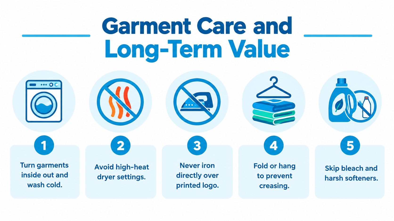
Turn garments inside out before washing. Use cold water, avoid bleach and harsh softeners, and choose low-heat drying when the decoration supplier recommends it. Keep an iron away from printed logos and transfers. Embroidered garments also need gentle handling because heat, abrasion, and poor drying can stress the fabric and stitched surface.
Make reordering deliberate
Track actual wear and requests before choosing the next run. If one polo is frequently requested while another remains in storage, adjust the blank garment, color, or size mix accordingly. Keep the approved logo file, proof, garment name, color, decoration method, placement, and size breakdown in one order record. Future production should follow documented specifications, not memory.
Store spare garments folded or hung in a clean, dry area. Protect them from crushing, unnecessary heat, and conditions that can distort the fabric or decoration. For retail and event programs, record which colors and sizes move first. That history reduces dead stock and makes purchasing more precise.
With placement alone showing limited effect on perceived quality in the study cited earlier, long-term perceived value depends on more than choosing a fashionable position. Garment quality, decoration finish, and care now become the practical differentiators, as discussed in this apparel design trend analysis.
Use the video below as a visual reminder of habits that protect decorated garments.
Before reordering, confirm that the logo file is approved, the garment has not changed, the decoration method still suits the fabric, and wearers have the care instructions. A logo on shirt delivers value when it remains legible, comfortable, and wearable after repeated use.
Dirt Cheap Product, Inc. provides custom screen printing, embroidery, DTF, sublimation, and custom patches across shirts, polos, sweaters, outerwear, hats, bags, and other promotional products. Upload your logo at Dirt Cheap Product, Inc. to review garment options, receive production guidance and proofs, and plan a consistent order for your team, event, retail line, or next reorder.