
You're holding a polo in one hand and a proof on your screen in the other, and they don't seem like the same shirt. The logo looked rich in the mockup, but the finished sample feels flat, the colors aren't as sharp, and now you're wondering whether the blank was wrong, the press was off, or the decoration method was the problem. That's the kind of confusion the dye sublimation process creates for buyers who just want branded apparel that looks clean, feels light, and holds up on the job.
Table of Contents
- Why Your Branded Polos Look Dull and How Sublimation Fixes It
- The Science Behind the Dye Sublimation Process
- Substrates That Work and Ones That Don't
- Equipment and Materials Behind a Clean Press
- Sublimation Compared to DTF, Screen Print, and Embroidery
- Why Two Correct Presses Can Still Look Different
- Common Defects and How to Fix Them
- Costs, Turnaround, and Care for Sublimated Products
Why Your Branded Polos Look Dull and How Sublimation Fixes It
A small business orders matching polos for a trade show team. The proof looks bright, but the delivery lands with a logo that feels heavy, looks a little tired, and already seems like it belongs on top of the fabric instead of inside it. That's usually where disappointment starts, not with the artwork, but with the decoration method.
Dye sublimation behaves differently because the color doesn't sit as a layer on the surface. On the right material, the dye becomes part of the substrate itself, so the print feels smooth and doesn't bring that thick, added-on look many buyers notice on other methods. That's why sublimation has become such a strong fit for apparel, signage, banners, and coated promotional items on polyester and polymer-coated goods, rather than standard cotton basics, as outlined in the Graphics Atlas overview of dye sublimation.
Practical rule: if a branded shirt needs to feel light, move naturally, and keep a crisp full-color look, the blank matters just as much as the artwork.
That's the buyer lesson. A polo can look dull for reasons that have nothing to do with your logo file, and the fix may be to switch from a surface-applied decoration to a heat-based transfer that bonds into the material. For a straightforward walkthrough of the overall workflow, the guide on how to sublimate step by step is a useful reference point.
The rest of this guide keeps the focus on what decides the outcome in a real shop. That means the science of the press, what materials work, why humidity changes results, and how sublimation stacks up against DTF, screen print, and embroidery when you're choosing a decoration method for uniforms, retail merch, or event gear.
The Science Behind the Dye Sublimation Process
Think of sublimation like a solid skipping a middle step. Instead of melting into liquid first, the dye turns straight from solid into gas under heat, then gets driven into the polyester or coated surface before locking in as it cools. That's the reason the print can feel like part of the fabric instead of something sitting on top of it.
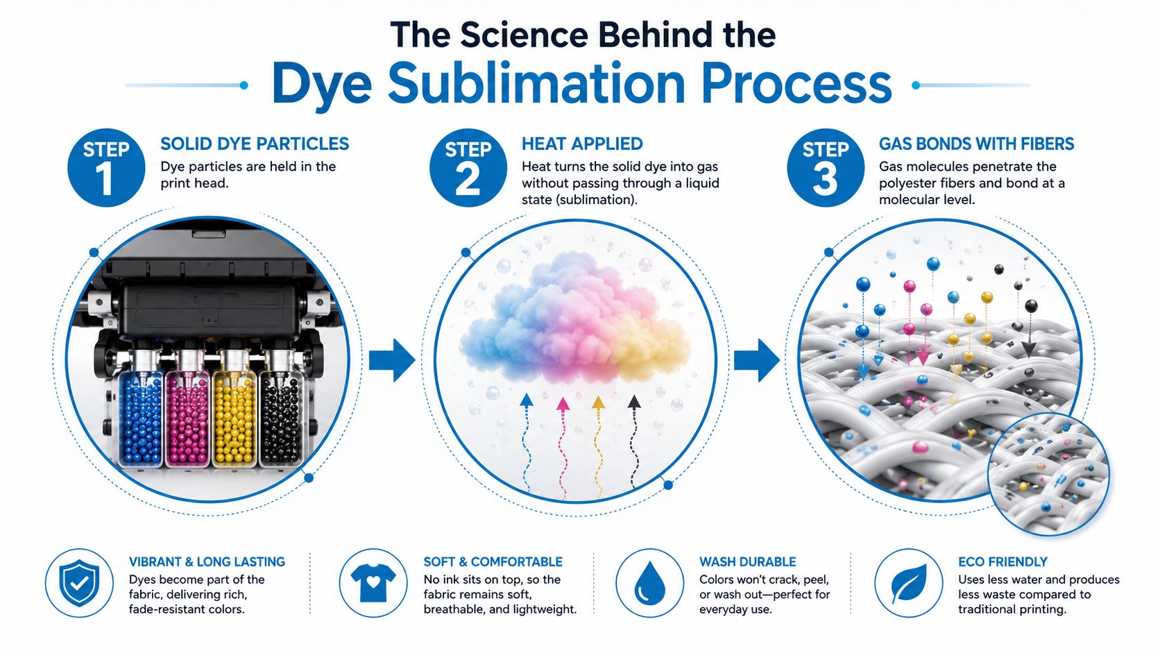
The create print press workflow
The standard workflow is simple on paper, and each step matters. First, the design is prepared in graphics software. Then it's printed onto sublimation transfer paper with sublimation ink, and finally the transfer is pressed onto the item with heat and pressure, using a heat press or calender, as described in a typical sublimation guide.
The usual operating window is 180 to 200°C for 35 to 60 seconds, with no drying time or post-treatment required after the transfer. Another benchmark commonly used in practice is the high-heat range around 350 to 420°F, which is the zone where the ink vaporizes and bonds into the receiving material, according to the process descriptions in the verified sources above.
Heat alone isn't the whole story. Heat plus pressure is what pushes the dye gas into the fibers or coating so it can bond instead of float on top.
Why the image becomes part of the substrate
The key detail is what happens after the press opens. The dye is no longer just on paper, and it's not sitting as a wet layer on the garment. It has moved into the substrate and then solidified as the material cools, which is why the finish is usually durable and resistant to fading compared with a surface print.
That's also why people get confused when a sublimation print looks dull before pressing. The color often changes dramatically only after the heat cycle, because the chemistry doesn't finish until the press does its job. A useful color-prep reference for artwork setup is the RGB to CMYK conversion guide, especially for buyers reviewing proofs and wondering why screen color never matches the final substrate exactly.
Substrates That Work and Ones That Don't
Sublimation is picky in a way that helps and frustrates people at the same time. It gives strong, clean results on the right material, but it doesn't forgive the wrong one. That's why polyester fibers and polymer-coated rigid items are the home turf of the process, while standard cotton and many untreated surfaces do not hold the dye the same way.
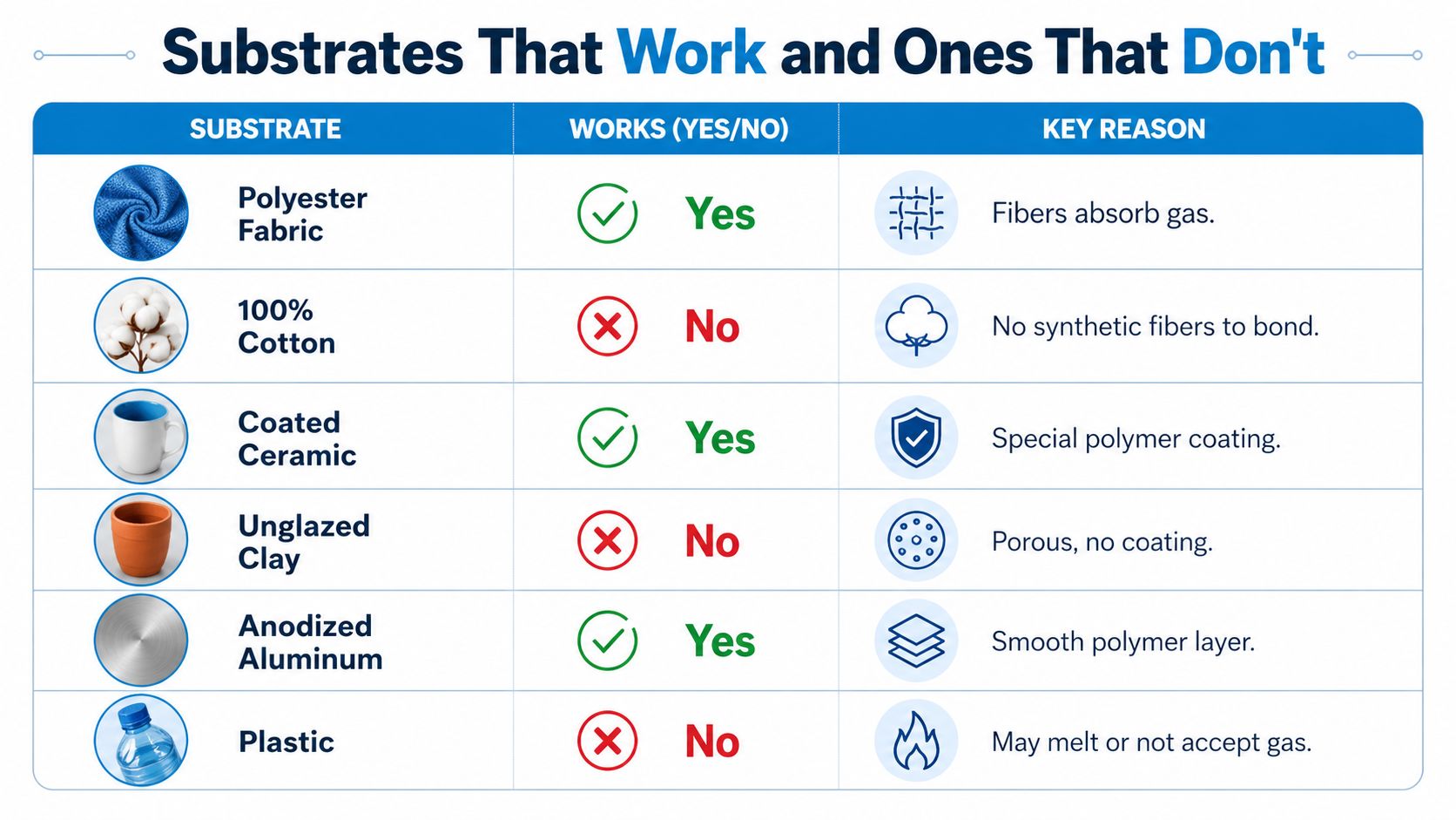
Fast compatibility check
If you're ordering apparel, the safest bet is white or light polyester, especially when color vibrancy matters. That's where sublimation gives you the cleanest visual payoff and the softest hand feel, because the image bonds into the fibers instead of creating a top layer.
A few common examples help make the decision easier:
- Polyester performance shirts: strong fit, especially for vivid, full-color graphics.
- Coated mugs and coated metal panels: good fit, because the polymer coating accepts the dye.
- Soft signage and banners: strong fit when the base is polyester.
- Cotton tees: poor fit for direct sublimation, because there's no synthetic fiber structure for the gas dye to bond with.
- Dark garments: poor fit for direct sublimation, since the ink isn't built to hide the base color.
- Untreated hard goods: weak or unreliable fit unless they have the right coating.
Why buyers should care before approving art
The material question changes everything about the final look. A design that would feel perfect on a polyester polo can look washed out on cotton, and a hard good without the right coating may never receive the dye evenly. That's why many decorators steer buyers toward polyester-rich blanks when the goal is brightness and a light feel, not a thick decorated layer.
If you're comparing coated drinkware options, the guide on branding on mugs is a good reminder that the coating matters as much as the shape. When a product is outside the normal compatibility window, a tiny test panel or sample piece is the smartest way to avoid a full run of disappointment.
Equipment and Materials Behind a Clean Press
A clean sublimation job starts before the press closes. The setup usually includes a sublimation printer with disperse dye ink, sublimation transfer paper, a heat press matched to the product, and design software that handles color and placement cleanly. None of those pieces is optional if the goal is consistent output.
The print side of the workflow
The printer has one job, put the right amount of dye on the paper in the right place. The paper has another job, hold that ink long enough to release it cleanly under heat. If either piece is wrong, the transfer can come out weak, muddy, or uneven.
On the design side, buyers should expect a few practical choices that affect quality:
- CMYK expectations: screen colors don't always match printed results, so proofs need to be checked realistically.
- Mirrored output: transfers often need to be reversed before pressing.
- Bleed settings: edges need enough margin so trimming or alignment doesn't clip the art.
- Resolution choices: sharper artwork protects fine detail on fabric and coated items.
The press changes what's possible
A flat press, mug press, cap press, and calender each solve a different job. A flat press works for shirts, panels, and many soft goods. A mug press is built for curved drinkware. A cap press suits structured headwear, while a calender handles continuous fabric and wider runs.
A decorator with the wrong press can still make something. They just can't make everything well.
That's the question buyers should ask before approving art. If the item is curved, coated, wide, or oversized, the equipment has to match the product or the transfer won't sit evenly. The setup also tells you a lot about the decorator's range. A shop with the right tools can choose the method that fits your blank, instead of forcing every order through the same machine.
Sublimation Compared to DTF, Screen Print, and Embroidery
Most buyers don't need a theory lesson, they need a smart match between garment, design, and finish. Sublimation wins when the blank is polyester or polymer-coated, the art is full color, and the customer wants a soft, weightless feel. It's a poor fit when the fabric is cotton, the garment is dark, or the design only needs a simple logo.
The comparison below gives a practical view of where each method shines.
| Method | Best Fabric | Color Range | Hand Feel | Typical Run Size |
|---|---|---|---|---|
| Dye sublimation | Polyester, polymer-coated substrates | Full color, vivid | No added layer on the right substrate | Short runs, specialty pieces, all-over prints |
| DTF | Cotton, blends, many fabrics | Full color | Thin film feel on top of fabric | Short to medium runs |
| Screen print | Cotton and many apparel basics | Strong, depends on screens used | Can be light or heavier depending on ink count | Medium to large runs |
| Embroidery | Most stable apparel fabrics | Thread color limited by thread selection | Raised stitched texture | Logos, uniforms, structured garments |
For a more direct comparison of decoration methods, the internal guide on DTF vs sublimation printing is a helpful companion piece. The main point is simple. Sublimation is not the universal answer, but it's a very strong answer when the product and artwork fit its strengths.
Where sublimation is the obvious pick
Use it when you want full-color gradients, photo-like art, or all-over visuals on polyester performance wear. It also makes sense for coated promo pieces where a bright image has to stay smooth and integrated with the surface. In those cases, the softness of the finish is part of the value.
Where another method usually makes more sense
If the order is a small batch of cotton tees with a clean two-color logo, screen print or DTF may be a better fit. If the piece is a polo with a simple chest mark and you want a more premium stitched look, embroidery can be the cleaner choice. Buyers save time and money when they choose the method that fits the fabric instead of asking one process to do every job.
Why Two Correct Presses Can Still Look Different
Two presses can follow the same numbers and still produce different color. That's the part many buyers don't hear about until a reorder looks a little off. In sublimation, moisture, humidity, and process control can change the result even when the artwork and substrate stay the same.
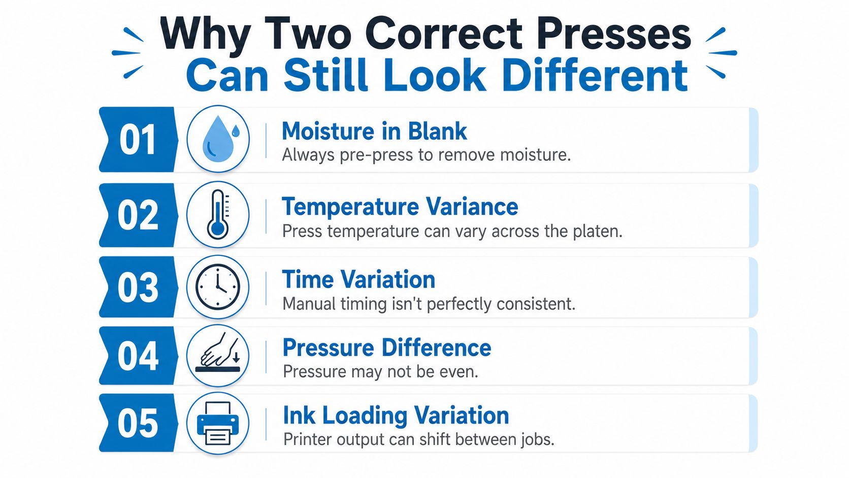
What shifts the result
The substrate and transfer paper both need to be in a controlled state before pressing. Industry guidance points to pre-heating the press, removing moisture, and keeping the workspace controlled, while technical sources also emphasize profiling, linearization, and ink-limit choices to keep chroma stable. If one shop stores paper in a dry room and another leaves it exposed to room humidity, the transfers won't always behave the same way.
A few shop-level variables matter more than most buyers realize:
- Moisture in the blank: wet fibers can mute output and create inconsistency.
- Humidity in the room: paper handling changes when the environment isn't controlled.
- Press temperature spread: not every spot on the platen behaves identically.
- Dwell time consistency: manual timing can drift from job to job.
- Pressure balance: uneven pressure changes how the dye moves.
What to ask before a reorder
Ask whether the decorator pre-heats the press, dries the blank before transfer, and stores paper in a controlled area. Ask what profiling workflow they use and whether the same printer settings are being carried over from the original run. Those questions tell you whether the shop is treating sublimation like a repeatable process or just pushing it through the machine and hoping the result matches.
The practical takeaway is easy. If the original order looked great and the reorder doesn't, the press numbers may not be the only thing worth checking. Moisture and handling can change the outcome before the heat even starts.
Common Defects and How to Fix Them
Most sublimation defects trace back to a small handful of causes. Once you know what they look like, it gets much easier to talk to your decorator without guessing. The goal isn't to memorize every possible flaw, just to recognize the pattern fast.
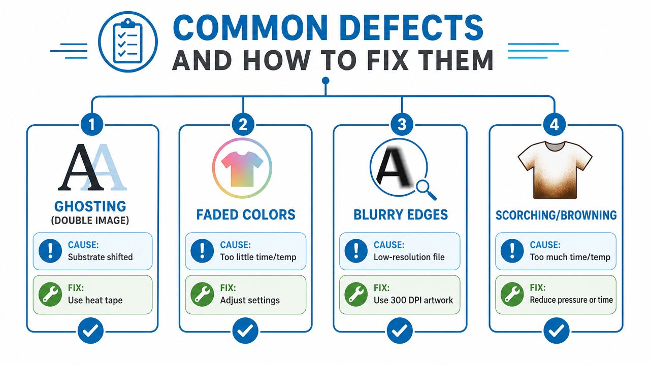
The defects buyers notice first
Ghosting usually means the transfer shifted after contact. The fix is better hold and alignment, often with heat tape so the paper stays put. Faded colors often point to too little time or too little heat, so the decorator needs to adjust the press settings.
Blurry edges usually come from the file itself, not the press. Low-resolution art spreads out on fabric and softens detail, so the better fix is clean artwork at a proper resolution. Scorching or browning points the other way, too much time or too much heat, which means the press settings need to come down.
If a print defect shows up in the same spot twice, the blank, the file, or the setup is usually the real cause, not bad luck.
A simple pre-approval check
Before a full run is pressed, ask for a sample on the exact blank if possible. Check edge sharpness, color balance, and whether the transfer stayed locked in place during pressing. If the design feels wrong on a sample, don't assume it will magically improve on the full order.
For a visual explanation of common errors, the embedded troubleshooting clip below is worth watching.
Costs, Turnaround, and Care for Sublimated Products
Cost in sublimation comes down to the blank, the complexity of the design, the quantity, and the substrate type. Polyester blanks usually fit the method better than cotton, while coated rigid pieces add their own material and production considerations. Full-color art also tends to demand more setup attention than a simple one-color mark, so the proof stage matters.
What affects the price
A buyer should expect the blank choice to matter first. A polyester performance shirt, a coated mug, and a coated metal panel all live in different production lanes, even when the print looks similar. Design complexity matters too, because photo art, gradients, and edge-to-edge placement require more careful setup than a basic logo.
Turnaround usually depends on whether the artwork is already approved and whether the decorator is running a new design or a repeat. A rerun with the same file and the same blank is usually easier to move through the shop than a fresh order that needs proofing and setup. That's why a clean art file saves time before the press even starts.
How to make the print last
Care is straightforward, but it matters. Wash cool, avoid harsh detergents, skip the high-heat dryer, and don't iron directly on the print. Those habits protect the dye that's bonded into the fibers or coating.
Treat the garment like the image lives inside it, because on the right substrate, that's exactly what happened.
Quick FAQ
Can sublimation work on children's apparel? Yes, if the garment is made from the right polyester-based material and the decoration is appropriate for the item.
Does sublimation have a minimum order quantity? It can work for single items or small runs, especially when the product is specialized or full-color.
How should I review a proof? Check the substrate, placement, color expectations, and whether the mockup matches the actual blank. If the material isn't compatible, the proof can still look good while the finished item disappoints.
If you're ordering branded apparel and want the decoration method matched to the right blank, reach out to Dirt Cheap Product, Inc. for a quote, a proof review, and a practical recommendation on whether sublimation, DTF, screen print, or embroidery is the best fit for your next run.