You're probably here because a standard logo tee feels a little too plain, but you're not ready to jump all the way to polos or full retail merch. That's exactly where a custom t shirt with pocket makes sense. It gives your staff shirt, event shirt, or merch piece a more finished look, but it also creates a set of production decisions that don't exist on a basic left-chest print.
The pocket changes everything. It changes where the logo can sit, how much detail will survive, which decoration method makes sense, and how the shirt feels when someone wears it for a full day. Most first-time buyers ask the same question in different ways: should the logo go on the pocket, above the pocket, or should the pocket stay clean and act as a style feature only? That's the key decision, and it affects cost, comfort, and appearance more than most clients expect.
Table of Contents
- Beyond the Basic Tee Why Choose a Custom Pocket T-Shirt
- Choose Your Canvas Pocket Styles and Shirt Fabrics
- Select Your Decoration Method Screen Print Embroidery or DTF
- Prepare Artwork for Perfect Pocket Placement
- From Quote to Delivery Navigating the Ordering Process
- Your Final Quality Check What to Look For
- Frequently Asked Questions About Pocket Tees
Beyond the Basic Tee Why Choose a Custom Pocket T-Shirt
A pocket tee works when you want branded apparel that looks more intentional than a standard promo shirt. For coffee shops, builders, breweries, campus groups, service teams, and boutique merch brands, that extra chest detail gives the shirt a retail feel without making it formal.
The pocket also creates a built-in focal point. Instead of dropping a logo into open space and hoping the shirt looks balanced, you can use the pocket as part of the design. Some brands keep the artwork subtle and treat the pocket as a frame. Others use the pocket as the whole idea, especially with the peekaboo approach where the design interacts with the edge of the pocket.
A lot of buyers think pocket tees are niche. They aren't. Pocket tees are now a standard custom-apparel category shaped by e-commerce ordering, online design tools, and no-minimum ordering options, and the popular peekaboo style commonly uses artwork sized at about 3 x 3 inches according to pocket tee design guidance from RushOrderTees.
Practical rule: A pocket tee looks simple on the surface, but it rewards brands that make deliberate decisions early.
That's why the pocket tee is attractive and tricky at the same time. It gives you style, structure, and branding opportunity. It also reduces your usable decoration area and makes poor placement much more obvious.
If you're ordering for a team, the question isn't just “Can we add our logo?” The better question is “What do we want the shirt to feel like?” Clean uniform. Casual merch. Premium workwear. Event giveaway with a little personality. The right pocket tee can do any of those, but only if the blank shirt, decoration method, and placement all match the job.
Choose Your Canvas Pocket Styles and Shirt Fabrics
Before you talk about ink, thread, or transfers, choose the shirt correctly. The pocket tee blank decides how polished the final product looks and how forgiving the decoration process will be.
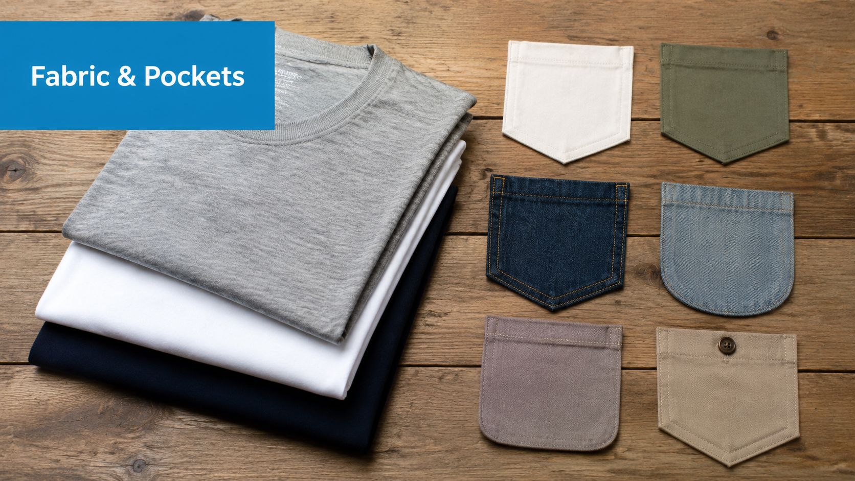
A standard T-shirt pocket is usually about 4 x 5 inches, but the decoration area is smaller. Industry guidance recommends a maximum pocket print area of about 3 x 3 inches to avoid running into seams and edges, as noted in this pocket printing size guide from TShirt Elephant. That's the core limitation you're designing around.
Pick the pocket style first
Not all pockets behave the same way.
- Standard chest pocket: This is the easiest version to source and the safest for uniforms. It gives you the classic pocket-tee look and a predictable placement zone.
- Rounded or fashion pocket: These can look more retail, but the curve can make certain logos feel cramped.
- Contrast pocket: Good for merch and lifestyle brands. Harder to decorate cleanly if the pocket color competes with the logo.
- Utility-style larger pocket: Better when function matters, but the pocket can dominate the shirt visually.
If your brand mark is very compact, decorating directly on the pocket can work. If your logo is wider, has a tagline, or needs breathing room, a shirt with a pocket may still work, but the decoration usually belongs above or around it rather than on it.
Match fabric to the decoration plan
Fabric changes both appearance and production behavior.
Cotton is usually the easiest choice when you want a classic feel and straightforward print performance. It's common for event tees, merch, and casual uniforms.
Poly blends can be a better fit for active teams or work settings where moisture management matters. They often pair well with methods that don't rely on the garment behaving like a soft cotton print surface.
Tri-blends feel softer and more fashion-forward, but the shirt itself can read more retail than utility. That can be perfect for merch. It can also make a heavy logo feel out of place.
A pocket tee should feel like the blank and the decoration belong together. A rugged logo on a feather-soft fashion tee can look mismatched. So can a delicate stitched emblem on a very basic work shirt.
If you're evaluating construction quality, it helps to understand how stretch and recovery affect seams and pocket stability. A sewing-focused resource like mastering stretchy fabric sewing gives useful background on why some knit fabrics shift more than others during handling and finishing.
What usually works best
For first-time buyers, the safest route is simple:
- Choose a pocket tee with a clean, standard left chest pocket.
- Use a fabric that fits the job, not just the price point.
- Confirm whether the pocket is part of the branding plan or just part of the shirt style.
That last point saves a lot of revisions.
Select Your Decoration Method Screen Print Embroidery or DTF
Most pocket tee orders are won or lost based on the pocket's execution. A logo that looks great on a full front print can fail on a pocket. A method that works beautifully above the pocket can feel stiff or crowded when placed directly on it.

Commercial pocket tee pages usually mention several decoration methods, but they rarely explain the actual tradeoff between printing on the pocket and decorating above it. That gap matters because the wrong choice can make a logo feel crowded, obscure the design, or reduce comfort for uniforms and daily wear, as noted by Broken Arrow Wear's discussion of pocket placement options.
What changes when the pocket is the print zone
The pocket adds thickness, seams, and edge constraints. That affects registration, feel, and visual balance.
Screen print usually makes the most sense when the artwork is simple and the order is larger. But the pocket itself is less forgiving than a flat shirt front. If the art reaches too close to the seams, the print can look compromised even when the file itself is clean.
Embroidery gives a premium look and works especially well for compact logos. It often shines above the pocket where the logo can sit cleanly on the shirt body. Direct embroidery on the pocket can work too, but some designs become too stiff or too dense for comfortable daily wear.
DTF is often the most flexible option when the logo needs fine detail or full color in a tight area. For buyers comparing options for smaller runs or more complex logos, this overview of DTF printing for small business is a useful reference point.
A short visual helps when teams are deciding between methods:
Pocket Decoration Method Comparison
| Method | Best For | Pocket Placement | Durability | Cost (per unit) |
|---|---|---|---|---|
| Screen Print | Simple logos and limited-color artwork on volume orders | Usually better above the pocket or carefully sized on the pocket | Strong for the right design and shirt combination | Usually more favorable on larger runs |
| Embroidery | Clean logos, badges, monograms, premium uniform looks | Often strongest above the pocket, sometimes on the pocket for simple marks | Strong for repeated wear when digitized well | Usually higher than basic print methods |
| DTF | Full-color logos, fine detail, mixed-fabric jobs | Often the most forgiving direct-on-pocket option | Good when applied correctly | Often practical for detailed or smaller-batch work |
Shop-floor note: If your logo includes tiny text, thin outlines, or color transitions, don't assume embroidery or screen print will translate well just because the full-size version looks sharp.
When above the pocket is the smarter choice
A lot of first-time clients want the logo directly on the pocket because it feels obvious. In practice, above the pocket is often cleaner.
Choose above the pocket when:
- Your logo is wider than it is tall: Horizontal marks usually breathe better above the pocket.
- You need a professional uniform look: This placement often reads cleaner for office staff, hospitality, and sales teams.
- The pocket should stay usable: Decoration on the pocket can affect how it feels or functions.
- You want embroidery without stiffness in the pocket panel: Stitching on the shirt body usually wears more comfortably.
Choose on the pocket when:
- The logo is compact and bold
- You want the pocket to be the design feature
- You're using a peekaboo concept
- The art has been redrawn specifically for the pocket area
One practical option some buyers overlook is to leave the pocket undecorated and place the branding elsewhere on the shirt. That keeps the pocket's visual appeal without forcing a logo into a space that doesn't suit it. Shops including Dirt Cheap Product, Inc. can quote pocket-area decoration alongside standard chest placements so clients can compare methods and placements before approval.
Prepare Artwork for Perfect Pocket Placement
Pocket artwork fails when buyers treat it like a normal chest print and just scale it down. That almost always creates trouble. Lines get too thin, small text turns muddy, and the design ends up too close to stitching.
![]()
For pocket decoration, the production workflow should start with a placement audit before the art is finalized. The design should stay centered and maintain at least 1 inch of clearance from seams, because printing over seams distorts artwork. Small pocket art also benefits from vector files for crisp edges, according to this pocket placement guide from RushOrderTees.
Start with the pocket not the logo file
The first thing to check is the actual garment. Not the mockup. Not the website thumbnail. The actual shirt spec or physical sample.
Look at:
- Pocket opening and edge stitching
- Pocket shape
- Fabric texture
- Any seam bulk that could interfere with printing or pressing
If the item is non-standard, ask for a sample before approving final production. That's especially important when the logo must sit directly on the pocket.
If embroidery is on the table, a placement reference like this placement guide for embroidery helps clients understand why a left-chest position on a pocket tee isn't exactly the same as a left-chest position on a shirt without a pocket.
What pocket artwork usually needs
Pocket-sized art often needs redesign, not resizing.
Thicker strokes help logos hold together at small scale. Hairline details that look elegant in a brand guide often disappear on fabric.
Less text is almost always better. If the full logo has a company name, descriptor, and slogan, use a simplified mark for the pocket and move the full brand lockup elsewhere if needed.
Cleaner negative space matters because small gaps can fill in visually. That's true in thread and in print.
A good approval workflow usually looks like this:
- Measure the actual printable area on the chosen shirt.
- Redraw or simplify the artwork for that size.
- Check seam clearance.
- Review a proof that shows the design on the actual garment color and pocket placement.
- Confirm whether the art is centered to the pocket or centered visually to the chest area around it.
Don't judge pocket art on your laptop at full zoom. Judge it at actual size.
That one habit prevents a lot of disappointment.
From Quote to Delivery Navigating the Ordering Process
Pocket tee orders go more smoothly when the buyer gives the shop the right information up front. If you send a logo and ask for pricing, you'll usually get a rough starting point. If you send the garment style, quantity range, decoration location, and target use, you'll get a much better quote and a faster proof cycle.
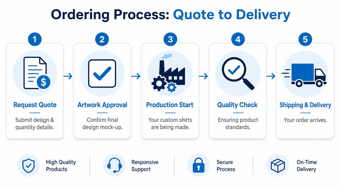
Pocket decoration should be priced using a full cost model, not a quick markup. Bulk corporate, school, and event orders commonly land in the 100–1,000 unit range, and that scale can lower unit production costs enough to support volume discounts while preserving margin. It's also common to underprice if labor and proofing time for pocket alignment aren't accounted for, as explained in this custom shirt pricing breakdown from Merchize.
What to send with your quote request
A useful first inquiry includes the basics, but it should also answer the production questions before the rep has to ask.
Send these details:
- Garment choice: If you know the shirt, include brand, color, and pocket style. If not, describe the look you want.
- Estimated quantity: Even a range helps.
- Artwork file: Vector is ideal for logos.
- Placement preference: On the pocket, above the pocket, or open to recommendation.
- Use case: Staff uniforms, retail merch, event giveaway, or promo campaign.
If you're comparing vendors or learning how buying in volume affects the final order, Ecuadane's guide on buying wholesale gives a helpful outside perspective on how wholesale purchasing decisions shape cost and consistency.
For teams ordering across multiple branded items, this custom promotional products bulk buying guide is also useful when you want the shirts to coordinate with hats, bags, or event pieces.
Why proof approval matters so much on pocket tees
The proof stage is the moment to catch the details that cost time later.
Check the proof for:
- Placement logic: Is the design centered to the pocket itself, or positioned to look balanced on the chest?
- Scale: Does the logo still read cleanly at actual size?
- Decoration method: Is the chosen method consistent with the logo detail and shirt fabric?
- Garment color contrast: A pocket can interrupt the visual field, so contrast matters more than many buyers expect.
Approving a pocket tee proof without checking the actual logo size is how small text slips through.
Once production starts, changes become expensive or impossible. That's why strong account managers push clients to review the proof slowly, even on rush jobs.
Your Final Quality Check What to Look For
When the order lands, don't just count boxes and move on. Open them and inspect a practical sample across sizes.
Start with placement consistency. Pull a few shirts from different sizes and compare logo position. The pocket changes the visual reference point, so consistency matters more than it does on a plain tee.
Then check the decoration quality itself.
- Print quality: Look for clean edges, solid application, and artwork that matches the approved proof.
- Embroidery quality: Check for trimmed threads, smooth stitching, and backing that doesn't feel messy or excessive.
- Pocket finish: Make sure the decoration didn't create obvious distortion, crowd the edge, or make the pocket look poorly aligned.
Also confirm the garment details. Verify shirt color, size breakdown, and total quantity against your order record. If the order includes multiple placements or mixed styles, separate and review them immediately while everything is still fresh.
A final quick check is wearability. Hold a decorated pocket tee up, touch the area from the inside, and ask a simple question: would your staff or customers want to wear this for hours? That gut check catches stiffness, bulk, and visual crowding fast.
Frequently Asked Questions About Pocket Tees
Can you print directly on the pocket?
Yes, but it depends on the artwork, fabric, and pocket construction. Compact art works better than wide or text-heavy logos.
Is above-the-pocket placement more professional?
Usually, yes. It often gives a cleaner uniform look and avoids some of the visual and technical limits of decorating directly on the pocket.
Which method is best for a simple company logo?
It depends on the logo style. Simple logos often work well with embroidery or screen print. If the logo has fine detail or full color, DTF is often easier to execute cleanly in the pocket area.
Can we use the same logo file from our regular chest print?
Sometimes, but it often needs adjustment. Pocket art usually needs simplified detail, stronger line weight, and a layout designed specifically for the smaller area.
Are pocket tees a good choice for uniforms?
Yes, especially when you want something more polished than a standard tee but less formal than a polo. They work well for teams that want casual branding with structure.
Should we decorate the pocket, above it, or leave it plain?
If the logo is compact and the pocket is part of the concept, decorate the pocket. If clarity and comfort matter most, go above it. If the shirt already looks strong and the logo feels forced there, leave the pocket plain and brand another location.
If you're planning a custom t shirt with pocket order and want help choosing the right placement, fabric, and decoration method, Dirt Cheap Product, Inc. can review your logo, garment choice, and quantity range, then provide a proof-driven path to production so you can compare what works on the pocket versus above it before you commit.