The cheapest custom letter openers are usually the worst buy. They look fine on a quote sheet, then disappear into a drawer, bend in transit, or carry a logo so faint that nobody notices it after the first week. Smart buyers should judge them by total cost of ownership, because a low unit price means nothing if the item never stays on a desk long enough to earn repeated brand impressions.
That is the buying test. A letter opener is small, but it sits in front of people for months or years, and that makes it a better branding vehicle than many expect. The right version turns one purchase into a durable desk accessory, while the wrong version becomes dead inventory.
Table of Contents
- Why Custom Letter Openers Deserve a Second Look
- Materials and Styles That Match Your Brand
- Imprint and Engraving Methods Explained
- Sizing Constraints and Artwork Guidelines
- Packaging and Presentation Options
- Pricing Structures and Minimum Order Quantities
- Production Timelines and Proofing Best Practices
- Promotional Use Cases That Deliver Results
Why Custom Letter Openers Deserve a Second Look
The usual advice is lazy. People tell buyers to chase the lowest unit price, then act surprised when the item feels disposable. That mindset makes sense for a flyer or a short-lived handout, not for custom letter openers, which are meant to sit on a desk and keep working.
The object lasts longer than most promo items
The historical case is strong here. Practical envelopes and lower postage rates in the mid-19th century pushed demand for the tool, and by the late 19th century letter openers were common in business firms, government offices, and private homes. One historical account also places the first recorded mention around 1850, which shows how long this category has been tied to office life, not trend cycles. You can see that evolution in the object itself, from a seal-cutting tool to a branded desk accessory, and that matters because durable desk items keep generating impressions after the giveaway moment is over. Historical overview of 19th-century letter openers
Practical rule: if the item won't stay visible, don't pay for decoration.
That same historical context explains why the opener became a promotional object so quickly. By the late 19th century, they were popular as giveaways and were often made of metal or celluloid, which made them suitable for display as well as utility. In other words, this category has always rewarded the same thing buyers care about today, a useful object with enough surface presence to carry a brand.
Where they beat pens and stress balls
Pens get used, then lost. Stress balls get tossed into a drawer or replaced by whatever's on the desk that week. A well-made letter opener is different because it solves a task without asking for attention, and that makes it fit better in mailrooms, finance teams, executive offices, law firms, and donor relations departments.
The better question is not whether the item is fashionable. The better question is whether it will still be in view long after the campaign ends. If your audience opens mail regularly, keeps a tidy desk, or values small professional tools, custom letter openers outperform flashier giveaways because they trade novelty for repeat exposure.
Materials and Styles That Match Your Brand
Material choice changes the whole read of the item. A stainless steel opener says something different from a lightweight plastic one, and buyers should treat that difference as a branding decision, not just a cost decision. The same is true for handle shape, thickness, and the feel in hand, because those details control both perceived value and everyday usefulness.

Stainless steel, aluminum, and plastic each solve a different problem
Stainless steel is the strongest fit for executive gifts and client-facing pieces. It feels substantial, it holds up well, and it reads as intentional instead of cheap. If the opener is meant to sit in a visible office environment, stainless steel is the safest premium choice.
Aluminum works best when you want a lighter premium look without the heft of steel. It's a practical middle ground for conference kits, onboarding packets, and corporate mailings where shipping weight matters. The finish can look polished, but it still needs a clean imprint to avoid looking generic.
Plastic is the budget play. It can work for large distribution runs, internal mailrooms, and short-term campaigns, but it needs stronger branding discipline because the base material already signals lower value. If you go plastic, keep the design simple and the message clear.
Choose style by audience, not by habit
Thin, blade-like profiles feel more traditional. Wider handles give you more room for decoration, but they also change the look from classic desk tool to promotional accessory. That is fine if the item lives in a welcome kit or event bag, but less ideal if you want a more formal executive desk presence.
For buyers trying to align material choice with sustainability or broader promotional planning, the category can also fit into a larger mix of office-friendly branded items. A useful starting point is this eco-friendly promotional products guide, especially if your campaign is already leaning toward durable, reusable items instead of throwaways.
My recommendation
If the opener is for executives, donors, or high-value clients, don't cheap out on the base material. If the opener is going into mailrooms, internal kits, or mass mailings, choose the lightest reliable option and spend your money on decoration clarity instead. That trade-off usually beats paying extra for a premium body that nobody notices.
Imprint and Engraving Methods Explained
Decoration method matters more on custom letter openers than on many other promo items because the surface is small and the brand area is limited. Buyers often focus on the opener body and ignore the imprint process, which is a mistake. A weak decoration choice can make even a good product look careless.
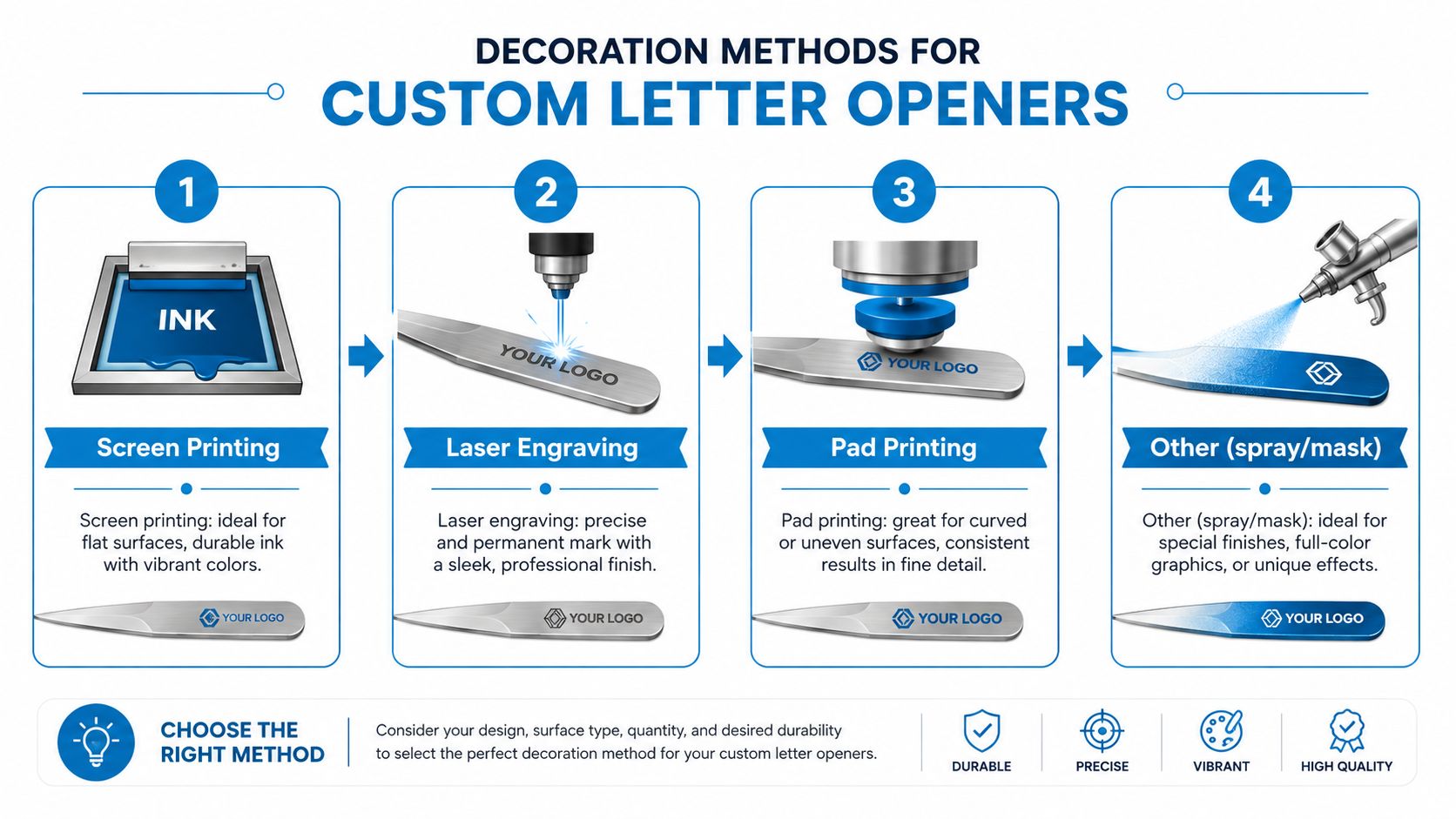
Pick the method that fits the logo, not the other way around
Screen printing is the right call for flat, simple logos with strong contrast. It's the most straightforward path when you want color and the design doesn't depend on tiny detail. Use it when the brand mark is bold and the surface is forgiving.
Laser engraving is better for metal bodies and for buyers who want a clean, durable mark that won't wear the way surface ink can. It's the most dependable option for high-use desk items because the decoration becomes part of the object rather than sitting on top of it. If you want a quieter, more professional finish, engraving is usually the smarter choice.
Pad printing helps when the surface isn't perfectly flat or the logo needs more flexibility than screen printing allows. It's common in promotional production because it can handle many shapes, but it still demands disciplined artwork. Keep the design legible, because this method doesn't rescue weak files.
A useful resource for understanding how decoration choices affect a blank is the 2026 buyer's guide for engraving blanks, especially if you're comparing how different substrates respond to marking. For a more practical supplier-side overview, the logo decoration method guide is also worth using before you approve art.
Don't overcomplicate the artwork
If the logo has tiny text, heavy gradients, or thin outlines, simplify it before production. Custom letter openers don't give you the luxury of a large billboard surface, so the decoration should be bold, legible, and easy to reproduce. That means fewer colors, cleaner vector paths, and no decorative noise that disappears at small scale.
Procurement rule: on small promo tools, decoration reliability beats creative complexity every time.
Sizing Constraints and Artwork Guidelines
The biggest artwork mistake is treating a letter opener like a flat flyer. It isn't one. The usable imprint area is compact, and the handle or body shape controls what can be printed cleanly without looking crowded or off-center.
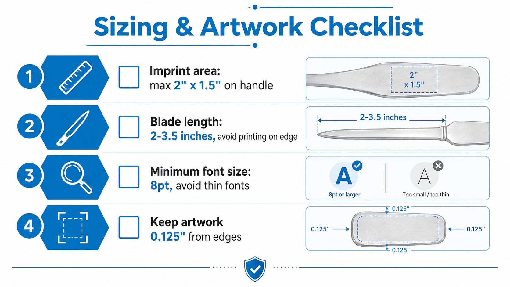
Use the imprint area as the design limit
One metal model measures 2.06 in × 3.13 in × 0.13 in with a screen-printed imprint area of 1.125 in × 1.880 in. Another plastic and stainless-steel version provides 1.817 in × 1.174 in of imprint space. Those numbers tell you the whole story, the art has to be small, clean, and deliberate. Custom letter opener imprint area details
That is why vector files are the default choice. They scale cleanly, hold crisp edges, and keep the logo from looking fuzzy on a narrow body. Raster artwork can work only when it's high quality and already simplified, but vector is the safer file type every time.
Build artwork for distance, not for close inspection
The opener will be viewed at arm's length, not under a designer's monitor. That means dense microtype, skinny strokes, and fine gradients are poor choices. Use strong contrast and leave enough breathing room around the mark so the logo doesn't look cramped against the edge.
A clean internal reference for artwork planning is this logo for gifts guide, because the same small-format logic applies to many branded desk items. If your brand mark only works in a large, detailed version, it needs simplification before you put it on a letter opener.
A simple file-prep checklist
- Send vector artwork first. PDF, AI, or EPS usually gives the cleanest production path.
- Keep the logo simple. Thin lines and tiny text often break at small size.
- Confirm placement early. A cramped imprint looks amateur, even if the decoration itself is technically correct.
- Expect proof review. Always check spacing, contrast, and orientation before approval.
If the file looks busy on screen, it will look worse on a small opener. Cut it down.
Packaging and Presentation Options
Packaging changes the perceived value more than most buyers admit. A plain opener in bulk wrap can work for internal distribution, but the same item in a box or presentation sleeve feels more intentional and more giftable. That difference matters if the opener is being handed to clients, donors, or event speakers.
When packaging is part of the package, keep the logic simple. A sturdy cardboard box is usually enough for protection and presentation when the goal is shipping efficiency and a clean first impression. If the opener is going into a premium kit, a box with a neat insert does more for brand perception than a flashy base item with sloppy packing.
Spend on packaging where the audience will notice
Executive gifts, recognition pieces, and donor thank-yous deserve better presentation than mailroom stock. A box, sleeve, or insert card creates a clearer handoff moment and makes the opener feel like a deliberate gift rather than a commodity. That's where packaging earns its place.
Bulk poly bags make sense for internal departments and large-scale distribution. They keep costs controlled and they're easy to palletize or sort. Just don't pretend they create a premium experience, because they don't.
Keep the format aligned with the campaign
If the opener is going into a conference kit, a compact insert card can provide context without adding much cost. If it's going straight to staff onboarding, plain protective packaging is usually enough. If it's a client gift, the box should protect the item and support the brand story at the same time.
Buy packaging with a purpose. Pretty wrapping that doesn't improve delivery, protection, or presentation is wasted budget.
The hidden cost here is labor. More packaging layers take more time to assemble and more space to ship. That means buyers should treat packaging as a line item, not an afterthought, and match the presentation tier to the audience rather than to personal taste.
Pricing Structures and Minimum Order Quantities
Custom letter opener pricing is usually where buyers lose discipline. They compare unit prices, skip the setup details, and then wonder why the final invoice jumped. The actual number is total project spend, not the sticker price on the item.
| Cost Component | Budget Tier | Mid-Range | Premium |
|---|---|---|---|
| Base opener | Low unit cost, usually plastic or simple finish | Better material, cleaner feel | Metal, heavier body, stronger perceived value |
| Decoration | Simple one-color imprint | Cleaner multi-step imprint or better finish | Durable engraving or higher-end decoration |
| Setup | Often unavoidable | Still present, but easier to justify | Usually easier to absorb because the item supports a gift-level use |
| Packaging | Bulk wrap | Basic box or sleeve | Presentation box or custom pack-out |
| Shipping | Lower per item, but can rise with volume | Balanced weight and protection | Higher if the item and packaging are heavier |
| Reorder value | Weak if the item feels disposable | Better if the opener stays on desk | Strongest when the piece is kept and reused |
The hidden fees are what hurt
Setup charges, artwork revisions, sample costs, rush fees, and shipping usually do the damage. A cheap opener with weak decoration and poor packaging can end up costing more in disappointment than in dollars because the brand impression never lands. That's the hidden TCO problem most product pages ignore.
Minimum order quantities also matter because small orders often carry more friction. If the quantity is too low, the setup cost gets spread across too few pieces, and the per-unit cost climbs fast. That's why the “cheapest” item is sometimes the most expensive choice once you look at the full order.
Buy for lifespan, not just for launch
A slightly better opener that stays in use has more value than a cheaper one that fails early or disappears into a drawer. For a procurement team, that means the right comparison is not opener A versus opener B on unit cost alone. It's whether the brand mark stays visible long enough to justify the order in the first place.
If you need to tighten spend, reduce packaging before you reduce durability or decoration clarity. That's usually the cleanest place to save money without weakening the item itself.
Production Timelines and Proofing Best Practices
Rushing this category is a bad habit. It leads to bad art, missed approvals, and production mistakes that could have been avoided with one careful review. Build time into the order, because the proof is where most problems show up.
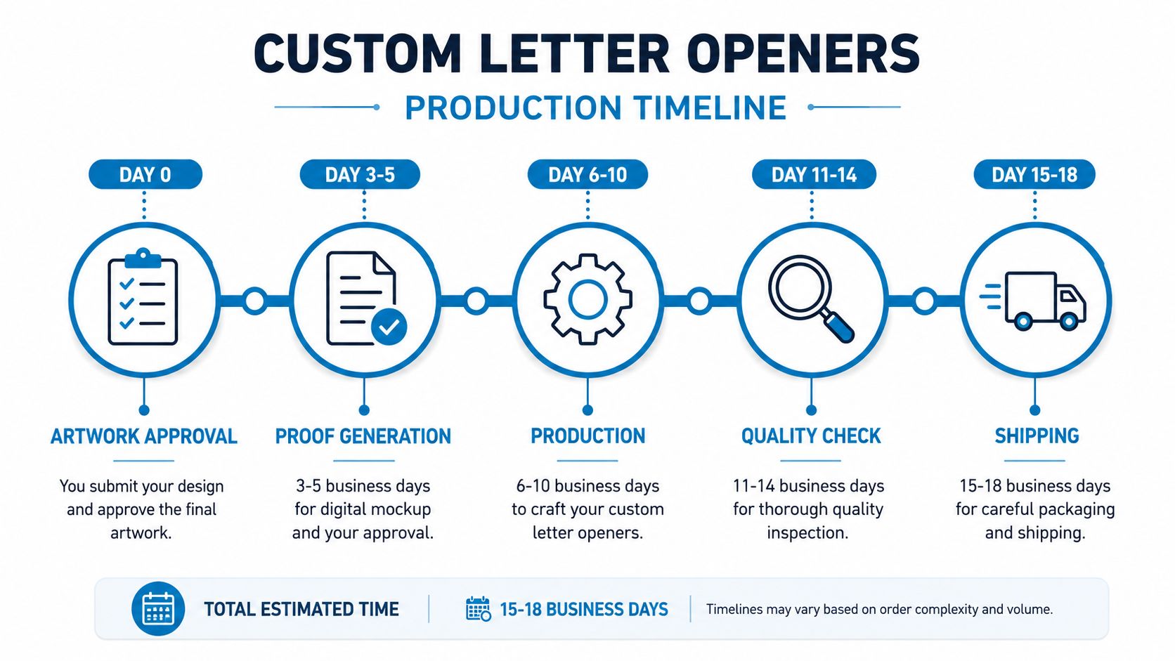
Approve the proof like it's the final product
Start with artwork approval on day one, then review the proof slowly. Check spelling, placement, imprint size, and whether the logo still looks clean at opener scale. If the proof is off, fix it before production starts, not after.
The timeline in the workflow should include time for proof generation, production, quality check, and shipping. A realistic production window keeps everyone honest and avoids the pressure that leads to mistakes. If a supplier offers a rush path, use it only when the event date demands it.
The proofing checklist that prevents rework
- Check the logo spelling. One missed character ruins the whole run.
- Review placement carefully. Tiny alignment errors stand out on small items.
- Confirm imprint color or engraving style. Don't assume the default is correct.
- Look at scale, not just art quality. A perfect file can still be wrong if it's oversized.
- Approve only when the proof matches the order. That sounds obvious, but it's where mistakes usually get through.
When you're planning for a launch, campaign drop, or event kit, don't forget approval lag. Sales teams, marketing teams, and executives all tend to want one more revision. Build that into the schedule instead of hoping the vendor can absorb it.
A clear proofing process protects both timing and budget. It also protects your brand, because nothing makes a promotional item look cheaper than a visible error that should've been caught before production.
Promotional Use Cases That Deliver Results
The strongest use cases are the ones where the opener gets handled repeatedly. Financial services firms use them in client appreciation packages because the item feels professional and practical. Nonprofits use them for donor recognition because a desk item keeps the relationship visible without feeling flashy. Event teams use them in conference kits when they want a useful object that survives the conference bag purge.
The best audience is the person who still opens physical mail, keeps a desk, and appreciates a useful tool. That often includes executives, administrators, office managers, legal staff, finance teams, and donor-facing staff. If the recipient values order and routine, the opener is more likely to stay in circulation.
Three distribution patterns work best
- Direct mail inserts: strong for client relationships, especially when the item supports a message or invitation.
- Onboarding packages: effective for new hires who will use desk tools.
- Recognition gifts: useful when the goal is appreciation, not mass exposure.
A branded opener also works well when it's part of a larger touchpoint sequence. Give it with a welcome note, place it in a conference kit, or pair it with another desk item that fits the same visual system. The opener itself is small, but the surrounding presentation can make it feel much more important.
The mistake is giving it to audiences who won't use it. If the recipient lives in email and never touches physical mail, choose another item. If they do open envelopes regularly, this category earns its place fast because it keeps your brand in front of them every time they clear the stack.
Dirt Cheap Product, Inc. supplies custom branding solutions for teams that need useful promo items, fast proofs, and clean decoration without wasting budget on gimmicks. If you're sourcing custom letter openers for client gifts, onboarding kits, or mailroom use, visit Dirt Cheap Product, Inc. and put your logo on a practical item that stays on the desk.