
You hand a card across the table, and the other person's eyes drop to that little rectangle before you've finished your sentence. In that brief pause, color does a lot of work. It can make your brand feel steady, sharp, warm, premium, or forgettable, and the wrong shade can fight the rest of your design before anyone reads your name.
That's why business card colors are never just decoration. They sit at the point where instinct, brand strategy, and print production meet, and each layer matters. A color that feels right on your laptop can land differently on paper, and a polished stock can change the same ink again once it's in someone's hand.
If you already think in terms of brand identity, this pairs well with the practical framing in Baslon Digital on brand identity. For a wider small-business branding context, the notes at Dirt Cheap Product's small business branding tag are useful as a reference point too.
Table of Contents
- What Your Card Says Before You Open Your Mouth
- A Short History of Color on the Card in Your Hand
- The Feelings Each Color Family Carries
- Designing for Ink, Not for Your Screen
- Contrast Ratios That Keep Small Text Readable
- How Paper Finish Changes the Color You See
- When Bold Trends Help and When They Hurt Recall
- Your One-Page Checklist Before Approving the Proof
What Your Card Says Before You Open Your Mouth
A card gets judged before it gets read. Color does that first round of speaking, and AlphaGraphics notes that initial reactions are often driven by color alone. That is why the first visual impression can outweigh the logo or the type size.
There is no single correct palette. A card for a trade show, a quiet client lunch, and a fast referral handoff all need a different tone, even if they come from the same business. A lawyer, a florist, and a SaaS founder can all look credible with different colors if the choice matches the job.
To choose colors, think in three layers. First, what the hue suggests. Second, how that choice survives CMYK conversion and the print process. Third, what the paper finish does to the ink once the card is cut, stacked, and passed from hand to hand. That is the bridge between instinct and a printer's quote.
If you want a brand-level lens before you pick a palette, start with how color fits into the full identity system, not only the card face. The practical test is simple, your card should look like it belongs to your business, not just to a mood board. For more context on that wider identity view, see Baslon Digital on brand identity and this overview of small business branding examples and notes.
Practical rule: begin with the feeling you want people to carry away, then check whether the ink, stock, and finish can deliver it in print.
A Short History of Color on the Card in Your Hand
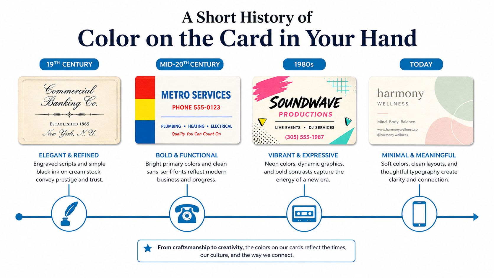
A business card used to be more about restraint than expression. The Library of Congress notes that by the 19th century trade cards were more common and sometimes colorful, while traditional business cards were still usually white or cream with black text and only a small accent of color. Cornell's trade-card history adds that business cards in the mid-19th century were often mainly black-and-white, with only an occasional second color, while color lithography helped push broader color printing from the 1870s to about 1900 Paperlust.
That history matters because color once signaled cost. When a card was cream stock with black engraved script, the weight of the paper and the sharpness of the impression did most of the talking. A bright accent or a second ink meant more setup, more effort, and often a more established buyer.
As presses got faster and four-color process printing became more accessible, the palette widened. Full-color cards stopped being a luxury reserved for larger brands, and solo operators could finally order cards that looked closer to their logo files. That shift is why color still feels loaded today, even though reproduction is far cheaper than it used to be.
The lingering effect is psychological as much as historical. A card with one deliberate color choice still feels intentional, while a card with too many colors can feel noisy because it seems to be trying too hard. The old economy of printing is gone, but the sense that color carries meaning has stayed behind.
The Feelings Each Color Family Carries
Color family is where most readers start, because people want the shorthand first. That shortcut is useful, as long as it stays a starting point and not a rigid rule. A thoughtful guide from DesignStack on colour psychology in branding is helpful here because it treats color as a signal, not a magic trick.
Blue tends to read as calm, professional, and trustworthy. Green often suggests growth, health, balance, or sustainability. Red leans toward urgency, appetite, and energy. Yellow and orange usually feel warmer and more active, while black, white, and gray can signal luxury, precision, or minimalism.
| Color Family | Primary Signal | Fits Well In |
|---|---|---|
| Blue | Trust, stability, professionalism | Finance, law, healthcare, consulting |
| Red | Energy, urgency, appetite | Food, sales, entertainment, promotions |
| Green | Growth, balance, sustainability | Wellness, eco-focused brands, finance-adjacent work |
| Yellow and orange | Warmth, optimism, motion | Hospitality, children's services, creative studios |
| Black, white, gray | Luxury, precision, restraint | Fashion, architecture, tech, premium services |
Industry fit matters because people bring expectations with them. A navy card can feel reassuring in an insurance office and formal in a design studio. A bright orange card can feel lively at a creative event and overwhelming in a legal setting.
The trap is assuming the hue alone does the job. Contrast against the stock changes the signal, and so does how much of the card you let the color occupy. A pale yellow background can be cheerful, but it can also make small text disappear if you don't plan the typography carefully.
Good design uses color as a cue, not as a costume. If the shade fits the field, the audience, and the legibility requirements, it helps. If it only looks interesting on screen, it's probably doing too much.
Designing for Ink, Not for Your Screen
A file that looks crisp on a monitor rarely lands the same way on paper. Screens show light, while printers lay down ink. That gap matters because CMYK uses cyan, magenta, yellow, and black to subtract color on paper, while RGB builds color with light on a screen. A design has to be translated before it goes to press Overnight Prints.
That translation is where the surprises start. Electric blue, lime green, neon orange, and vivid purple often shift because their screen versions can sit outside what ink and paper can reproduce cleanly. Even soft pastels can change character, especially if they looked airy on a backlit display and then turn muddy on uncoated stock.
If you need tighter brand matching, spot-color printing may belong in the conversation. For a practical comparison of matching options, Dirt Cheap Product's PMS color matching page helps when you're asking a printer how exact a brand color needs to be. That question is different from choosing a swatch on screen, because the print method changes the result.
| RGB Family | Typical Conversion Issue | Safer Approach |
|---|---|---|
| Electric blue | Can dull or darken in CMYK | Test a proof on the final stock |
| Lime green | Often shifts toward a flatter green | Choose a slightly less saturated green |
| Neon orange | Can lose brightness quickly | Use a strong but printable orange |
| Vivid purple | May tilt warmer or look muted | Check a press proof before approving |
A simple habit saves money and frustration. Approve a physical proof on the exact paper, not a PDF on your phone. A file can look polished on a monitor and still disappoint in hand.
Paper choice, ink density, and coating all affect the final read. Glossy stock can make colors feel cleaner and sharper. Uncoated stock absorbs more ink, so the same color can look softer or darker. If a business card color is central to your brand, ask the printer how the chosen stock will affect it before you sign off.
Contrast Ratios That Keep Small Text Readable

A contrast ratio measures how strongly one color stands out from another, on a scale from 1:1 to 21:1 Digital.gov. For normal text, WCAG AA calls for 4.5:1, AAA calls for 7:1, and large text can pass at 3:1 Digital.gov.
On a business card, those numbers show up fast. Light gray on cream can look refined on a monitor and still blur in the hand. White type on a yellow field can seem lively on screen, then turn into a reading test once it is printed.
Scope's brand guidelines state that Bright Pink reaches AA only for text above 18pt, which makes it better for headings, larger text, and visual accents Scope. That is the practical split to keep in mind. Decorative color can live in a logo block, border, or back panel. Functional color has to carry names, titles, phone numbers, and email addresses without strain.
A printer will usually help you catch weak pairings before they cost money. Run the layout through a free contrast checker, then ask for a proof on the actual stock. Screen brightness can hide a problem that paper makes obvious. If the card has to do real work, the type needs enough separation from its background to stay clear at a glance.
How Paper Finish Changes the Color You See
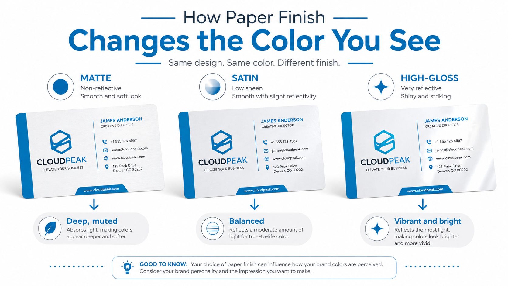
Paper finish changes color more than most owners expect. Matte, satin, and gloss all treat light differently, so the same swatch can look deeper, sharper, or brighter depending on the coating. On a soft-touch matte stock, a navy can feel heavier and a little warmer. On a high-gloss coat, the same color can pop harder because the surface reflects more light.
That means finish and color should be chosen together. Deep navy, charcoal, and emerald often feel grounded on matte stocks. Saturated reds and electric blues usually look more alive under gloss. Natural kraft and other earthy stocks work better when the palette leans warm and restrained, because the paper itself becomes part of the visual message.
A square card can make this even more noticeable because the format puts more surface in play and less white space to hide weak choices. If you're weighing shape and finish together, Simon Stratford's guide to presenting a square card design gives a useful frame for thinking about how the format changes the read.
If you're comparing stocks, ask for a sample ring before you lock the spec. A printed hex code is not the same thing as a finished card in your hand, and heavy card stock changes the feel as much as the look. For a closer look at stock choices, Dirt Cheap Product's heavy cardstock paper page is a practical starting point.
The simplest rule is this. Treat paper as part of the color decision, not an afterthought. The same design can feel like three different cards when you move it across matte, satin, and gloss.
When Bold Trends Help and When They Hurt Recall
The current trend toward darker cards, clashing palettes, metallic effects, and creative QR codes can look sharp, but sharp is not the same as useful. A trend roundup for 2025 and 2026 points to bold colors, black cards, colored edges, gradients, translucent finishes, and QR integration, but it also leaves an opening that matters to small businesses, which is when these choices improve memorability and when they become visual noise VistaPrint Canada.
A crowded trade-show table is a different test from a client lunch. At a booth, a louder card may help someone spot your stack in a sea of beige. At lunch, the same treatment can feel overdesigned, especially if the other person is already listening to you and doesn't need a visual shout to remember your name.
A quick exchange at a conference elevator is another case entirely. People often glance once, tuck the card away, and move on. In that setting, a bold card helps only if the dominant color is still obvious at a glance. If someone can't name that color within a few seconds, the design may have traded recall for novelty.
That's where restraint wins more often than people expect. One strong accent on a neutral field is usually easier to remember than a full clash of saturated tones, especially for businesses that rely on repeat referrals instead of a single viral moment. Dark or black cards can feel premium, but they still need enough contrast and enough breathing room to keep the text legible.
If the palette looks dramatic but the person has to squint to read your details, the drama is working against the card.
Your One-Page Checklist Before Approving the Proof
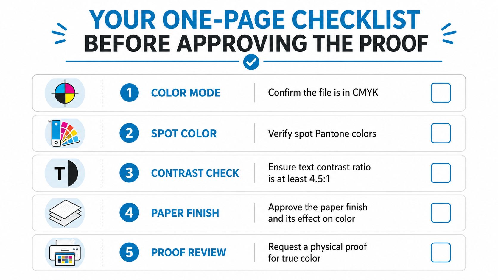
A proof review works best when it stays short and exact. Start with the file mode, because CMYK is the print language and RGB is only a screen language. Then confirm whether each brand color is set as a spot color or converted through process printing, since that choice affects how closely the press can match it, especially on uncoated stock.
Readability comes next. Check that body text holds a 4.5:1 contrast ratio against its background, the same basic standard that keeps small type from disappearing on a busy card. Use that step as the filter before you get attached to the palette. If the contrast is weak, the card may look polished on screen and still fail in hand.
Paper finish changes the result in a very practical way. Gloss pushes saturation forward. Matte tends to mute glare and makes some tones feel deeper. That is why the same color can look bright on one stock and quiet on another.
A physical proof still matters after the file looks clean. Print it, hold it, and view it under the office lighting where the card will usually be handed out. Then compare the proof with the approved file so you can see whether the printer, the stock, or the color conversion shifted the result.
Final check: save the approved proof PDF with the print quote. Reorders go faster when the printer can match the exact version you signed off on.
Dirt Cheap Product, Inc. handles branded print and decoration work across apparel and promotional items, and that same proofing habit helps keep colors, placement, and finishes consistent when you are ordering marketing materials for events or client-facing handouts. If you are ready to talk through a card or another branded piece with a team that works from uploaded artwork and sends proofs quickly, visit Dirt Cheap Product, Inc. and start with the same color choices you want customers to remember.