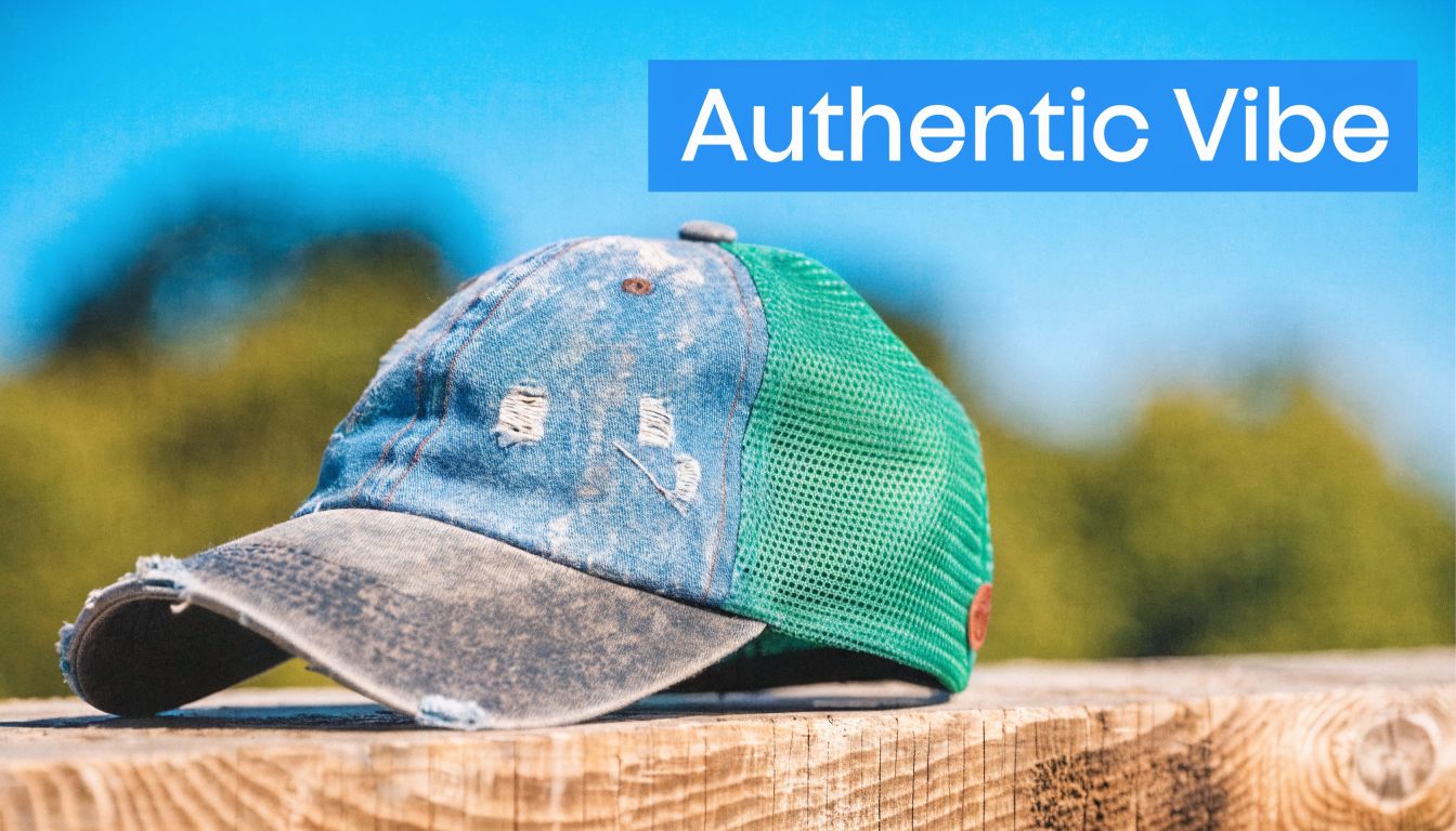
You’re probably in the same spot most first-time hat buyers hit. You want merch that looks retail-ready, not like a leftover giveaway from a folding table. You also don’t want to spend money on a distressed trucker hat order, add your logo, and then realize the print cracks, the stitching puckers, or the finished hat looks cheaper than the blank did.
That’s where a little planning saves a lot of frustration. Distressed trucker hats can look excellent for staff uniforms, event merch, retail shelves, and branded giveaways, but only if the blank, decoration method, and artwork all match the worn-in fabric. The hat itself has character. Your branding has to work with that character, not fight it.
Table of Contents
- Why Your Next Merch Drop Needs a Worn-In Vibe
- What Makes a Trucker Hat Distressed
- Choosing Your Blank Hat Styles Materials and Fit
- The Ultimate Guide to Branding Your Hat
- Smart Use Cases for Branded Distressed Hats
- Navigating Pricing Minimums and Timelines
- Conclusion Creating a Hat People Love to Wear
Why Your Next Merch Drop Needs a Worn-In Vibe
A lot of branded merch fails for one simple reason. It asks people to advertise a company, but gives them something they wouldn’t choose to wear on their own.
A distressed trucker hat solves that better than most promo products. It already looks broken-in, casual, and familiar, so the branding feels like part of the hat instead of an afterthought. That matters when you want a customer, staff member, or event attendee to keep reaching for it.
Think about a coffee roaster, local brewery, fishing charter, landscaping company, or music festival. A clean corporate cap can feel too stiff for those brands. A distressed trucker hat gives the logo a softer landing. It feels lived-in from day one, which makes the merch feel less promotional and more personal.
That worn look also helps with one of the biggest challenges in branded apparel. People don't want to look like they're wearing a uniform when they’re off the clock.
Practical rule: If the hat looks like something a person would buy without your logo on it, you’re starting in the right place.
The strongest merch drops usually get this balance right:
- The style feels current: The hat looks like retail product, not leftover trade show inventory.
- The branding feels integrated: A patch, stitch, or print works with the faded fabric instead of overpowering it.
- The item fits daily use: People can throw it on for errands, workdays, travel, or weekends.
That’s why this category keeps showing up across small business merch programs. The hat does part of the branding work before you even decorate it. Your logo doesn’t need to carry the whole piece by itself.
What Makes a Trucker Hat Distressed
A distressed trucker hat isn’t just a regular mesh cap with damage added for effect. It has three distinct parts: the trucker shape, the worn finish, and the casual attitude that finish creates.
The style has real roots. Trucker hats, often called gimme caps or feed hats, started in the early 1970s as inexpensive promotional giveaways from U.S. feed stores and farming supply companies to truck drivers and farmers, which is part of why they still carry that practical, working-class identity today, as noted in Highsnobiety’s history of trucker hats.
The trucker foundation matters
Before the distressing, the build has to be right. A true trucker hat usually has a structured front, a curved bill, and mesh in back. That combination gives you two things at once. You get a front area that can hold a logo, and a back half that feels lighter and cooler than a full-fabric cap.
That’s why this style has lasted. It was useful long before it became fashionable.
Distressing is controlled, not accidental
A good distressed trucker hat looks worn, but not ruined. The finish is usually created through pre-washing, fading, sanding, fraying, or similar treatments that soften the fabric and break up the surface visually. The goal isn’t random damage. The goal is a hat that already feels familiar.
That creates a different branding surface than a smooth, untouched cap. The front panel may have faded color, softened structure, or slight texture variation. All of that affects how embroidery, print, and patches sit on the hat.
Here’s the easiest way to tell the difference between a regular trucker and a distressed one:
| Feature | Standard trucker hat | Distressed trucker hat |
|---|---|---|
| Surface look | Clean and uniform | Faded, washed, or worn-in |
| Brand feel | Crisp and straightforward | Casual and vintage-leaning |
| Best logo style | Sharp, simple marks | Marks with texture, contrast, or depth |
A first-time buyer often assumes distressing is only about style. It isn’t. It changes decoration choices too. The more aged the front panel looks, the more carefully you need to choose a method that still reads cleanly.
The best distressed hats look intentional from every angle. The worst ones look like a damaged blank with a logo added later.
Choosing Your Blank Hat Styles Materials and Fit
A client usually notices the logo first. The wearer notices the hat first. If the blank feels awkward, flimsy, or too trendy for the audience, the branding never gets a fair chance.
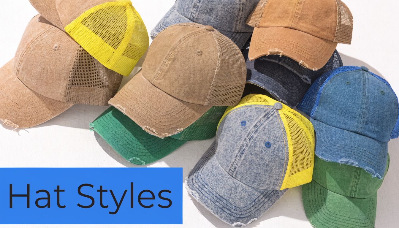
Start by judging the blank on its own. A good distressed trucker should already look like something your team, customers, or event attendees would choose to wear off the shelf. That matters even more on pre-distressed fabric, because the finish already adds personality. The wrong crown shape or panel layout can make the final hat look cheap fast.
Start with profile and panel layout
Profile controls both appearance and decoration space. Mid-profile is usually the safest choice for branded orders because it gives your logo enough room without pushing the crown too high. It tends to work across more face shapes, and it usually causes fewer complaints on bulk orders.
High-profile hats have their place. They stand out, and they can work well for bold retail-style branding. The trade-off is proportion. A small left-chest-style logo often looks undersized on a tall crown, especially once fading and abrasion soften the front panel visually.
Panel layout matters just as much. A 5-panel trucker gives you one broad front surface, which helps patches and larger artwork sit cleanly. A 6-panel hat has a center seam. That seam is fine for simple embroidery, but it can break up detailed art or create a bump under a patch.
If you're comparing shape-driven hat projects beyond standard caps, specialty tools like Die for quilted hats can be useful for understanding how panel construction changes design possibilities.
Pick materials for comfort, decoration, and wear life
Material choice affects three things at once. How the hat feels. How the logo applies. How the finished piece holds up after real use.
That last point gets missed on first orders.
Distressed hats already have a softened, worn surface, so the front panel needs enough stability for your decoration method. Foam fronts give you a bold, clean face for simple graphics, but they can look too shiny or too new if the rest of the hat has a washed, vintage finish. Cotton and cotton-blend fronts usually feel more natural on distressed styles, and they tend to pair better with embroidery or patches because the texture matches the aged look.
Mesh also deserves a quick check. Some trucker hats use soft mesh that wears comfortably right away. Others use stiffer mesh that keeps its shape longer but can feel less forgiving out of the box. For staff uniforms, giveaways, and repeat event wear, that comfort difference matters because people only keep wearing the hat if it feels good after the first day.
A practical shortlist:
- Foam front: best for bold art with limited detail
- Cotton or cotton/poly front: better for a worn-in look and more premium branding methods
- Softer mesh back: better for comfort-focused orders
- Stiffer mesh back: better if shape retention matters more than softness
To compare silhouettes before you lock decoration specs, a broader headwear style catalog can help narrow the look first.
A quick product walkthrough helps once you’ve got the basics in mind:
Fit is where bulk orders usually go right or wrong
Poor fit creates dead stock. It also hurts the perceived quality of the branding, even if the logo itself was done well.
For most company orders, adjustable trucker hats are the safest route. Snapbacks cover the widest range of wearers, and they reduce the chance that half the box goes unworn because the fit was too shallow or too tight. Fitted options can work for retail programs or highly specific audiences, but they add complexity that many first-time buyers do not need.
Use this filter before approving a blank:
- Choose mid-profile for the broadest audience
- Choose a cleaner front panel if your logo has small detail
- Choose adjustable closure unless your audience specifically wants fitted hats
- Choose color contrast carefully so the logo still reads over fading, wash effects, and distress marks
The goal is simple. Pick a blank that still looks professional after the distressing, supports the branding method you plan to use, and feels good enough to stay in rotation instead of ending up in a glove box.
The Ultimate Guide to Branding Your Hat
The success of most custom hat orders often depends on how the distressed effect is handled. Distressed fabric has texture, faded color, and sometimes frayed areas. That means decoration has to be chosen for both appearance and durability, not just price.
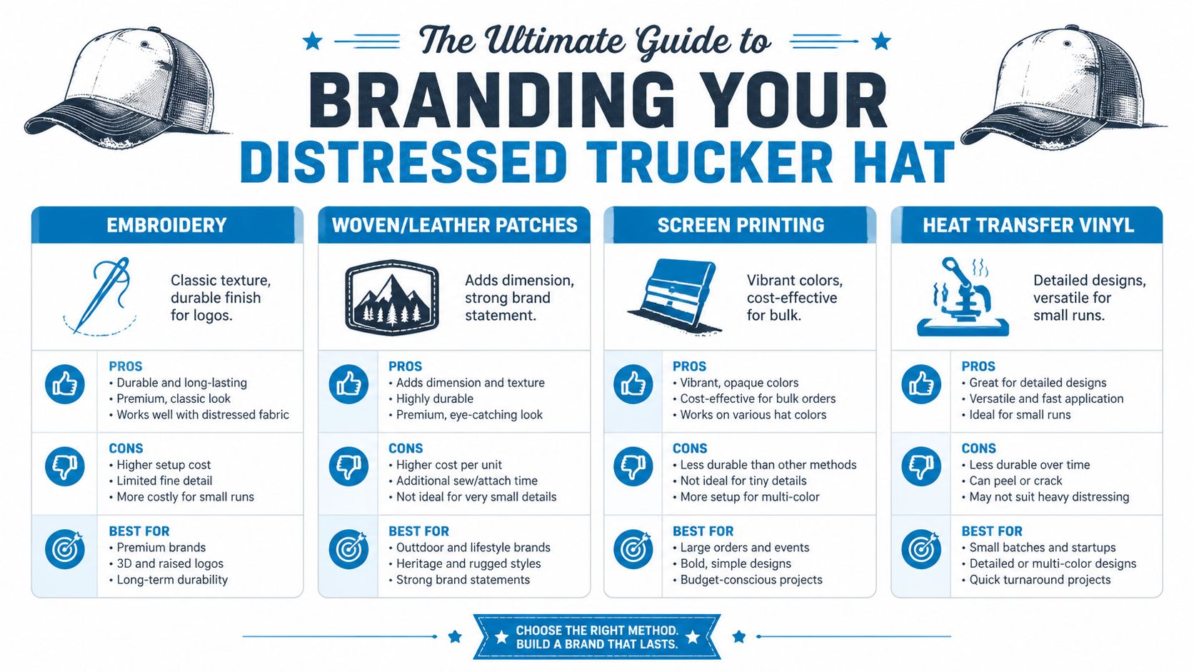
For promotional wear, durability matters. A cited apparel durability comparison notes that embroidered logos on cotton-mesh hybrid hats retained 85% integrity after 50 washes, compared with 70% for printed designs on similar distressed finishes, according to the material summarized on Katydid’s distressed trucker hat collection page.
Embroidery
Embroidery is usually the safest answer when a buyer wants the hat to feel premium. Stitch has texture, shape, and enough presence to stand up against a faded or weathered front panel. It also tends to look more intentional on distressed caps than a flat decoration does.
But embroidery isn’t automatic. On softer, washed fronts, dense stitching can pull the fabric and create puckering. Fine text can also close up if the digitizing isn’t adjusted for the material.
What works best:
- Simple logos: Clean shapes, initials, icons, and short words.
- Moderate stitch density: Enough coverage for presence, not so much that the panel warps.
- Thoughtful placement: Center front usually wins, but slight elevation often helps on curved profiles.
What usually fails:
- Tiny copy: Slogans and website URLs often become unreadable.
- Overly dense fills: The logo gets heavy and the front panel loses its shape.
- Ignoring distress marks: Stitching too close to frayed areas can make the hat look messy instead of vintage.
If you’re evaluating vendors for this method, custom embroidery services are worth reviewing alongside sample photos and sew-outs, especially for logos with small detail.
Patches
Patches are one of the smartest choices for a distressed trucker hat because they create a clean visual boundary. Instead of stitching or printing directly onto a faded, uneven panel, you decorate the patch and apply that finished piece to the hat.
That solves a lot of problems fast. A patch can cover minor inconsistencies in the fabric and make the branding look sharper.
Different patch styles create different moods:
| Patch type | Best look | Trade-off |
|---|---|---|
| Embroidered patch | Traditional and textured | Less detail than woven |
| Woven patch | Cleaner for finer lines | Flatter visual feel |
| Leather-style patch | Rugged and upscale | Not ideal for every logo style |
Patches are especially useful when the hat already has strong personality. Instead of competing with the distressed finish, the patch frames the logo and gives the eye a clean place to land.
A patch is often the easiest way to make a distressed hat look retail-ready on the first try.
Screen printing
Screen printing can work on a distressed trucker hat, but it has to be the right project. It’s a stronger fit for simple, bold art than for logos with delicate details. Distressed surfaces can make the print look broken or uneven if the artwork relies on crisp edges.
The upside is visual impact. Print can give you strong color and a flatter graphic style that embroidery can’t match.
The downside is wear. On a softened, pre-distressed surface, print has less forgiveness over time than stitching or patches. If the project is built around longevity, print usually isn’t my first recommendation for this category.
Use screen print when:
- You want a graphic look rather than a stitched look.
- The artwork is bold and uncomplicated.
- The order is more style-driven than long-term uniform-driven.
DTF transfers
DTF is useful when the logo has detail that embroidery would lose and a patch would overbuild. It can handle multi-element artwork well, and it gives flexibility for smaller runs or art with color variation.
Still, distressed trucker hats expose the limits of DTF fast. If the front panel is heavily washed, textured, or uneven, a transfer can look like it’s sitting on top of the hat instead of belonging to it. Application quality matters a lot here.
I’d use DTF selectively. It’s a practical option for test runs, event drops, and detailed art, but not every distressed blank is a good candidate.
Before approving any decorated sample for online sales, check how it photographs too. A hat that looks good in hand can still look flat in ecommerce images. A practical resource for that step is the MerchLoom product photo guide, especially if you’re planning to sell the hat rather than only hand it out.
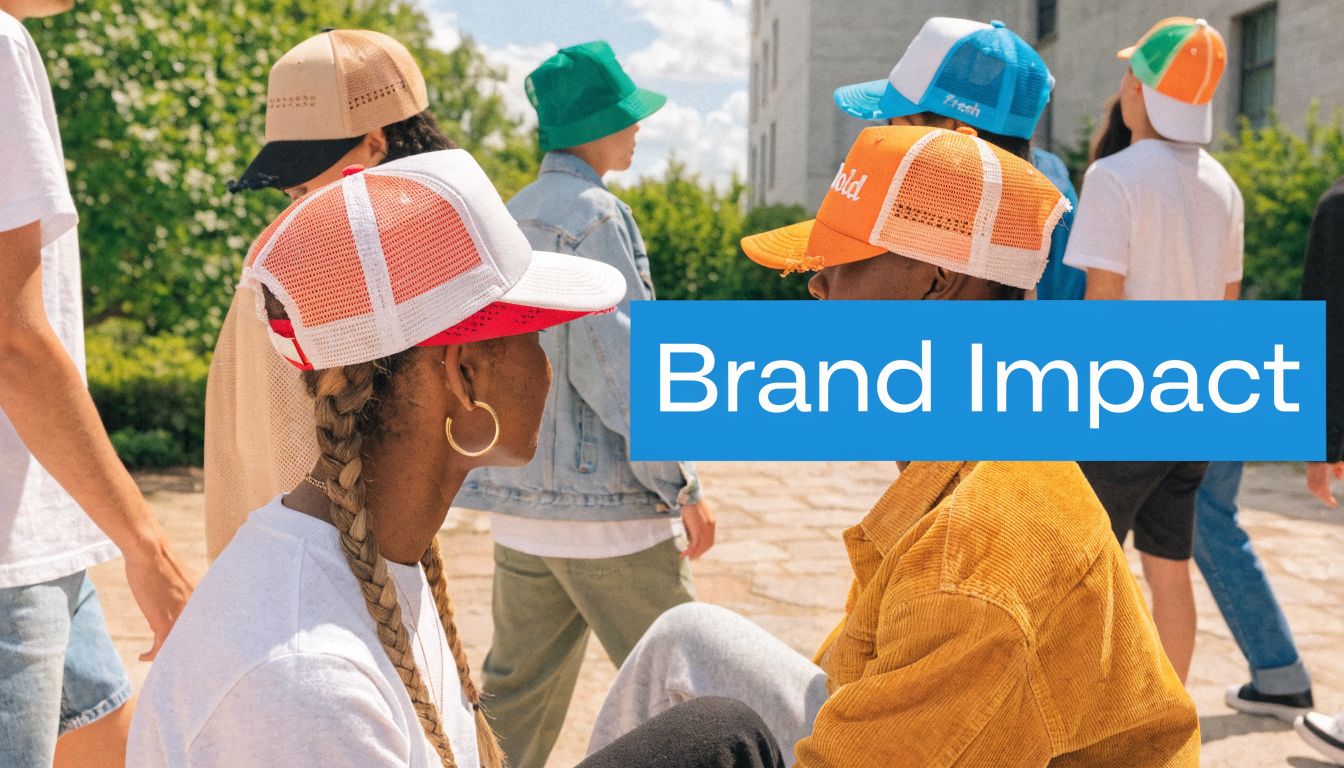
Smart Use Cases for Branded Distressed Hats
Not every branded product fits every business. Distressed trucker hats work best when the brand wants some personality built in before the logo is applied.
The reason they fit so many different settings comes from their history in fashion. Their crossover into mainstream style peaked in the 1990s and early 2000s, driven by skate and music subcultures, with brands like Von Dutch selling millions of units, which helped establish the trucker hat as a flexible fashion piece for many kinds of brands, as described in Make My Cap’s trucker hat history.
Staff uniforms that don’t feel uniform
A brewery, coffee stand, landscaping crew, marina, or outdoor tour company can use distressed hats as staff gear without making the team look overly corporate. That matters if the business sells personality as much as product.
For these orders, embroidery or a patch usually works best. The hat needs to survive repeated wear and still look intentional at the register, on job sites, or in social posts.
Retail merch with a built-in point of view
For boutiques, bands, surf shops, and local lifestyle brands, a distressed trucker hat often has shelf appeal before anyone even notices the logo. The blank already looks familiar, which lowers the barrier for purchase.
That’s a big difference from basic promo hats. A regular cap often depends on the logo to create interest. A distressed cap brings some visual interest on its own.
Event giveaways people keep
Trade shows, festivals, nonprofit events, and sponsor activations all want the same thing. They want a giveaway that doesn’t end up at the bottom of a bag.
A distressed trucker hat gives you a better chance of that, especially when the branding is understated. For broader event planning ideas, it can help to review other promotional item options alongside hats so the headwear fits the rest of the merch mix.
The best giveaway hat doesn’t look like a giveaway.
Use this style when the audience is likely to wear casual headwear anyway. Don’t use it just because it’s trendy. Match it to the people who’ll put it on.
Navigating Pricing Minimums and Timelines
Most custom hat quotes are shaped by three things. The blank itself, the decoration method, and how many moving parts the artwork creates.
That’s why two distressed trucker hat projects that look similar at first can end up on very different price paths. A simple embroidered logo on a stable blank is easier to produce than a highly detailed graphic on a heavily washed front panel.
What changes the price
Several choices affect cost fast:
- Decoration method: Embroidery, patch application, screen print, and DTF all create different labor and setup demands.
- Artwork complexity: Small text, lots of detail, or layered effects usually create more production work.
- Blank selection: Some distressed styles are straightforward. Others have more texture, seams, fading, or finish variation that makes setup harder.
The cheapest route on paper isn’t always the cheapest route in practice. If a low-cost method leads to a weak result, the hats sit in boxes and the order stops being a marketing asset.
How to think about minimums and timing
Minimums exist because setup takes time even when the order is small. Artwork prep, proofing, machine setup, and placement checks happen whether you’re ordering for a team, an event booth, or retail stock.
The practical move is to ask for a sample strategy first. If you’re unsure about decoration on a particular distressed trucker hat, seeing one approved sample can prevent a full production mistake.
Timelines also need breathing room. Distressed hats often take an extra layer of judgment because the finish varies from style to style. Proof approval, decoration testing, and final production all move more smoothly when the artwork is simple and the branding method fits the blank.
Order hats the same way you order signage. Give enough time for proofing, revision, and one real quality check before the full run.
Sustainability affects sourcing now
Sustainability now affects sourcing conversations even for something as casual as a trucker hat. According to the summary on Sugarboo’s distressed cap page, Google Trends showed a 180% spike in searches for “sustainable trucker hat” as of 2026, and sourcing blanks made from organic or recycled materials can reduce environmental footprint by up to 45%.
That doesn’t mean every order needs an eco story built around it. It does mean buyers should ask questions earlier. Distressing can be water-intensive, so if sustainability matters to your organization, check blank material and finishing details before approving the style, not after the quote is signed.
Conclusion Creating a Hat People Love to Wear
A good distressed trucker hat order doesn’t happen by accident. It comes from matching the right blank with the right logo treatment and being honest about how the hat will be used.
If the hats are for staff, prioritize durability and readability. If they’re for resale, focus on shape, finish, and decoration that photographs well. If they’re for an event, keep the design clean and easy to wear beyond the event itself.
The main mistake new buyers make is treating all decoration methods like they perform the same on worn fabric. They don’t. Distressed material has more texture, more personality, and less room for sloppy decisions. That’s why embroidery and patches often give a more reliable professional result, while print-based methods need a more careful match.
The upside is real. When you get this category right, the hat doesn’t feel like throwaway merch. It feels like a piece someone chose. That’s the whole point of branded apparel. You’re not just putting a logo on a product. You’re putting your brand into someone’s weekly rotation.
Start with a blank you’d wear yourself. Keep the logo readable. Don’t overcomplicate the artwork. Ask for a sample when the distressing is heavy or the design is detailed.
If you’re ready to price out a branded hat project, Dirt Cheap Product, Inc. can help you compare blanks, decoration methods, and artwork options so your distressed trucker hat order looks clean, wears well, and fits your budget.